If you started using Nate More’s Astro Icon with Astro early on and are using a version lower than 1.0, you will be in for a surprise when you upgrade to the latest version of Astro Icon and suddenly find a lot of breaking errors related to it.
Migrating from 0.x to 1.x is simple but can be a little tedious depending on how many icons you’re using. A couple key things to understand are that you have to import packages for each icon set that you use now, and that this is now an Astro integration. Don’t worry if you’re not sure how that affects you. You’ll handle adjusting to those changes in the upgrade steps below.
By the way, Nate has a great upgrade guide already at Upgrade to Astro Icon v1 | Astro Icon. I just thought I’d write about it too, since I’ve done this on a couple different sites now and I still have a couple to go.
I use npm-check-updates to update npm packages, but you can do it the standard way. The key thing to note is that in this instance I’m upgrading from astro-icon 0.8.2 to 1.0.2.
2. Import and integrate astro-icon in your astro.config.mjs
No explanation needed here – import astro-icon and add to the list of integrations.
astro.config.mjs
1
import{defineConfig}from"astro/config";
2
importiconfrom"astro-icon";
3
importpagefindfrom"astro-pagefind";
4
importsitemapfrom"@astrojs/sitemap";
5
6
// https://astro.build/config
7
exportdefaultdefineConfig({
8
site:"https://friendswithbeer.com/",
9
integrations: [ icon(),pagefind(),sitemap(),],
10
});
3. Install @iconify-json/icon-family for every icon package you use
This one requires you to scour through every place you specify an icon package name. Search for [astro-icon in your project and look for instances of things like <Icon name="simple-icons:mastodon" /> or CSS instances like [astro-icon="bi:hand-thumbs-up-fill"] and take note of the package names (in these examples, simple-icons and bi).
Now install these by installing @iconify-json/package-name for each. E.g,
That will install the two packages in my example above.
4. Change your astro-icon import statements on Astro pages
The old way to import astro-icons in your .astro files is
1
import {Icon} from "astro-icon";
Change all instances of this in your astro files to
1
import {Icon} from "astro-icon/components";
5. Change all references to [astro-icon] in your CSS to [data-icon]
Another search and replace activity – [astro-icon] references have been replaced with [data-icon] references.
Old:
1
<style>
2
[astro-icon="simple-icons:mastodon"]{
3
color:var(--color-five);
4
width:2.2rem;
5
}
6
</style>
New:
1
<style>
2
[data-icon="simple-icons:mastodon"]{
3
color:var(--color-five);
4
font-size:2.2rem;
5
}
6
</style>
6. Use font-size instead of width or height to set the icon sizes
You may have noticed in the previous section that I not only changed [astro-icon] to [data-icon] in my CSS reference to it, but I also removed the width property and replaced it with a font-size property instead.
After performing the first 5 steps, you’ll see wildly sized icons all over the place until you do this.
7. Tweak font-size on all CSS for your icons
Step 6 will get you in the ballpark, but you’ll now find that some of your sizes, while closer, are still off. Just play with font-size values until you get what you like. CSS specificity is key here – be specific about which icons you’re setting your CSS for and use scoped CSS by putting them in <style> tags in specific astro pages.
The first example below affects all icons, the second one affects the bi:hand-thumbs-up-fill icon specifically.
1
[data-icon] {
2
font-size: 1em;
3
}
1
[data-icon="bi:hand-thumbs-up-fill"] {
2
margin-bottom: 0.1rem;
3
}
Summarium
That’s pretty much it. Once change you will notice when running the dev server is that the first time you try to load the site in the browser, Astro Icon has to load all the icon sets and it takes a little bit. Don’t worry. It will work. 🙂
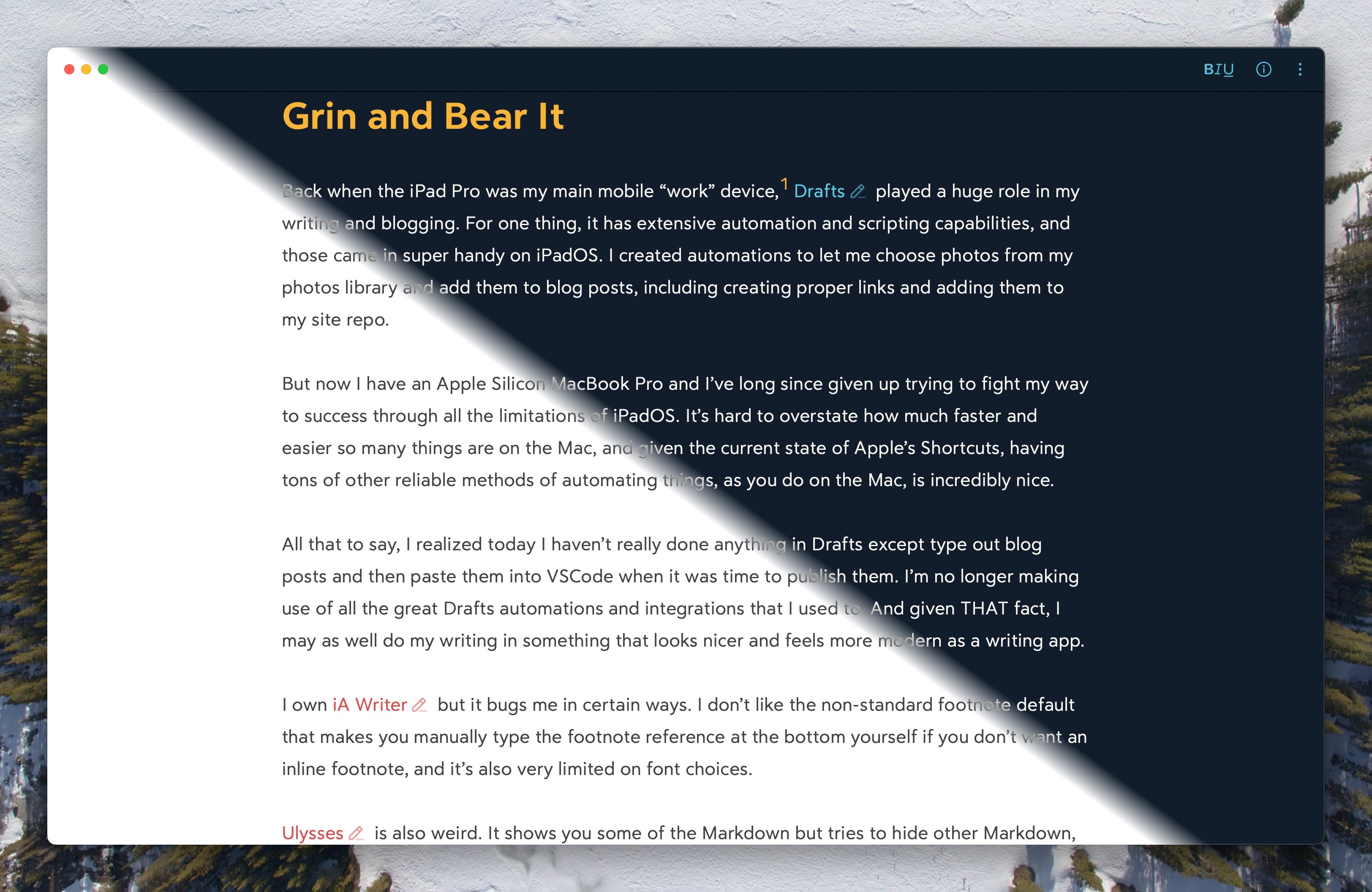
Back when the iPad Pro was my main mobile “work” device,1Drafts played a huge role in my writing and blogging. For one thing, it has extensive automation and scripting capabilities, and those came in super handy on iPadOS. I created automations to let me choose photos from my photos library and add them to blog posts, including creating proper links and adding them to my site repo.
But now I have an Apple Silicon MacBook Pro and I’ve long since given up trying to fight my way to success through all the limitations of iPadOS. It’s hard to overstate how much faster and easier so many things are on the Mac, and given the current state of Apple’s Shortcuts, having tons of other reliable methods of automating things, as you do on the Mac, is incredibly nice.
All that to say, I realized today I haven’t really done anything in Drafts except type out blog posts and then paste them into VSCode when it was time to publish them. I’m no longer making use of all the great Drafts automations and integrations that I used to. And given THAT fact, I may as well do my writing in something that looks nicer and feels more modern as a writing app.
I own iA Writer but it bugs me in certain ways. I don’t like the non-standard footnote default that makes you manually type the footnote reference at the bottom yourself if you don’t want an inline footnote, and it’s also very limited on font choices.
Ulysses is also weird. It shows you some of the Markdown but tries to hide other Markdown, like URLs, in very inconvenient ways. It’s been a long time since I thought I was a fan of Ulysses.
Before Ulysses, it was Byword for me. To say it looks a little basic now is a bit of an understatement.
That leaves Bear as the only realistic Markdown writing option for me, and I have to say, I like how the editor looks. That’s important to me. If it wasn’t, I’d still be using Drafts because it’s a great app and I do really like Greg Pierce and the work he does on it. It’s just not as important to me on the Mac now as it was on iPadOS.
I’m a person who has a lot of idiosyncrasies, and one of them is that I need a nice looking editor to be able to enjoy the writing process. Bear definitely looks nice. The defaults are nice, customizing it is simple, and things like images and links look really nice in it.
Below is an image showing both the light and dark themes I’m currently using in Bear.
There’s not a lot I need to do in order to incorporate Bear into my writing workflow. I already have a script that names my images and puts copies of them in the right locations to both be optimized for the blog and to be able to link to the original. I’ll need to put an automation somewhere in the publish chain that updates the post’s Markdown file with those image paths and creates the links to the larger, original images. But that was also something I needed to do for my Drafts workflow, and hadn’t yet.
Also I think playing with Bear has given me some ideas for improving my site CSS a bit… 🤔
Footnotes
Not my WORK work device, but my personal project work device ↩
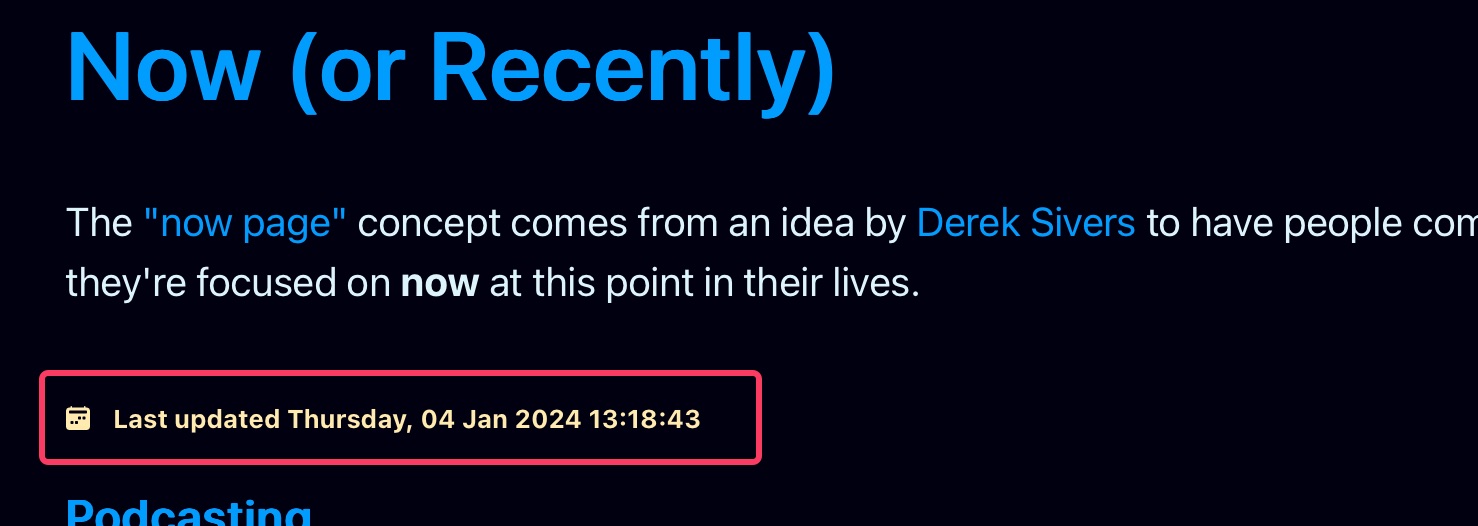
I’m trying to figure out how to use remark plugins in Astro to modify a couple things in posts for me automatically, and along the way I’ve used remark to add a couple quality of life improvements. The first is an auto-generated table of contents for longer posts that I feel need one, and the second is an auto-generated last modified date for pages based on git commit timestamps.
The benefit of an automatically generated last modified date is that I don’t have to remember to update it when I make changes to a page that displays it, like my now page or my links page. I can just commit my changes and the last modified date will update automatically. It’s simple, but it’s kind of beautiful.
I basically did exactly what Astro’s documentation says to do in a helpful recipe called Add last modified time. I created a file called remark-modified-time.mjs and put it in my src/components/utilities folder.1
That’s it. Now I have auto-generated last modified dates for any page I feel needs one, thanks to Astro using remark to render markdown and therefore making adding remark plugins super simple.
Footnotes
You can put your remark plugin anywhere you want, as long as you reference the path correctly in astro.config.mjs. ↩
I don’t remember how I stumbled across the now page movement started by Derek Sivers, but I immediately thought “what a great idea!” and decided to add one to my site.
The concept is simple – it’s a page that lists some current interests, activities, or projects that you’re into or doing. I decided to title mine “Current and Recent Things” because it seemed more appropriate when talking about food I’ve recently enjoyed or movies I’ve recently watched to label those as “recent” instead of “right this second”.
This is the kind of thing I like about personal websites. I think I a lot of people are realizing that blogging isn’t dead yet, it’s not even just resting, and additions to personal sites like now pages make personal blogs and websites even more fun to maintain.
As you saw from my Default Apps December 2023 post, I use Safari for personal use and Chrome for web work and for some administrative and server-related tools that work best in it. The downside to this is that links go to the default browser from things like 1Password, Fastmarks, and email messages, for example. This means when I’m using Chrome, what I really need is for it to be my default browser, and the rest of the time, Safari to be.
Because I’m a Raycast user, I was intrigued by the Raycast Script Commands GitHub repo. The script command examples in this repo include system commands that include default browser scripts for Arc, Chrome, Chromium, Firefox, and Safari.
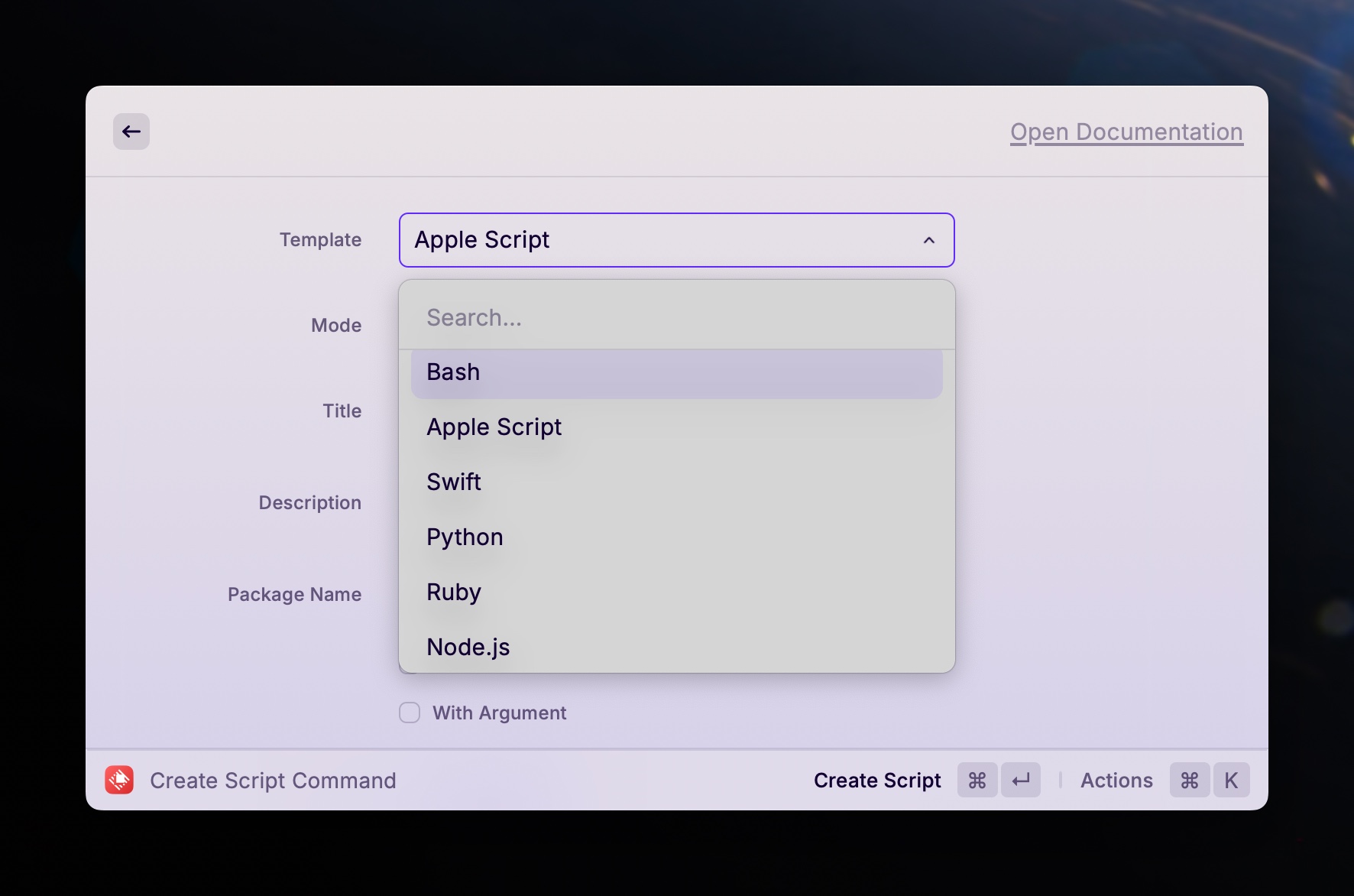
Raycast Script Commands
Raycast script commands are basically scripts that are registered in Raycast and have hooks that let it interact with them to pass parameters and show output in Raycast, if desired. These can be Bash scripts, AppleScript, Swift, Python, Ruby, or Node.js scripts.
Raycast Default Browser Script Commands
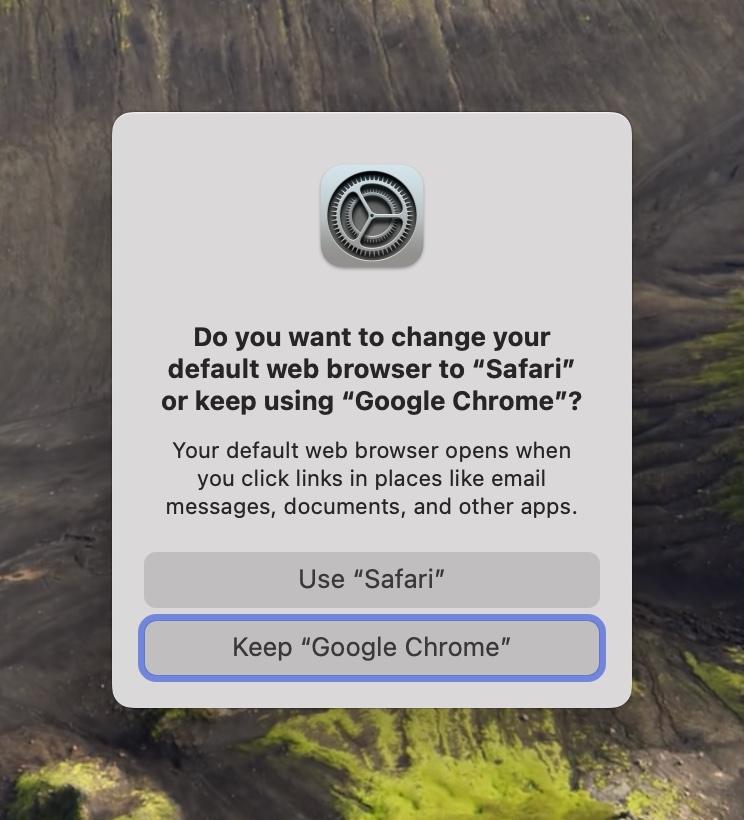
The default browser scripts in the Raycast script command repo rely on a very short Objective-C program that you compile on your Mac called defaultbrowser, which lets you change your default browser from the command line. Given this, you might be surprised to learn that these script commands are AppleScript, and not Bash scripts. The reason is simple: buttons.
When you tell your Mac to switch default browsers using defaultbrowser, you are presented with a dialog box giving you the option to set whatever browser you wanted as your new default, or to keep whatever browser is the current default. Bash scripts can’t click buttons, but AppleScript can. It can also run Bash scripts, which lets us call defaultbrowser from within the AppleScript.
Here’s the default-browser-safari.applescript script from the Raycast script commands repo:
# Install via Homebrew: `brew install defaultbrowser`
5
6
# Required parameters:
7
# @raycast.schemaVersion 1
8
# @raycast.title Default to Safari
9
# @raycast.mode silent
10
# @raycast.packageName Browser
11
12
# Optional parameters:
13
# @raycast.icon images/safari.png
14
15
# Documentation:
16
# @raycast.author Marcos Sánchez-Dehesa
17
# @raycast.authorURL https://github.com/dehesa
18
# @raycast.description Set Safari as the default browser.
19
20
set repeatCount to 0
21
22
tell application "System Events"
23
try
24
my changeDefaultBrowser("safari")
25
repeat until button 2 of window 1 of process "CoreServicesUIAgent" exists
26
delay 0.01
27
set repeatCount to repeatCount + 1
28
if repeatCount = 15 then exit repeat
29
end repeat
30
try
31
click button 2 of window 1 of process "CoreServicesUIAgent"
32
log "Safari is now your default browser"
33
on error
34
log "Safari is already your default browser"
35
end try
36
on error
37
log "The \"defaultbrowser\" CLI tool is required: https://github.com/kerma/defaultbrowser
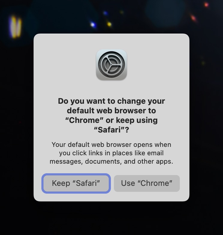
The top half is information for Raycast. Then the AppleScript portion gets going. First it calls a function1 that runs the defaultbrowser command line program with the string safari as a parameter value. Then it runs a loop waiting for the confirmation dialog box to pop up. It waits until either the window exists or it’s looped 15 times. Finally, it tries to click button 2 of the dialog box. The reason it tries to click button 2 is because the dialog looks like the following image – or at least, it’s supposed to. More on that later.
This means when you send it a request to change your default browser from Safari to Chrome, for example, you’ll get a dialog box with two buttons, the first of which cancels the change and the second of which executes the change to Chrome.
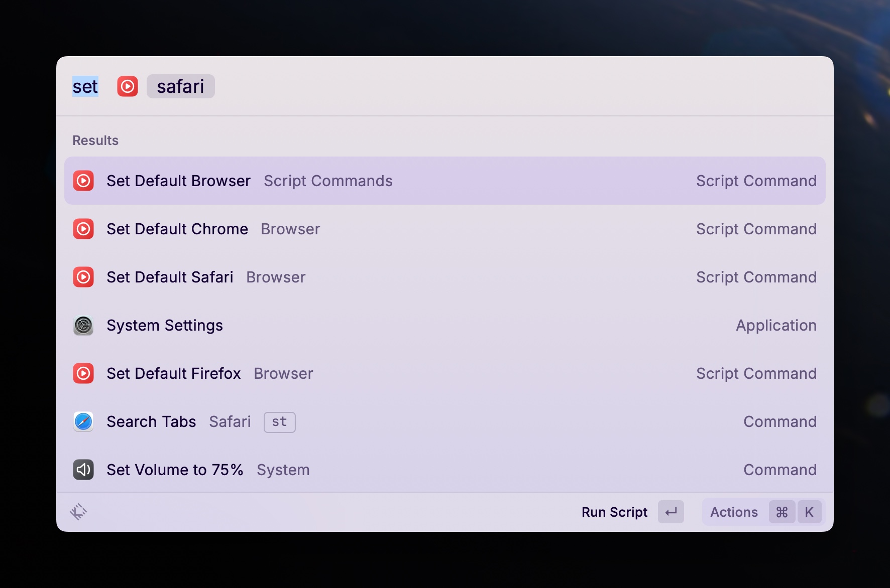
I created new Raycast script commands using the appropriately named “Create Script Command” command in Raycast, and then copied the AppleScripts from the repo into them. Hooray! End of blog post, right?
Except there was a problem.
Chrome Does It Differently
Everything worked great whenever I tried switching from any browser that wasn’t Chrome to any other browser. But whenever I tried switching FROM Chrome back to something else, it never worked.
A simple test using defaultbrowser directly in the command line showed me why. Chrome’s confirmation dialog box is different. It looks like this:
You see the problem. The command scripts assume that button 2 is the button for making the switch, but in the case of Chrome’s dialog box, it’s the other way around. Button 1 makes the change and button 2 keeps the current default browser setting.
I honestly don’t know whose responsibility this is, Google’s or Apple’s, and I don’t really care. I presume it’s Google’s because I presume at one point the Raycast versions of these script commands worked, even when switching away from Chrome as the default browser, so my guess is Google changed something about Chrome’s confirmation dialog. I don’t know. Honestly, I would have thought this was entirely handled by macOS.
Modifying the Default Browser Scripts to Handle the Chrome Dialog Box
The solution is simple: if switching from Chrome, click button 1. Otherwise, click button 2. Since the script could be switching to a non-Chrome browser from a different non-Chrome browser, this means I need to check. And that sent me down a rabbit hole that I refuse to admit the time duration of, because it was long enough to need to add an “s” to “hour”.
But it goes like this:
On macOS, your default browser setting is one of many settings saved in com.apple.launchservices.secure.plist in your local Library/Prefences folder (~/Library/Preferences). You can search for it. If you type the following, you’ll get a LONG output that includes two lines you care about:
That’s if Safari is your current default browser, of course. It could be org.mozilla.firefox or com.google.chrome, for example. But you want to search for a line with LSHandlerRoleAll set to some browser, followed by a line called LSHandlerURLScheme set to https.
Fortunately, awk was made for things like this, and also fortunately, AppleScript can run shell commands. So I made another function for my default browser AppleScripts to see what the current browser is.
1
to getCurrentDefaultBrowser()
2
set filePath to "~/Library/Preferences/com.apple.LaunchServices/com.apple.launchservices.secure.plist"
3
set output to do shell script "plutil -p " & filePath & " | awk '/LSHandlerRoleAll/{a=$3}/LSHandlerURLScheme/{if($3==\"\\\"https\\\"\") print a}'"
4
return output
5
end getCurrentDefaultBrowser
Now, before running the part of the script that runs defaultbrowser before waiting for a button to click, it checks which browser is the current default browser. If it’s com.google.chrome, then my script clicks button 1 for me. Otherwise it clicks button 2.
set currentDefaultBrowser to my getCurrentDefaultBrowser()
18
19
set repeatCount to 0
20
tell application "System Events"
21
try
22
my changeDefaultBrowser()
23
repeat until button 2 of window 1 of process "CoreServicesUIAgent" exists
24
delay 0.01
25
set repeatCount to repeatCount + 1
26
if repeatCount = 15 then exit repeat
27
end repeat
28
try
29
if currentDefaultBrowser contains "com.google.chrome" then
30
click button 1 of window 1 of process "CoreServicesUIAgent"
31
else
32
click button 2 of window 1 of process "CoreServicesUIAgent"
33
end if
34
log "Safari is now your default browser"
35
on error
36
log "Safari is already your default browser"
37
end try
38
on error
39
log "The \"defaultbrowser\" CLI tool is required: https://github.com/kerma/defaultbrowser"
40
end try
41
end tell
42
43
to getCurrentDefaultBrowser()
44
set filePath to "~/Library/Preferences/com.apple.LaunchServices/com.apple.launchservices.secure.plist"
45
set output to do shell script "plutil -p " & filePath & " | awk '/LSHandlerRoleAll/{a=$3}/LSHandlerURLScheme/{if($3==\"\\\"https\\\"\") print a}'"
46
return output
47
end getCurrentDefaultBrowser
48
49
to changeDefaultBrowser()
50
do shell script "
51
if ! command -v defaultbrowser &> /dev/null; then
52
exit 1
53
fi
54
defaultbrowser " & "safari" & "
55
exit 0
56
"
57
end changeDefaultBrowser
Now when I have Chrome set as my default browser and I don’t want that anymore, my Raycast default browser command scripts work as intended, and will actually manage to set my default browser to the desired one.
A Parameterized Version of the Default Browser Command Script
Just in case anyone else cares, I also created a parameterized version of the script that lets me type in the browser name as a raycast command parameter so that the same script can switch to any browser I want.
I like Warp. I did not intend to like Warp. I didn’t even want to like Warp. But after giving it a fair shot for a few days, I couldn’t help but liking it and sticking with it. It just feels to me like everything a next generation terminal should be.
According to its developers,
Warp is a modern, Rust-based terminal with AI built in so you and your team can build great software faster.
That sounds nice, if not a bit vague. What is so great about Warp, and what makes it more desirable to use than macOS Terminal app or iTerm2 or Secure Shellfish, for example? The obvious answer is its features and the workflows they enable. One of my favorite of those features is Blocks.
Blocks
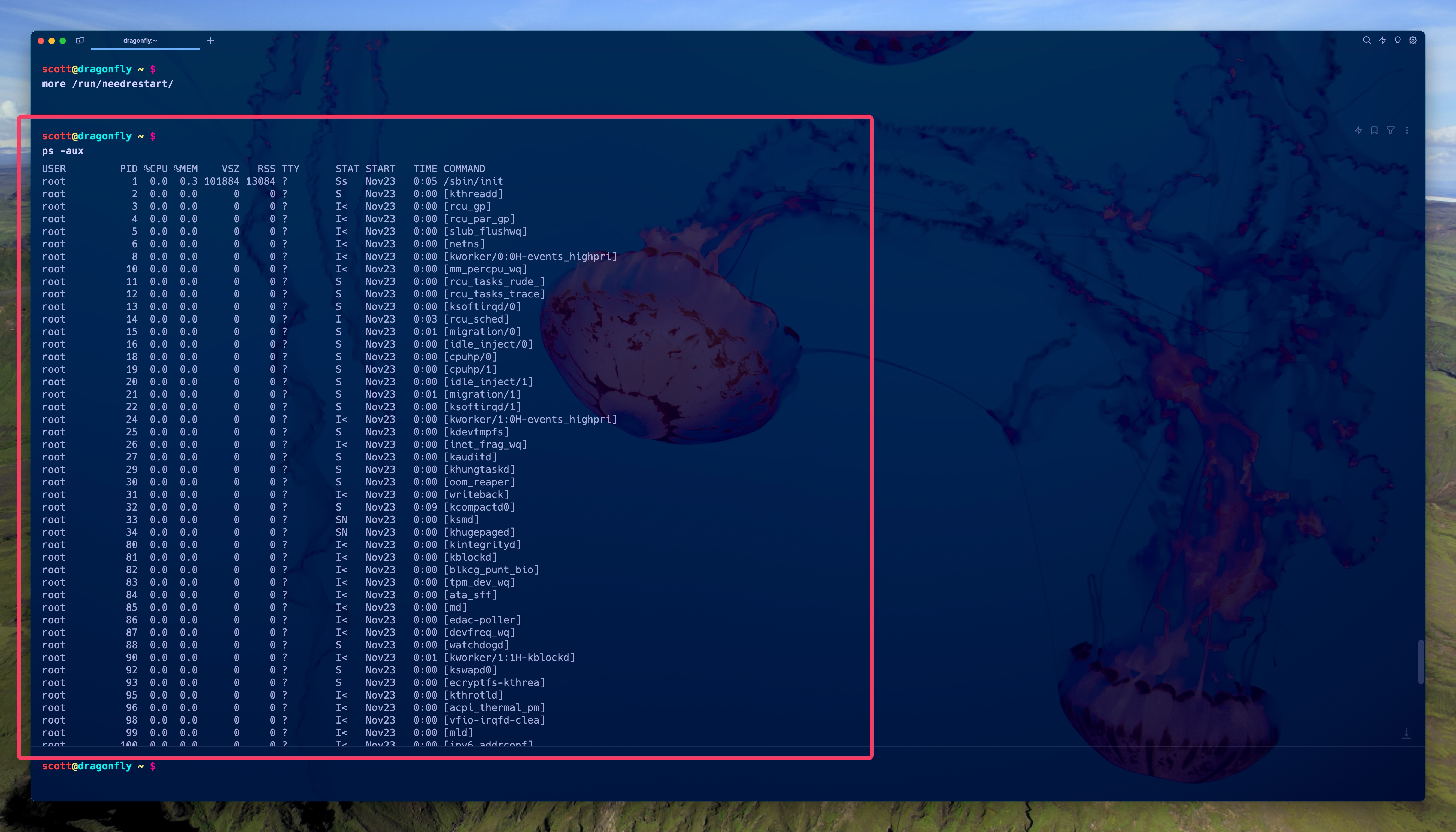
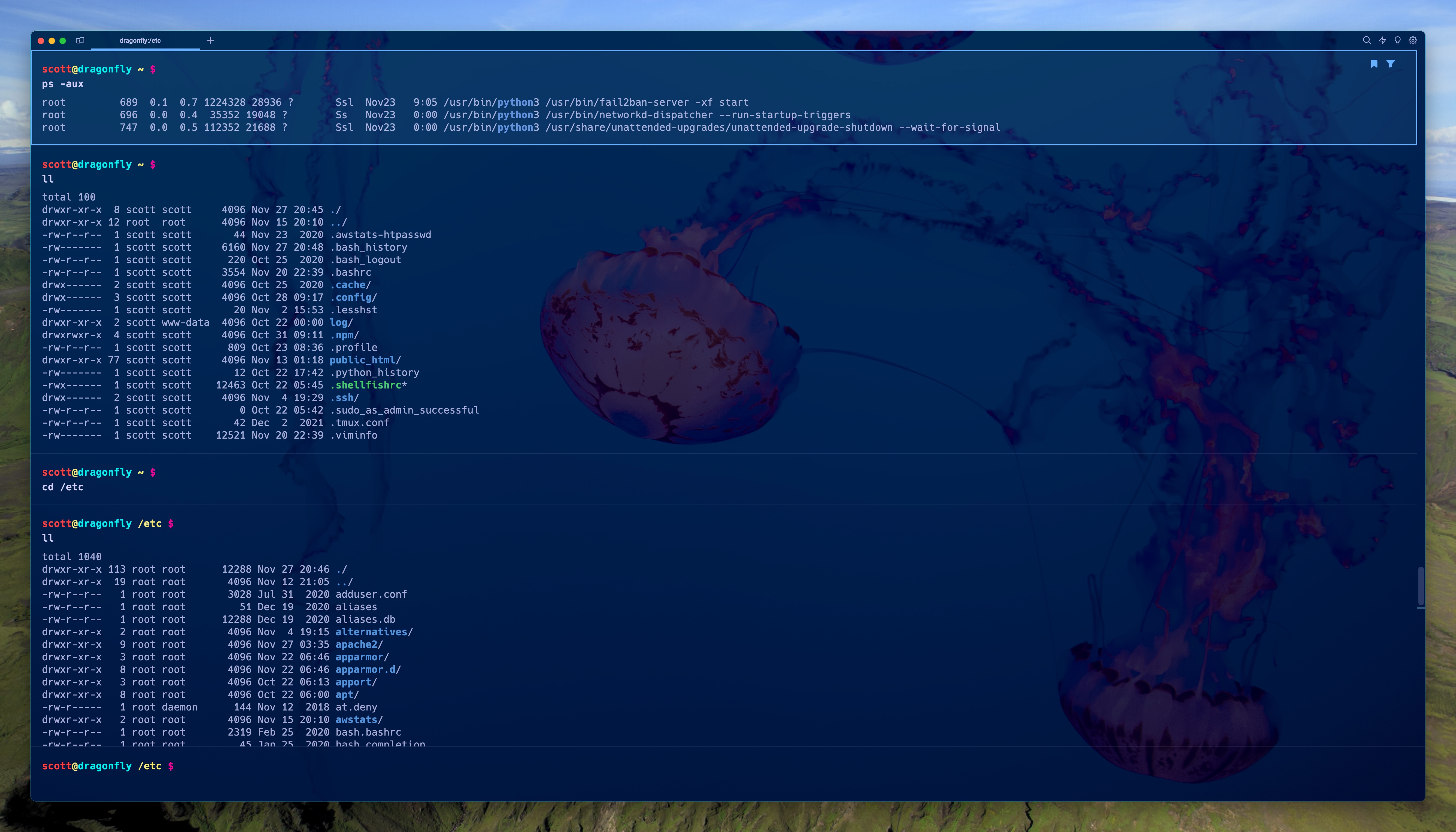
Blocks are one of the biggest Warp features, in my opinion, and one that I love and take advantage of all the time. Blocks are simply a grouping of a command and its output into one selectable and actionable section in Warp. For example, here’s the result of a ps -aux command that is now a block.
My new waiting command prompt is below the block and is now in a separate block from it, but I can scroll up and down to see the whole ps -aux block and perform actions on it. Blocks are nice because not only do they negate having to use something like ps -aux | more to see the full output of a command, but they also remain selectable, filterable, and modifiable.
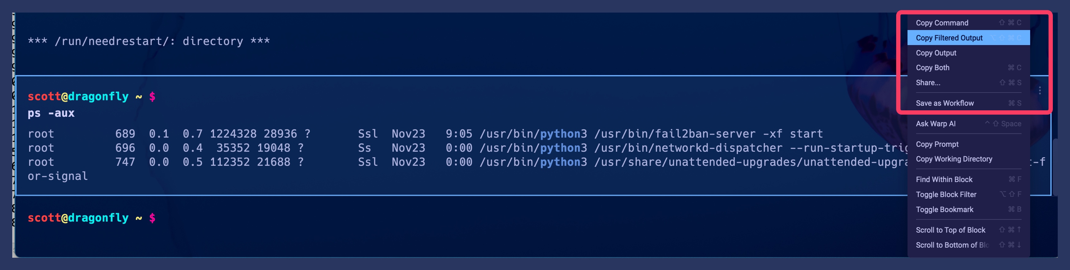
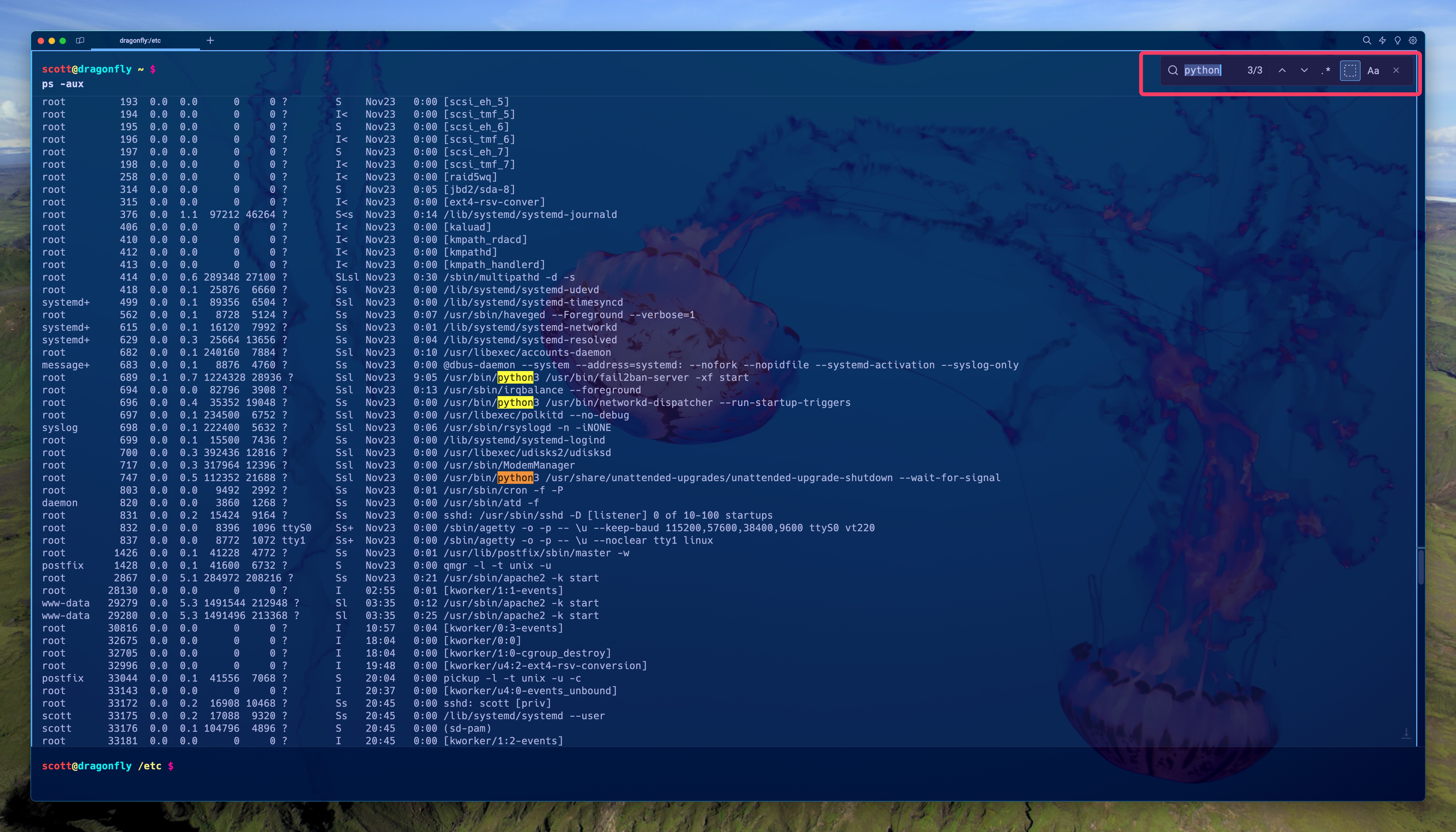
Speaking of filterable… here’s that same block filtered by the word “python”. Look how small it is… down from 124 lines of output to 3!
Filtering can accept regular expressions or case-sensitive text simply by choosing those options in the filter search, just like most modern text editors. The keyboard shortcut for filtering is Shift-Option-F (⇧ ⌥ F).
You may be thinking, hang on… I can just pipe the command to grep like this: ps -aux | grep 'python', and you’re right. You can. But filtering is fast and you can further act on it by saving the filtered output or the filtered output and the command, and more.
Bookmarking blocks is nice too. For example, here I left the previous ps -aux block filtered for “python” and bookmarked it. I then executed a bunch of other commands which all created their own blocks and the bookmarked ps -aux block scrolled off the screen. But by hitting Option-up (⌥-↑), I immediately jumped back up to the bookmarked (and still filtered) block.
Filtering isn’t the only way to find things in a block, you can also use standard old Command-F (⌘-F) to search within a block. The difference between this and filtering is exactly what the words imply: filtering reduces the output of the command to just lines with matches, while search finds search text or regular expression matches in the command output, but doesn’t filter to only show matching lines.
One nice feature is using search in a “live” block, like one that’s running an htop or a tail -f command. As the output of the running process updates, so do your search results.