You can toggle the themes on the site menu. There’s a little icon under all the menu items that appears as a moon (if you are in dark theme), a sun (if you’re in light theme), or a little 128k Mac (if you’re in hypercritical theme). Clicking that icon toggles through the themes from dark to hypercritical to light.
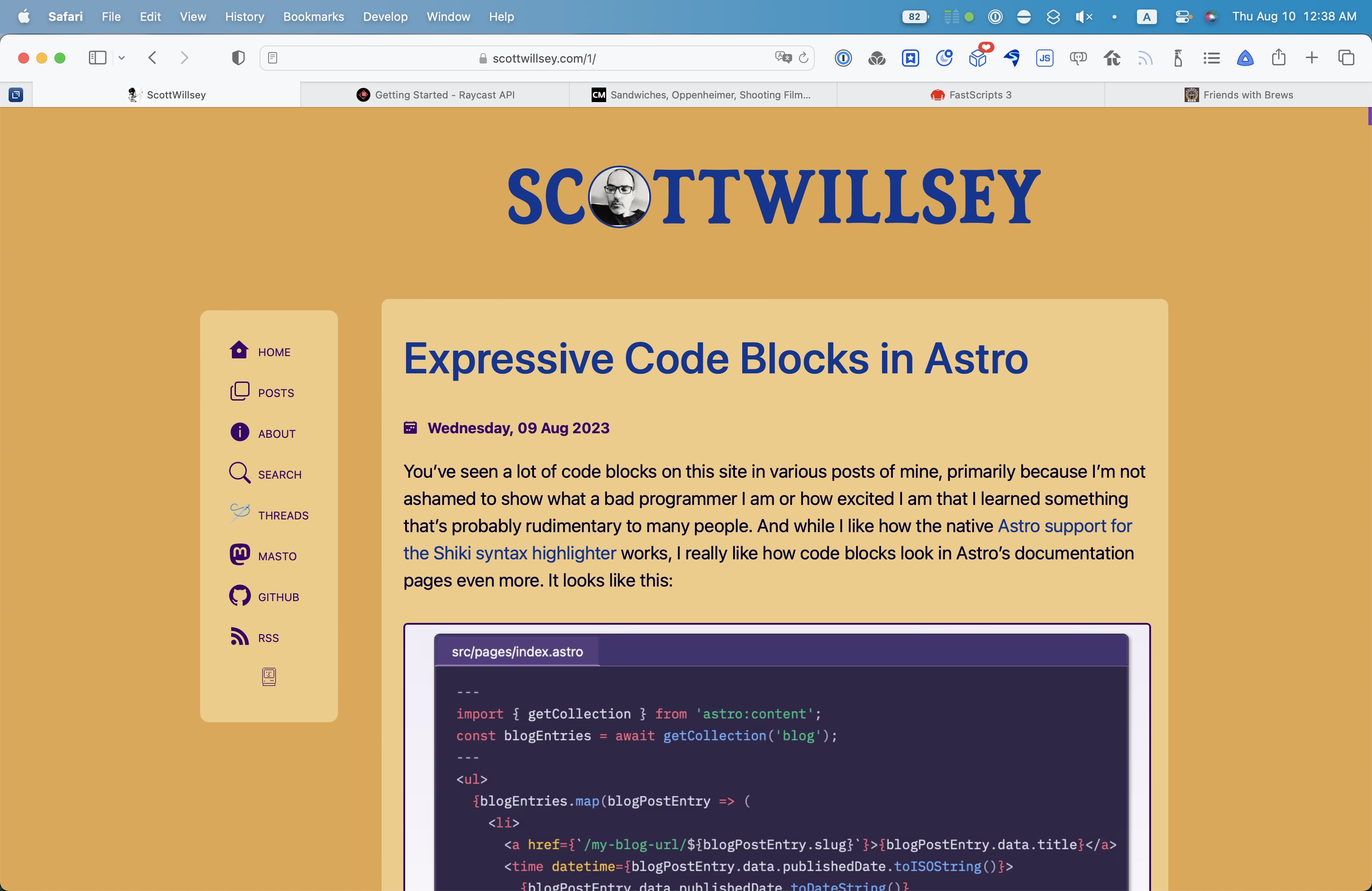
You’ve seen a lot of code blocks on this site in various posts of mine, primarily because I’m not ashamed to show what a bad programmer I am or how excited I am that I learned something that’s probably rudimentary to many people. And while I like how the native Astro support for the Shiki syntax highlighter works, I really like how code blocks look in Astro’s documentation pages even more. It looks like this:
I like the way they do this because it supports various languages and syntaxes, it allows for a frame with the name of the file being shown if applicable, and in general, it just looks really good.
I posted in the Astro Discord Starlight channel to ask how they tweaked Shiki to make it look like this, because I couldn’t tell from the Starlight source. I was looking for rehype markdown plugins or something. Chris Swithinbank, who’s a huge Astro docs contributor and also contributor of code for the Astro docs application itself, replied to let me know that what they’re doing for code blocks in the Astro docs is even simpler than that – it’s called Expressive Code.
Expressive Code is really all about code blocks, or syntax highlighting. And it just so happens most or all of the contributors are Astro contributors (including Chris!). This is great news because one of the packages available in Expressive Code is astro-expressive-code, which is an Astro specific Expressive Code integration. It’s so easy that all you have to do is install that one package in your Astro site and you’re in business.
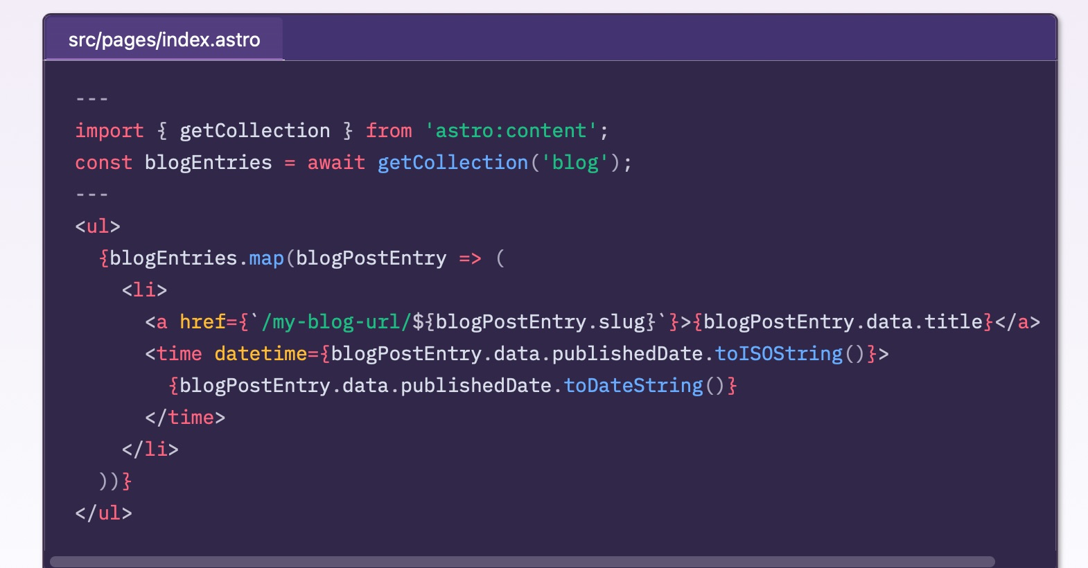
I installed it using the Astro CLI as recommended in the astro-expressive-code README with the command npx astro add astro-expressive-code (since I’m using npm). After that, I did absolutely nothing except edit all my posts with code blocks to add titles to any code blocks that I wanted to list file names for. Now my code blocks look like this:
Right now I’m just using the default Shiki GitHub theme. I haven’t customized the look at all. While they do look fine as is, I will customize the look more when I have time.
One of my site to-do items for a while now has been doing something with the keywords I add to each post’s front matter. Content in Astro can be different variations of Markdown, and front matter is a YAML section with metadata about the content, such as title, description, publish date, or really whatever you want to put in there. One of the things I add there is a YAML array of keywords which are really just tags. I called them keywords, they could have been called categories, tags, topics, whatever.
Here’s the YAML front matter for my last post, which was about podcasting software:
1
---
2
title:"My Podcasting Setup - Recording Software"
3
description:Part 2 of a series on podcasting setups and workflows. This is the software I use for recording podcasts.
4
date:"2023-08-04T09:00:00-08:00"
5
keywords:["mac","apps","podcast"]
6
slug:"podcasting-recording-software"
7
---
I thought it might be nice to add the ability to view posts associated with specific tags, to add a post-filtering option in addition to the site search. That way people could see everything I associated with “mac” or “podcast”, for example. I decided to show a subset of tags on my home page and have a tags index page that listed all of them. The tags in those tag lists would link to the specific tag’s page, with a list of posts using that tag.
Thanks to others who are a lot smarter than me who’ve already done this very thing with Astro, finding excellent examples to borrow and steal from didn’t take long at all.
I did a search for “astro tags” and found that the Astro documentation site has a tutorial that covers building a tag index page as well as individual tag pages, but I wanted some better examples of pulling the tags from the posts and sorting and filtering them rather than the array of tag objects used in the documentation examples.
Sarah’s post does a great job of explaining static vs. dynamic routing, and the astro getStaticPaths() function that’s used to generate dynamic routes. First, though, she builds her src/pages/tags/index.astro page which serves as her tags list page (which you can see in action here).
I have a slightly different approach in that I use Astro Content Collections, which were introduced after Sarah’s blog post, rather than Astro.fetchContent(), which she uses, which was in turn deprecated in favor of Astro.glob() in Astro 2.0. For now, just think of Content Collections as another way of grabbing all associated documents, such as posts. You can still use Astro.glob(). Content Collections have a few benefits that glob doesn’t, but require a little extra setup.
In any event, I wound up with this for a tags index page:
Well, that’s not very exciting. I don’t do any of the cool post grabbing stuff that Sarah does here. That’s because I put all that work into an Astro component I call TagCloud. You can see that I use my TagCloud component there in my tags index page. I did this because I also wanted to show a subset of my tag cloud on my home page and on my search page. Creating an Astro component to actually display the tag cloud makes all that logic and display markup reusable.
Also note that I pass two params to my TagCloud component – showCount="true" and displayNumber="999". I’ll explain those pretty soon.
HERE is where the magic happens, in TagCloud.astro itself:
All Tags ... <Iconname="ph:arrow-circle-right-bold"/>
39
</a>
40
) :null
41
}
42
</span>
43
<style>
44
span.categories{
45
display:flex;
46
justify-content:center;
47
flex-wrap:wrap;
48
gap:0.4rem;
49
}
50
span.categoriesa{
51
background-color:var(--surface-menu);
52
color:var(--color-gray-800);
53
padding:0.25rem0.5rem;
54
border-radius:0.25rem;
55
border:1pxsolidvar(--brand);
56
font-size:1rem;
57
text-transform:uppercase;
58
text-decoration:none;
59
}
60
span.categoriesa:hover{
61
background-color:var(--brand);
62
color:#fff;
63
}
64
[data-icon]{
65
width:1.5rem;
66
margin-bottom:-0.3rem;
67
}
68
69
@mediascreenand(max-width:500px){
70
span.categoriesa{
71
font-size:0.75rem;
72
}
73
[data-icon]{
74
width:1rem;
75
margin-bottom:-0.2rem;
76
}
77
}
78
</style>
Ok, that’s kind of a big chunk of code, but a lot of it is html and styling. But there are a few important parts, namely all that JavaScript in the front matter regarding allPosts, allTags, processedTags, and sortedTags.
Basically what this does is get my posts Content Collection, get the keywords arrays from the front matter, and then create a JavaScript object of key value pairs with each tag I’ve ever used as a key, and how many times I’ve used it as its value.
If you console.log(sortedTags), it looks like this:
The reason is that I’m keeping count of how many times each tag is used and I’m displaying that in my tag cloud, as shown below.
That’s the only reason why instead of just sticking with a simple array of tags, I am creating a JavaScript Object of key value pairs, with the tag name being the key and the number of times its used being the value.
I am not clever enough nor good enough with JavaScript to have written that function. All of that JavaScript in that code block above is the work of Chris Pennington, who has a really great YouTube channel called Coding in Public. One of his videos is titled Astro Blog Course #12 - Tag cloud, and it’s about exactly what you think it’s about.
My whole TagCloud.astro component aside from styling comes straight from his CategoryCloud.astro component, with one minor change.
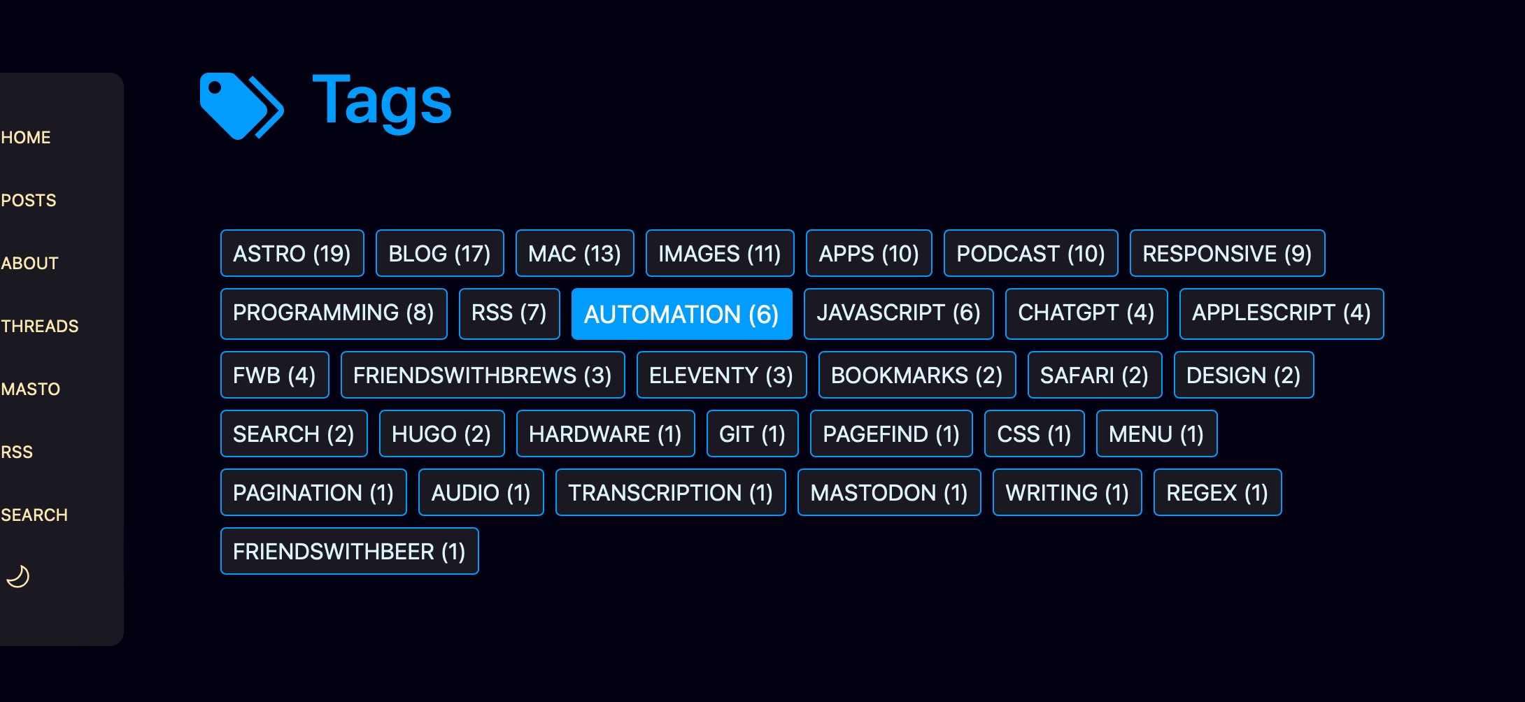
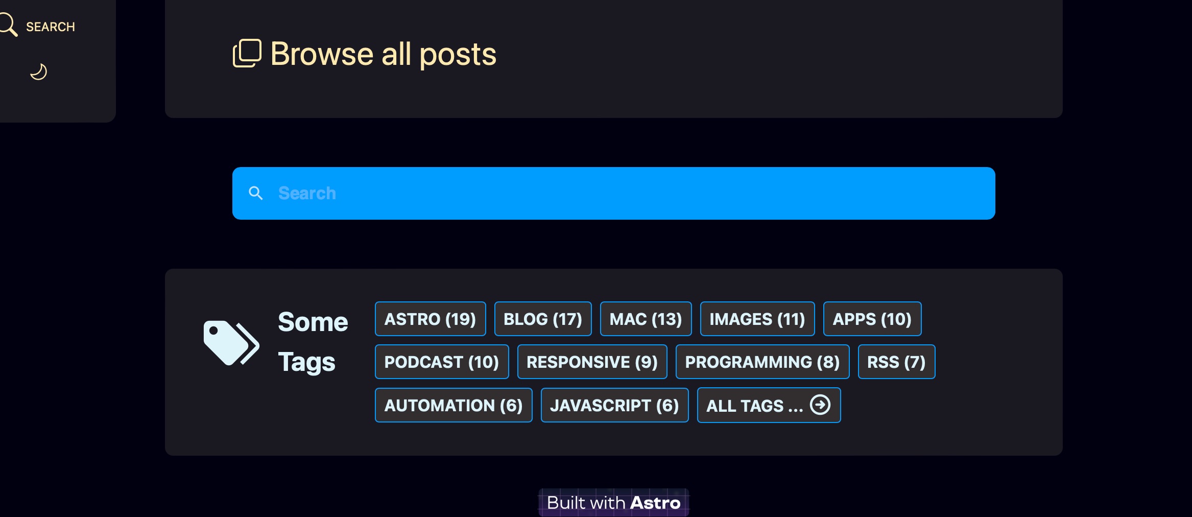
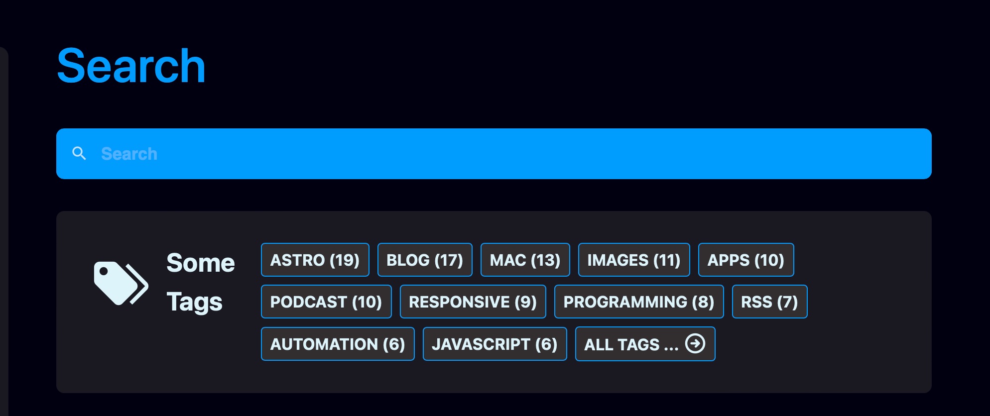
My minor change is the addition of a prop called displayNumber. If I give it something real, like 11, it will display 11 tags plus a “All tags… ” link to the tags index page. If I give it 999, it shows all tags. On my tags index page, I call TagCloud.astro with displayNumber="999", while on my site home page and my site search page, I call TagCloud.astro with displayNumber="11". The result is that my tags index page looks like the picture immediately above, while my home page and search page tag clouds look like the following two images.
Individual Tag Pages
The tag pages for individual tags are where dynamic routing comes in. While the tags index page is at src/pages/tags/index.astro, the fact that the individual tag page are dynamically created is evident by the Astro page name: src/pages/tags/[tag].astro. The brackets around the name indicate a dynamic route page, one that generates an actual page for each item in an array of objects. In our case, our objects are tags.
As the Astro documentation on dynamic routes says,
Because all routes must be determined at build time, a dynamic route must export a getStaticPaths() that returns an array of objects with a params property. Each of these objects will generate a corresponding route.
My tag.astro page looks just like Sarah’s as far as my getStaticPaths() function, because hers is perfect. Like I said, people much smarter than me have already solved this problem and documented it for others. I’m glad too, because JavaScript isn’t really something I spend hours improving my skills at. I tend to learn enough to do what I need to and then move on. Unfortunately this means that correctly expressing things in JavaScript like mapping and filtering is sometimes a struggle for me.
Here’s [tag].astro. It’s another long code block but here’s the full code dump anyway.
<ahref="/tags"><Iconname="mdi:tag-plus"/> Browse all tags</a>
85
</p>
86
</section>
87
</article>
88
</Base>
89
<style>
90
header{
91
background-color:var(--surface-menu);
92
border-radius:0.5rem;
93
padding:0.5rem2rem;
94
margin:1rem0;
95
}
96
h4{
97
margin:0.3em0;
98
}
99
div.cal,
100
div.cala{
101
font-weight:bold;
102
font-size:0.75em;
103
color:var(--accent1);
104
}
105
div.description{
106
font-size:0.75em;
107
margin:0.3em0;
108
}
109
p.posts-link{
110
margin:1.5em;
111
}
112
[data-icon="mdi:tag"]{
113
width:1em;
114
margin:00.5em-0.25em0;
115
}
116
[data-icon="bi:calendar2-week-fill"]{
117
width:0.75em;
118
}
119
[data-icon="mdi:tag-plus"]{
120
width:0.75em;
121
}
122
</style>
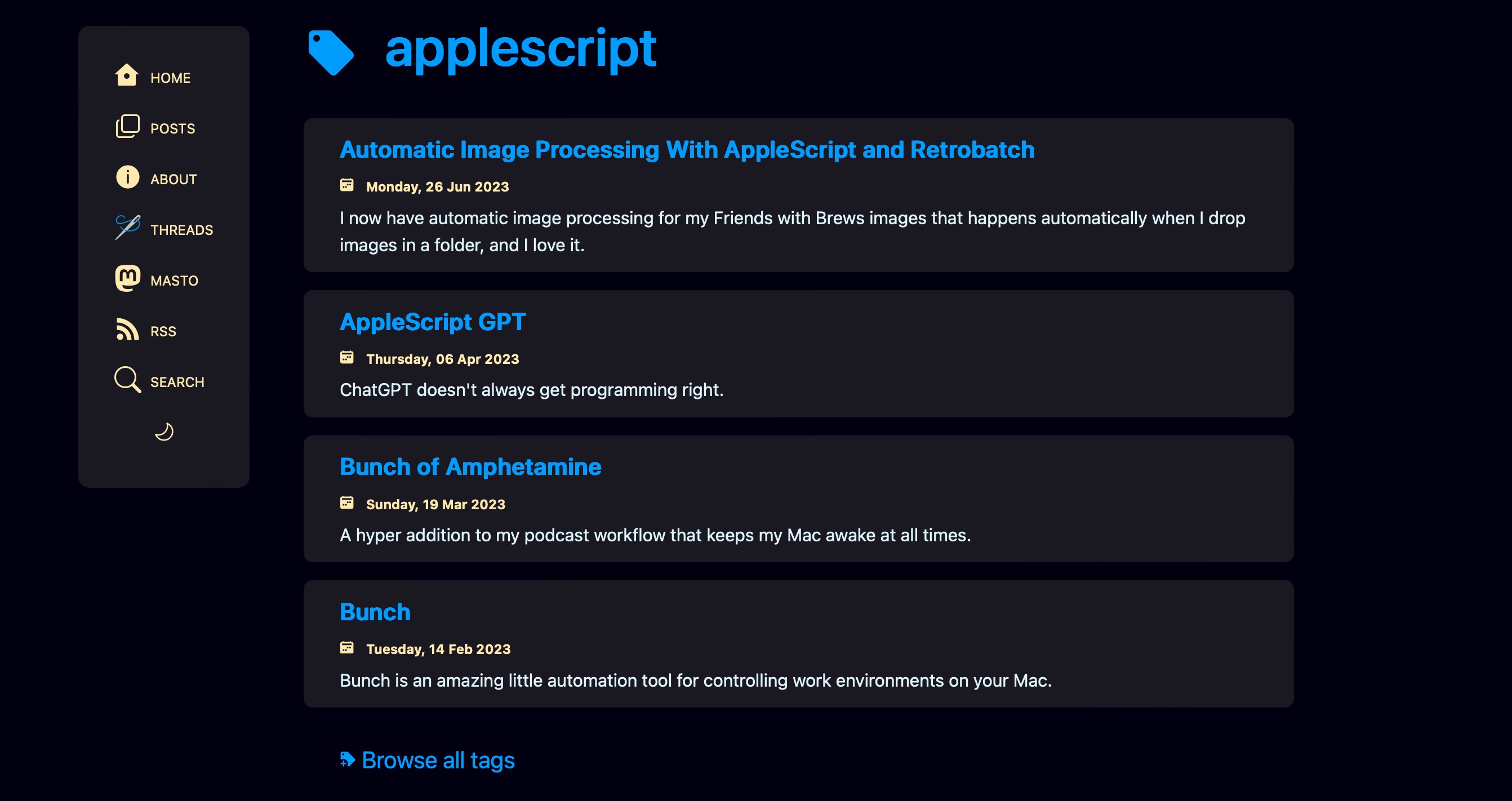
All of that in [tag].astro equates to the following individual tag view.
I don’t know if you’re tired of tags yet, but I’m getting there. I do like how this turned out though. I think it looks pretty good considering my horrific lack of design skills, and I like how I can implement the partial cloud on the home page and the search page, and the full tag cloud on the tags index page, all from the same TagCloud.astro component.
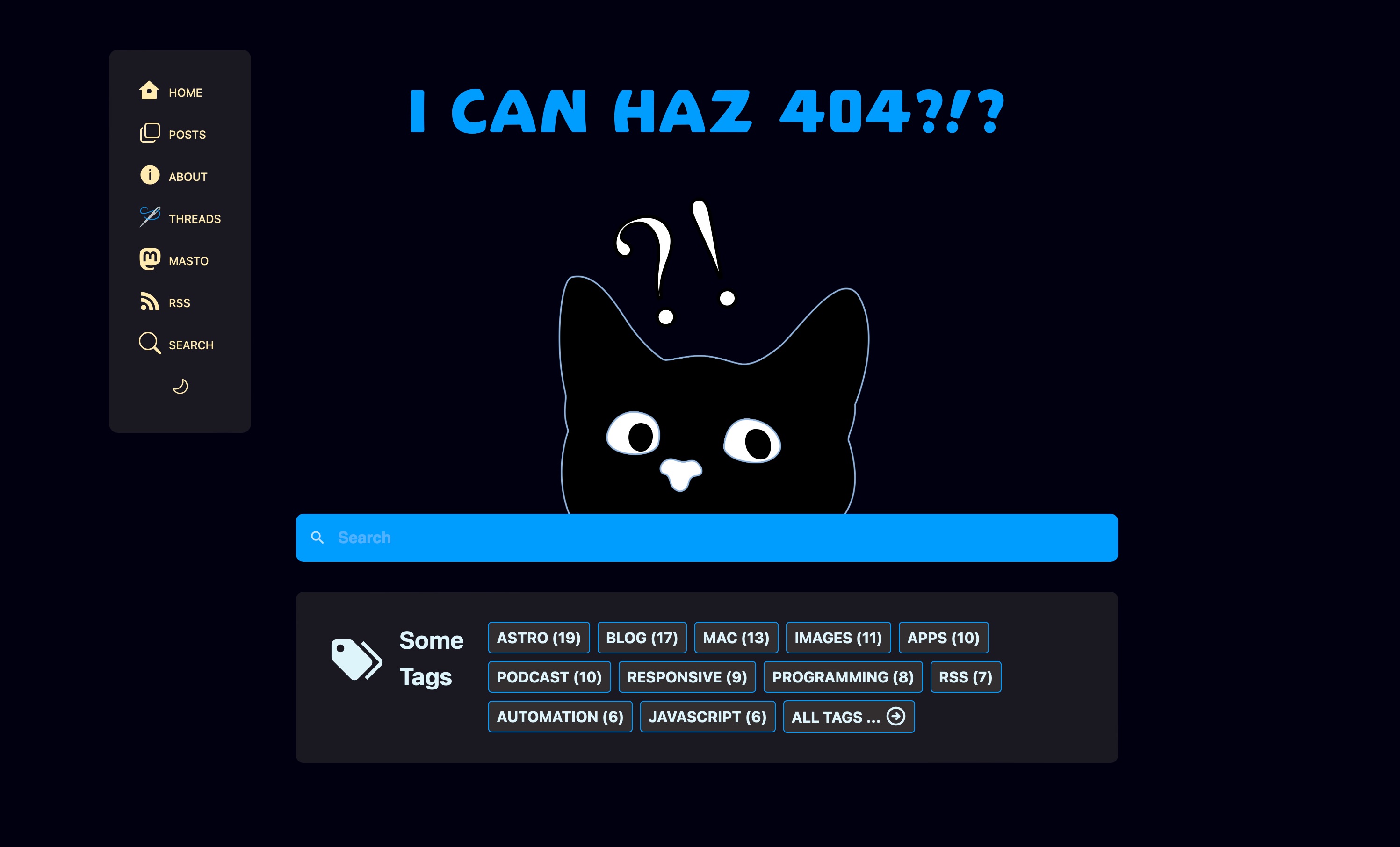
404, Scott Not Found
Oh, I also added the tag cloud along with a search field on my 404 page too.
And now I’m going to sleep, because it’s after 2 AM and I really need to be 404 myself right now.
I’ve talked about the hardware I use for podcasting, but what about the other tools of the trade? Obviously the first step to creating a podcast is to record one, and in my case, that’s all about software.
The Company You Keep
If there’s one name podcasters who use Macs tend to be very familiar with, it’s Rogue Amoeba. I don’t know if Rogue Amoeba set out to be the go-to people for podcasting on the Mac, but they’ve certainly achieved it. For me, all of their software is indispensable, but there’s one application in particular that you pretty much have to have – Audio Hijack.
Audio Hijack
Audio Hijack bills itself as the “Record Any Audio” application, and that’s exactly what it is. If there’s an app on your Mac that makes noise, Audio Hijack can record it.1
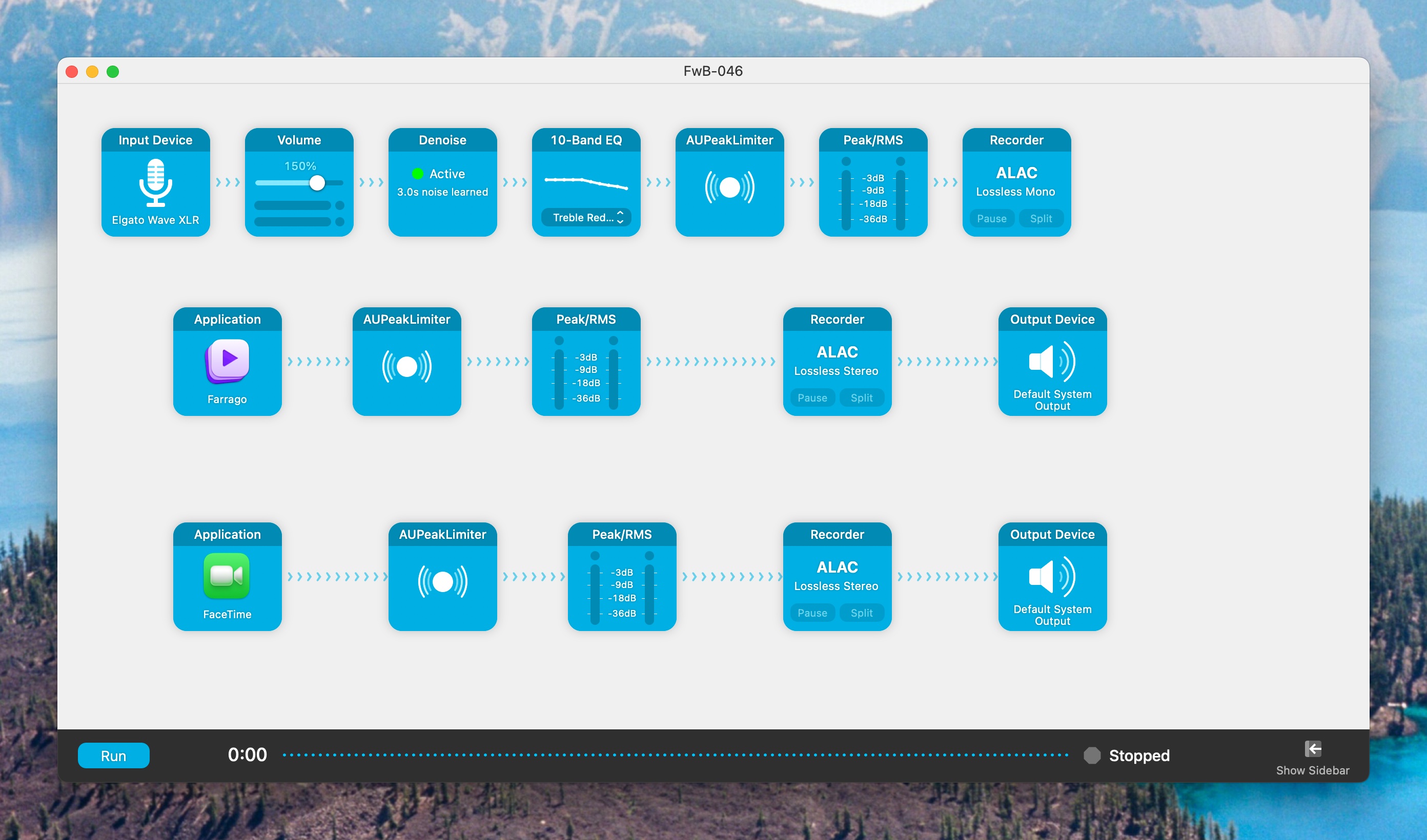
The beauty of Audio Hijack is that it sets up audio recording chains that can include effects, noise removal, peak limiting, and more, and it allows for granular control over whether audio sources get combined into a track or each record their own separate tracks. Each specific setup like this can be saved as a session, so you can always have a session appropriate to whatever kind of recording you want to do.
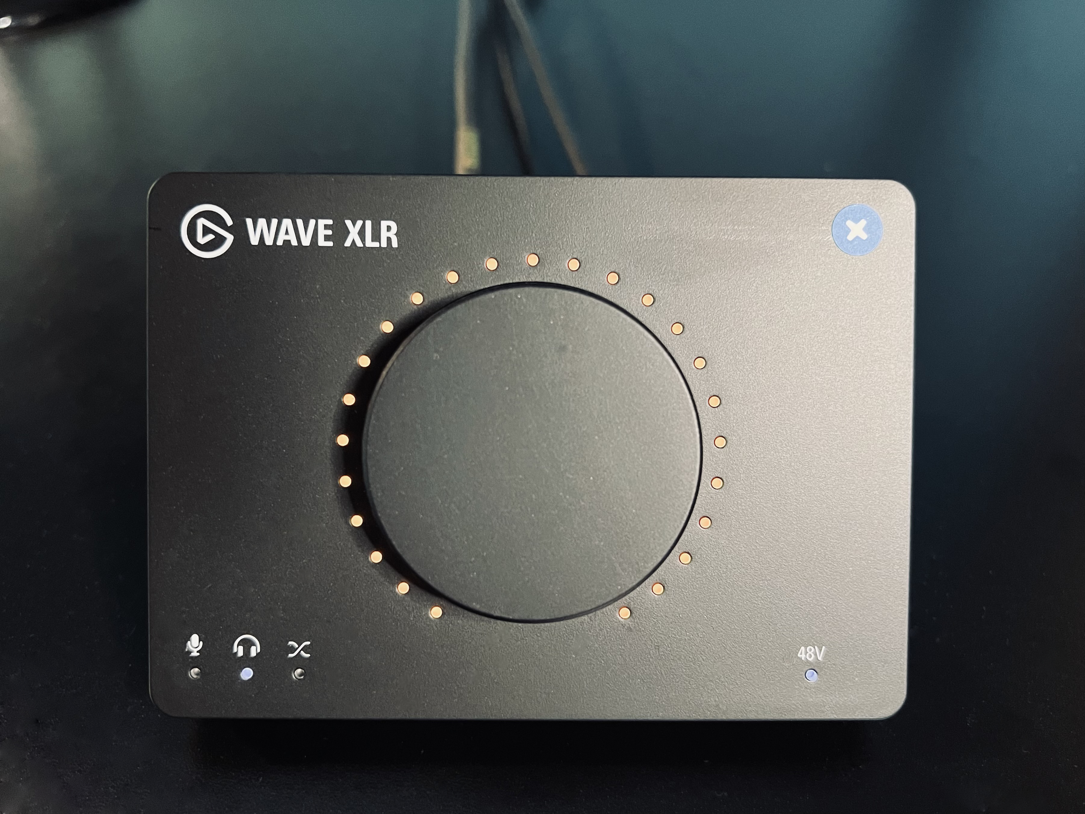
This session records my mic, which comes in through an Elgato Wave XLR interface, increases the volume, denoises, and ramps down the treble a little bit, because I have a nasally voice.
It also records my soundboard, which is provided courtesy of another Rogue Amoeba app called Farrago, and saves that to its own track.
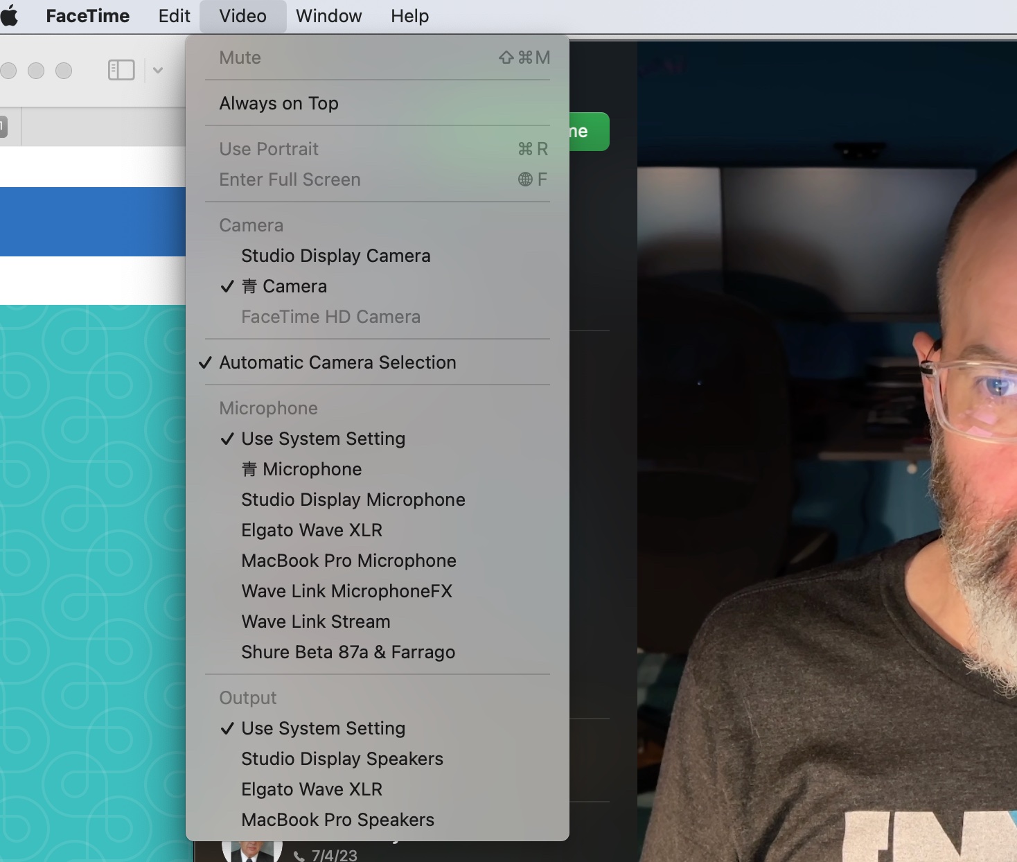
Finally, it records whatever VOIP app I’m using for the podcast as a backup recording of my co-host(s). Peter and I use FaceTime to talk to each other for Friends with Brews, unless our friend Adam Bell is on, and then we use Zoom.
The VOIP call recording is strictly a backup. We each record our own end locally for the best sound and I combine those tracks in my editor, a process I’ll describe in a separate post sometime soon.
Audio Hijack is very versatile in terms of output file format and quality, and also in terms of file naming.
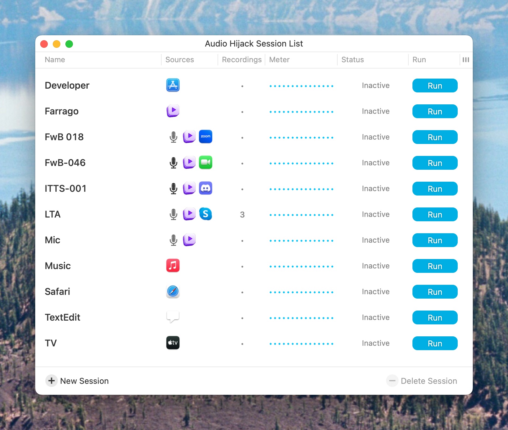
As I mentioned, you can save recording configurations as sessions. Here are all of my currently saved Audio Hijack sessions for recording various podcasts and Mac apps. Episode 18 of Friends with Brews wasn’t really the last time Adam was on the podcast and we used zoom (it was episode 39, I think) but apparently I forgot to rename that session. Anyway, you get the idea.
Farrago
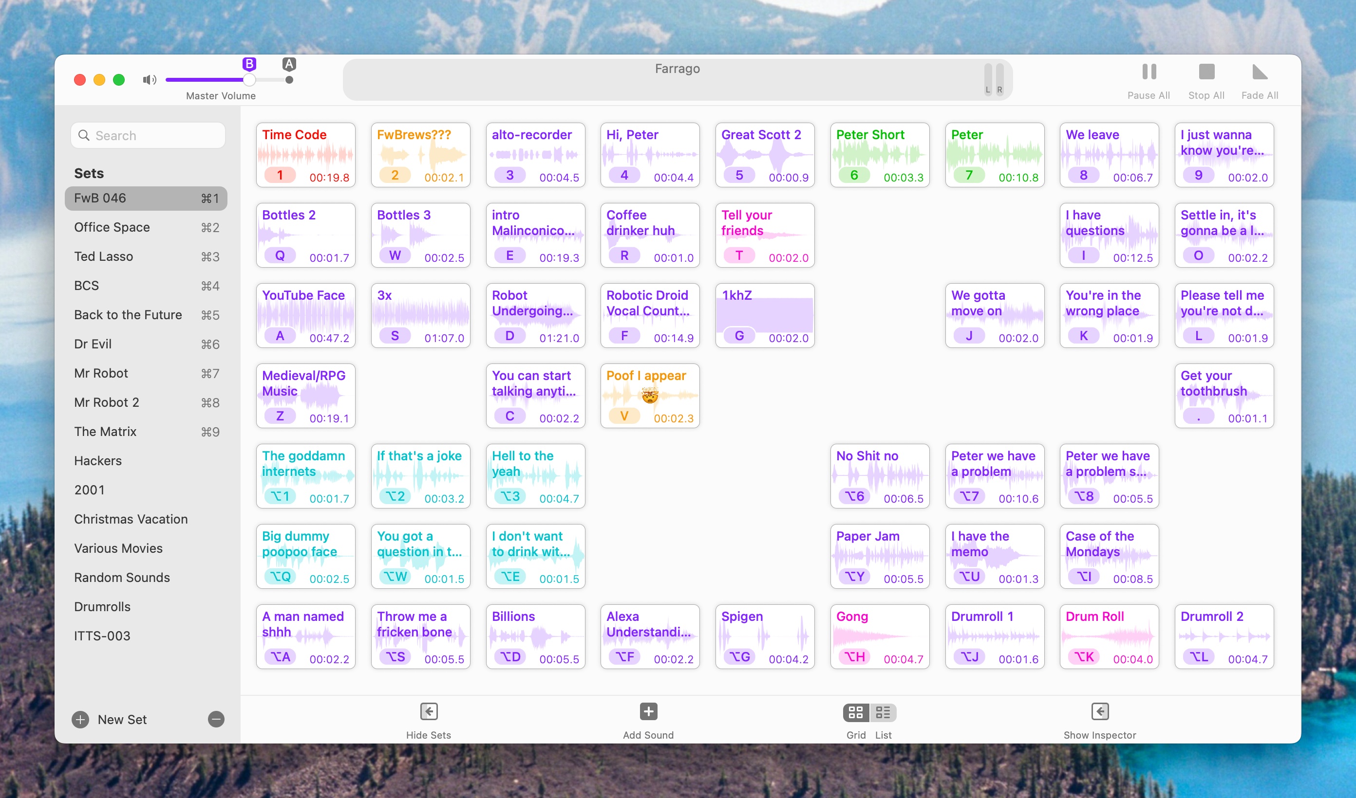
I mentioned Farrago earlier. Farrago is an amazing soundboard application that lets you store, perform minor edits on, and trigger audio sound clips – in other words, it’s a soundboard!
Farrago is how I play the “Friends? With BREWS?!” clip at the beginning of every podcast, as well as the “Hi, Peter!” and other clips that I like to annoy people with during various podcasts. I have a TON of Farrago sets with sounds from all kinds of stuff.
Vic Hudson and I used to do tv show related podcasts for BubbleSort TV, and those sound clips came in super handy. We’d usually set up sections of the podcast by playing clips from specific scenes, which really added to the shows. It also means they’re inserted live into the recordings (although we made sure they were on their own tracks for easier audio leveling and editing reasons) so they wouldn’t have to be edited in later, AND so the co-host could hear them and we’d both be on the same page about the conversation to follow.
By the way, if you guessed that I recorded every single one of those tv show and movie clips using Audio Hijack, you’re correct!
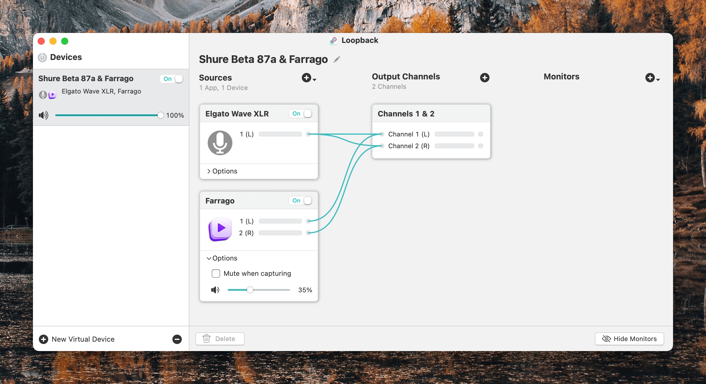
Loopback
“But Scott!” you say. “Just because you’re playing a sound clip in Farrago on your Mac doesn’t mean your cohosts can automatically hear them, does it?!?” Great question. The answer is no. No, it does not. Enter Loopback.
Because you’re such a doggone great guesser, maybe you surmised that Loopback is Yet. Another. App. By. Rogue Amoeba.
YES! IT IS! And it’s amazing, so back off! It’s not my fault they make all the best podcasting and audio routing and recording related software for the Mac!
Loopback does a lot of things, but simply put, it lets you combine audio sources into one or to pass audio from one application to another. The first use case is how my co-hosts can hear my soundboard – I have a Loopback device that combines my mic with Farrago. I can then set THAT as the input to my VOIP app of choice, such as FaceTime or Zoom or Skype, and then everyone on the other end(s) of the call can hear my soundboard coming from me exactly the same as they can hear me talking.
This Loopback device looks a lot like this – in fact, exactly like this:
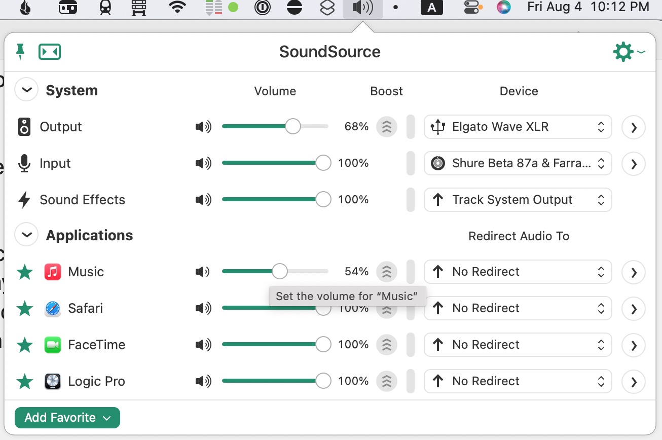
Usually, even though each app can have its own inputs and outputs separate from the system settings, I just set my system settings to the output I want (my Elgato Wave XLR, which my podcasting headphones are plugged into) and the input that I want (my Loopback input source that combines my mic and Farrago).
Then I set my VOIP app de jour to use system settings for input and output.
And, So
And THAT, my friends, is over 1000 words on software that I use to record the podcast. It’s not complete, because I have a few helper utilities that prepare the way, as John Siracusa might say, but I’ll save those for another post.
So topics you have to look forward to in this series in the future are helper utility apps that prepare the way for recording, apps I use during the editing process, what exactly my editing process actually entails, and finally, how I get all that published and ready for YOU to listen to, in the case of Friends with Brews especially.
You can bet on it. But maybe you shouldn’t. Just saying. Never bet unless the outcome is already certain. And then always only bet a dollar.
Footnotes
It can actually even record apps that don’t make noise, but that’s probably an exercise best reserved for the metaphysicians of the world. ↩
Thanks entirely to Tiffany White, I finally implemented something that’s been on my site to-do list for some time, but that I’ve never gotten around to actually doing until now: link posts.
You’ve seen link posts before, certainly so if you read a lot of Mac related blogs like Daring Fireball, SixColors, or MacStories. The idea is the title of the post links to an article on another site, and then you add some commentary and maybe quote part of the article in your post.
Tiffany created an issue on my site repo asking if I’d setup link post support in Astro yet. I had it on my to-do list, namely in my Obsidian kanban board for this site, but I hadn’t done it yet because I haven’t really wanted to link to too many external articles here. But Tiffany creating an issue for me gave me the motivation to figure out how I would do it.
Adding the Url Link
In order to add the URL that the post title should link to, I decided to add a front matter item called link:
1
---
2
title:"How to use Raycast and how it compares to Spotlight and Alfred"
3
description:Raycast compared to Spotlight and Alfred.
Because I’m using Astro Content Collections, I also needed to add this to my collection schema. Not all posts will have a link front matter item, so it needs to be optional.
src/content/config.ts
1
import{z,defineCollection}from"astro:content";
2
3
exportconstcollections={
4
posts:defineCollection({
5
schema:z.object({
6
title:z.string(),
7
description:z.string(),
8
link:z.string().optional(),
9
date:z.string().transform((str)=>newDate(str)),
10
keywords:z.string().array(),
11
}),
12
}),
13
};
Zod allows for optional entries, so links is defined as a z.string().optional().
The Astro Code for Link Post Titles
The rest of the work is done in a new component for creating the blog post title called PostTitle.astro.
I check for the existence of the link front matter value in two places: one for creating the href for the post title, and the other to decide whether or not to show the link icon next to the post title indicating that this is a link post.
If post.data.link exists, I use that as the href for the title link, otherwise I use the url of my blog post as the href so that my blog post links to itself as usual.
Now in my Post.astro component which creates the blog post layout, I call my PostTitle component instead of just creating the title in Post.astro itself.
Before implementing PostTitle to create link post titles when appropriate, I just created the title directly in Post.astro with the following:
1
<!-- old way of creating post title -->
2
<a
3
href={newURL(
4
path.join(config.get("posts.path"),post.slug),
5
config.get("url"),
6
)}
7
>
8
{titleCase(post.data.title)}
9
</a>
As you can see, it’s just a subset of what’s now in PostTitle.astro, namely just the portion that assumes the post title should just link back to the post itself. But you can see how easy it was to go from that to the new PostTitle component that can handle both link posts and regular posts.
Improvements
That’s it! There are still some improvements to be made. Besides just showing the link icon next to the title of a link post, I probably want to change the color of the title slightly and maybe change the post background color very subtly to indicate that it’s not just the usual site post.
I also plan to make quote sections a little more stylish by adding some nice quote marks around them to offset them just a little bit more than they already are.
I’m linking to a year-old article on The Verge because I just started using Raycast today. Prior to this, I was using Alfred. I was leery of Raycast because of the subscription model for pro features as well as concern over privacy issues, but it incorporates so much of what I was using other menubar apps for in addition to Alfred that it won me over in less than an hour of testing.
Typing Window into Raycast gives you a whole host of commands that let you manage the shape and size of the app you’re currently using. You can maximize it, set it to cover the left half of the screen, make it smaller, and more. There’s also a built-in notes app for jotting down quick thoughts into a floating window. There’s even a command built into Raycast that makes a shower of confetti appear on your screen.
This was a big one for me. I have tried several different window managers and JUST switched from Lasso to Moom yesterday before discovering today that I could customize Raycast’s window functions to do all this for me in a much nicer way.
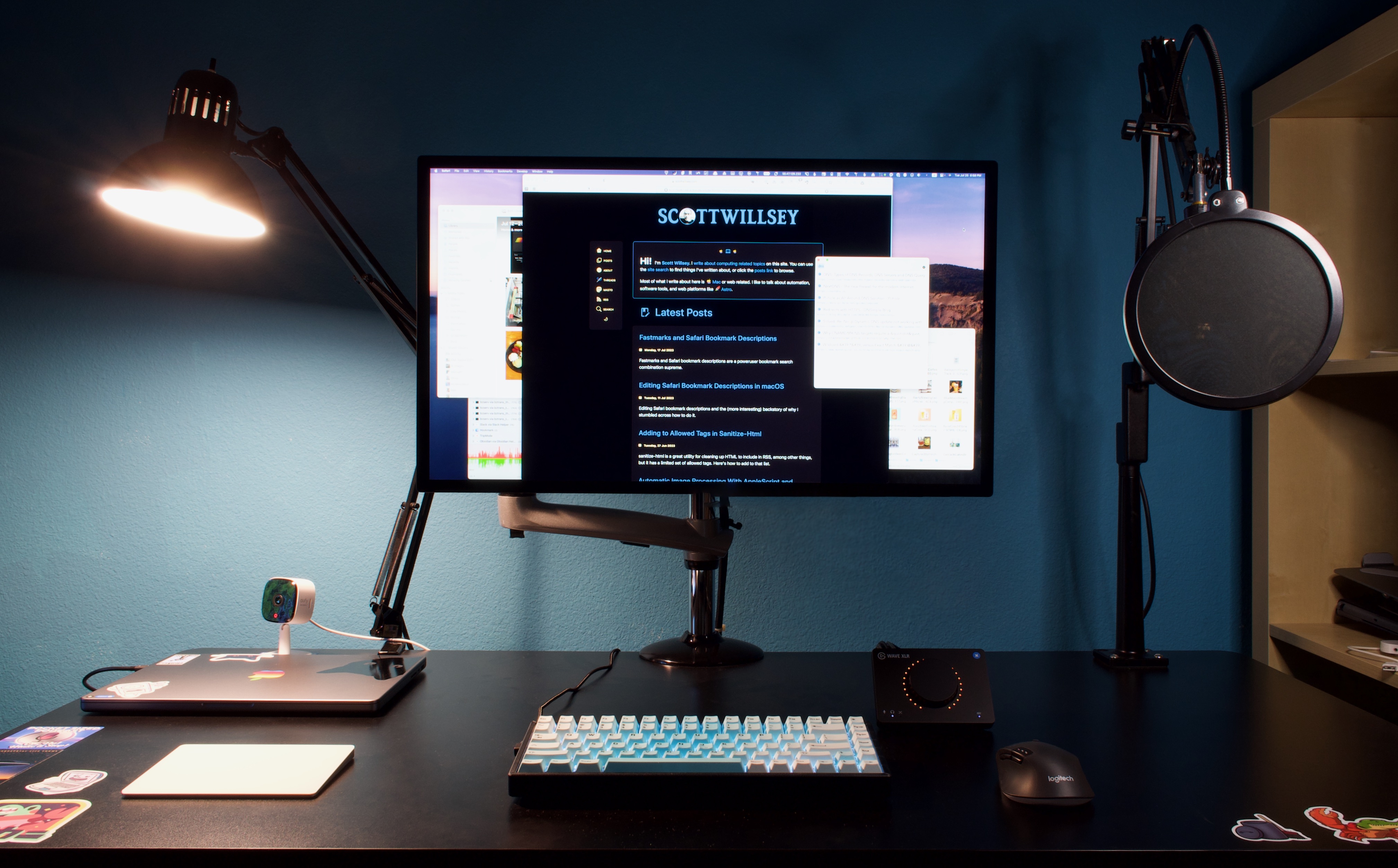
My friend Donnie Adams asked me on Mastodon if I’ve ever written anything about my podcasting setup and recording and editing workflow. The answer is… I don’t think so. Even if I did, whatever I wrote is out of date and not online anymore anyway. So in 2023, here’s my basic podcasting setup hardware.
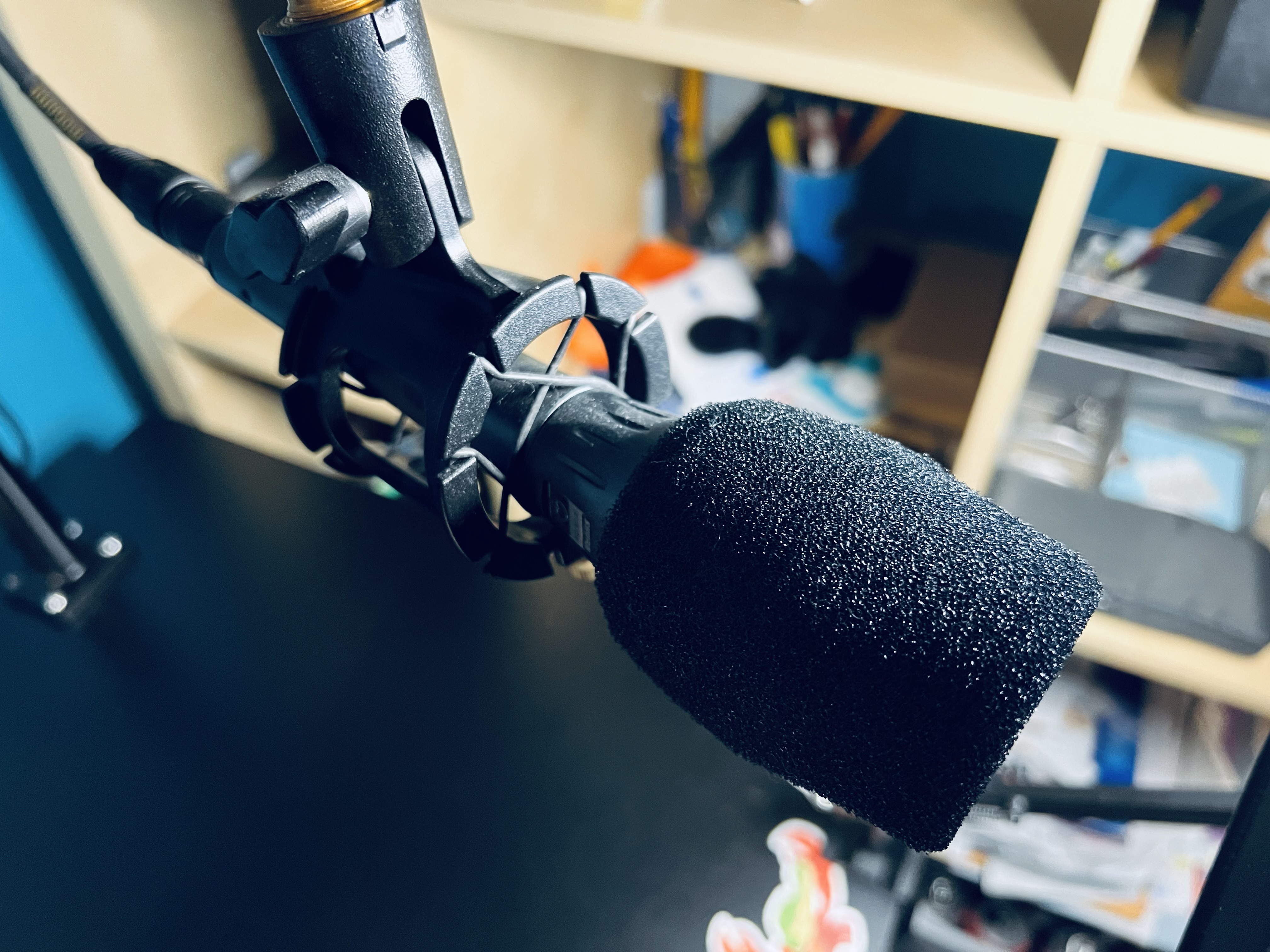
Mic
Mics are very subjective, and a mic that works well for one voice might not work well for others. In addition, the type of mic you get should also suit your recording environment. Many a relatively inexpensive condenser mic has been the go-to mic de jour for beginning podcasters, and condensers are not good for noisy environments. You need a quiet, non-echo-ey room for a condenser mic.
My mic is the Shure Beta 87A. I like the fact that it has the benefits of a condenser mic while also having good drop-off so that it doesn’t pick up every spec of dust hitting something somewhere in outer space.1
Personally I don’t recommend USB mics and I don’t recommend most of the mics marketed towards podcasters. Don’t get a Yeti. Don’t get a Snowball. Don’t get a Rode Podcaster or Procaster.2
Regardless of what mic you use, learn how it works in terms of proximity effect and positioning, use a pop filter and preferably a boom arm, and don’t bump it or move it while recording. Also find a way to mute the mic for when you need to clear your throat or make other noises. Depending on who’s doing your editing, you may find all that in the episode if you’re not careful.3
Mic Stand
The best stand for a mic is a boom arm, which keeps the mic off the desk, isolates it from bumps and vibrations, and makes it easy to position where you need it to get the best sound for your recording.
I think I’m currently using an Innogear mic stand. I’m not sure because I ordered a couple around the same time, one for me and one for my daughter. This is the nicer looking of the two in my order history, so that’s the one I’ll point out.
In the past I’ve had some bigger, heavier duty ones, but anything that can hold a 3 lbs or so will be fine.
Audio Interface
If you’re using an XLR mic and not a USB one, which is my recommendation, you’ll need an audio interface. Believe it or not, for podcasting or streaming, I’m not going to recommend some traditional interface with lots of knobs and features. I’m recommending the relatively inexpensive Elgato Wave XLR.
With a capacitive touch-to-mute function, plenty of gain, software settings including clipping prevention and other effects, this is a great value for the price. Previously I used a Tascam US-2x2, and I can’t be happier that I ditched it for the Elgato. It’s just nicer to use for podcasting and has plenty of clean gain.
If you do in-person recording with a co-host, you may need an interface with multiple mic inputs. If not, the Elgato Wave XLR is perfect for podcasting.
Computer
My computer is a 14” 2021 MacBook Pro M1 Pro with 16 GB of RAM, a 1TB SSD, 10 core CPU, and 16 core GPU. Those memory, SSD, and CPU/GPU specs are the absolute minimum I would ever go with, but for the money this is by far the most amazing computer I’ve ever owned. It eats giant number-crunching chores for breakfast and never gets hot. The only time I can warm it up even remotely is when generating transcripts of podcast episodes with MacWhisper.
When I have 5 or 6 tracks of audio in Logic Pro, all split up with silences stripped, it can get really slow to respond to selections and movements, especially for longer episodes. I attribute this to the 16GB of RAM. Previously I had 32GB in my iMac, but that was because I could add and remove RAM with ease. That’s obviously not the case with the MacBook Pro, so go for as much as you can afford.
I absolutely love the 14” form factor, by the way. I was tempted to go larger but this Mac is the nicest combination of size and utility I’ve ever had in a laptop. You get very good edge to edge use of the screen, it’s high resolution, and it has the most beautiful monitor Apple makes, in my opinion. It’s simply lovely to use for hours on end.
Before the current MacBook Pro, I had a 5k 27” iMac and this display is very much like that one except it has more usable area and it doesn’t have the huge chin and the giant foot hanging off it. I had it mounted on the same VESA arm the Studio Display is on, but the Studio Display is lighter and doesn’t jiggle when I type like the iMac wanted to do sometimes.
Look, I don’t know why PCs continue to have such horrendous monitors (especially the built-in laptop screens) and trick people into thinking 4k is amazing, but the 5k Apple Studio Display quality is the minimum I’ll accept for an external monitor.
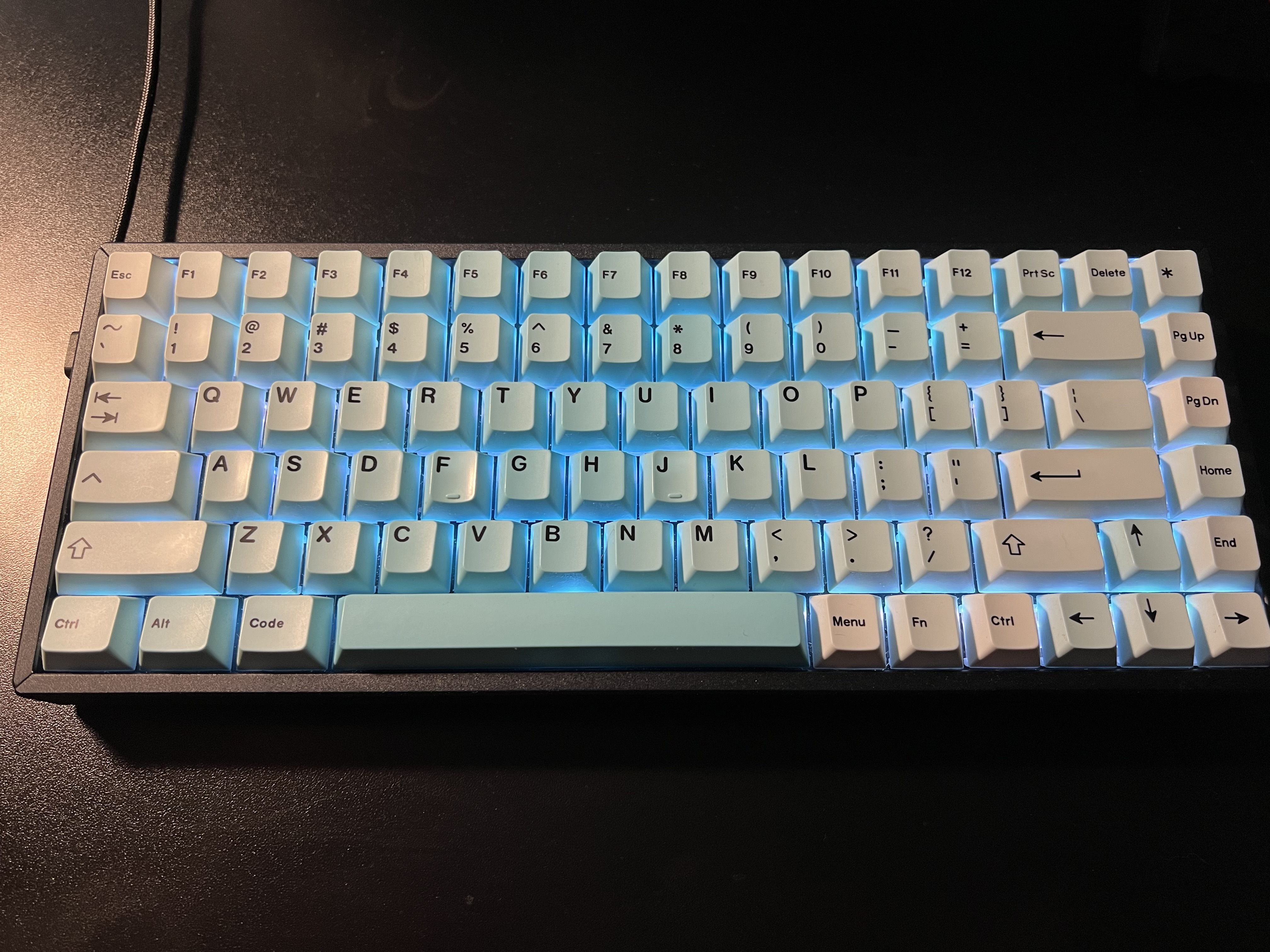
Keyboard
I love my clacky keyboard. It’s a Keychron K2 wireless (but I run it wired) with an Artifact Bloom Series Ocean Wave Keycap Set from Drop.com. I have some other custom keycaps but I love the blue of these, especially with the keyboard set to a light blue backlight.
Mouse and Trackpad
It’s really important to stress this – you don’t have to use the horrible Apple mouse. Yes, yes, I know, and I tried to like it too. But it’s ergonomically disastrous and it’s functionally stupid.
In order to keep the ability to use macOS gestures, I also have an Apple Magic Trackpad in white, and I love that too.
The mouse sits to the right of the keyboard and the trackpad to the left.
USB/Thunderbolt Hub
Docking the Mac and having it connect to all my accessories is simple. I have the CalDigit Thunderbolt 4 Element Hub. It’s got all the bandwidth needed for the Apple Studio Display with 4 Thunderbolt 4/USB4 ports and 4 USB-A ports. The same single connector that connects all my devices to my MacBook Pro also powers the computer so I don’t even have to bust out the MagSafe.
For the price, I think it’s one of the best out there. You could get a TS4 if you really want to go nuts, but I couldn’t quite justify it.
Standing Desk
My standing desk is a FLEXISPOT 55 x 28 Inches Standing Desk with electrical height adjustment motor. It’s black, it has lots of space, and it’s clean underneath which allows easy mounting of hub mounts and cable management items. I do use it in standing configuration quite often, and almost always while podcasting.
That’s All, Folks
That’s pretty much it for my hardware. Next time I’ll get into software, and then later we can talk about workflows, editing processes, and other things that will help make your podcast excellent.
Footnotes
That would be quite a feat since sound doesn’t travel in space. ↩
The Rode Podcaster and Procaster look tempting, but they have really muddy midrange. For voices like mine, they’re the absolute worst mic for way more money than is reasonable. ↩
If YOU are the editor, there’s no excuse for not editing that out. Anything that bothers you will definitely bother others, and a lot of things that don’t bother you will bother others. ↩