You may have noticed, as you’ve wandered the site, that I’m a bit of a Raycast fan. You may, therefore, imagine that I use the Raycast window management tools to move and arrange windows . And it’s true. Well, it was true. Then Many Tricks released Moom 4, the update to their popular Moom window manager app.
Historically, I’m a window manager serial monogamist. Like any other type of utility, there’s a wide range of approaches to this task in the available third-party apps. Some let you draw your window size and location on the screen, some have keyboard shortcuts for instantly popping things into specific locations, some let you save multi-window layouts, and many various combinations of these things. Raycast does two of these things. Moom does all of these things.
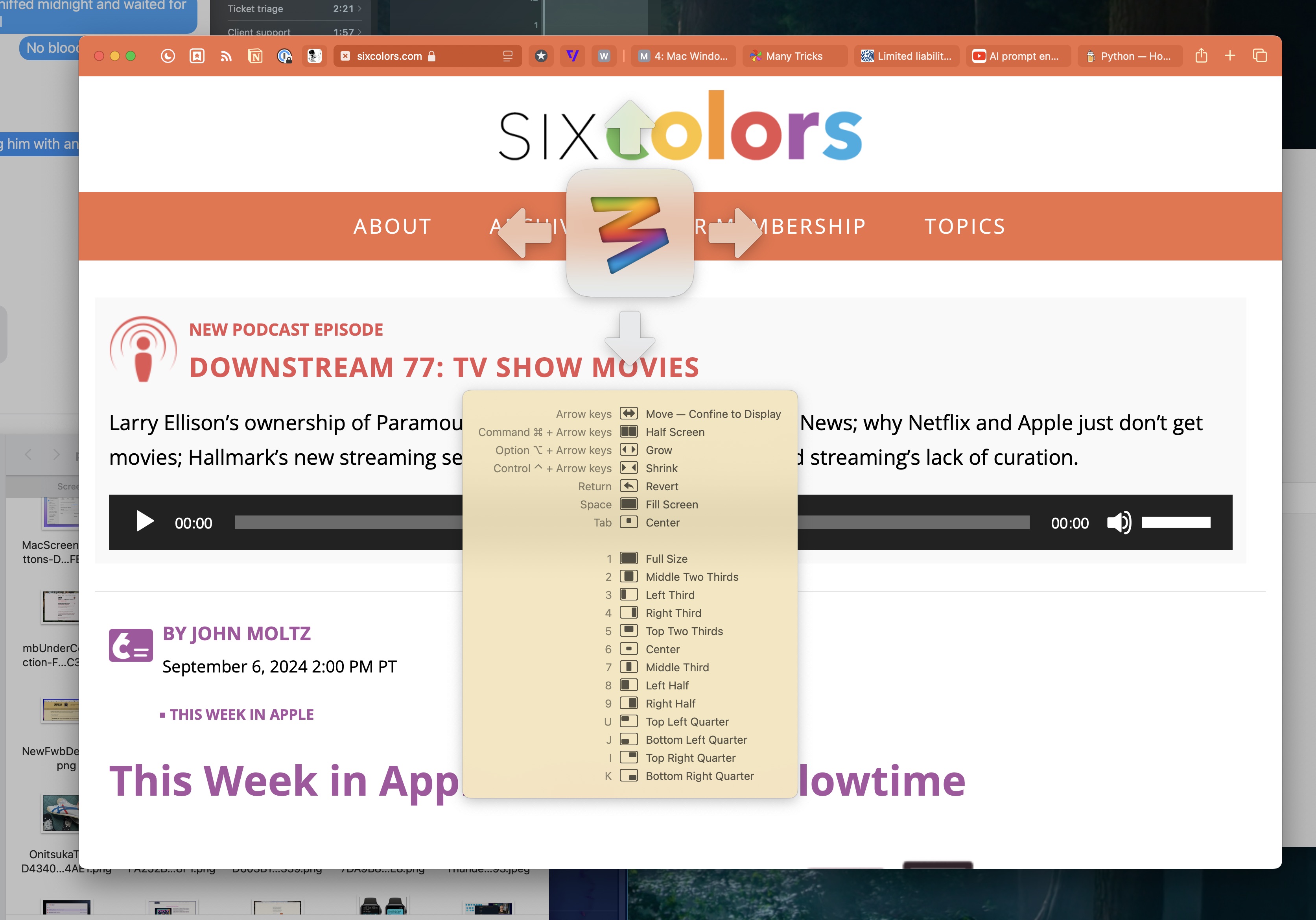
At first glance, you might think Moom is a slower way to manage windows. One of its signature controls is the Keyboard Controller, which you activate via a hotkey (in my case ^⌥⌘Space). Once it’s onscreen, you can use the keys indicated on its cheat sheet to move and/or resize your focused window per the options available.
You can also customize the options that appear at the top of that list, and the bottom section will always show any actions you’ve assigned single-key hotkeys for. For example, based on my arrangement above, pop open the Keyboard Controller with ^⌥⌘Space and then hit 3 and you’ll move the foreground window to the left third size of the screen.
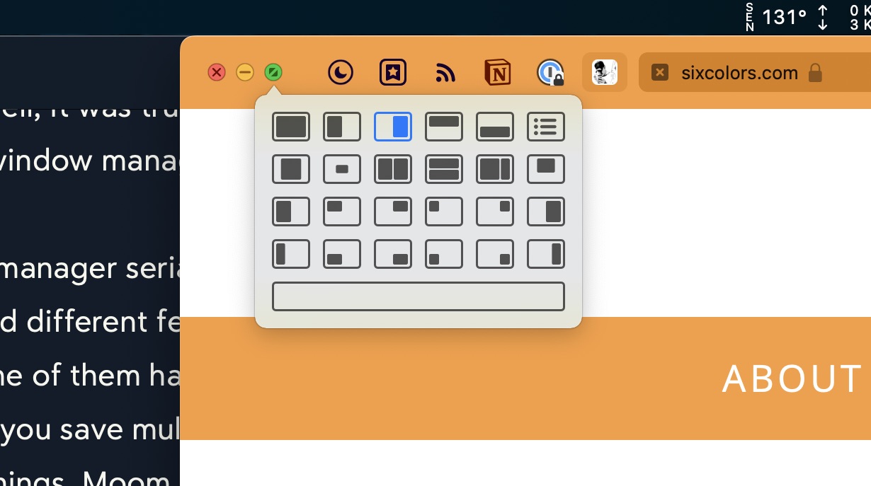
Another great way that Moom allows for window control is something I think may be unique to it – a palette of window management buttons that shows up when you hover over one of the stoplight buttons in the window’s top left corner. You can specify in Moom’s settings which of the three buttons to hover over to get the palette, as well as which window commands are available.
These are all great and dandy, but Moom has freeform sizing and moving options too. You can configure Moom hotkeys that allow you to glide the cursor over a window to move it or to resize it. These options sure beat trying to find an empty spot to click on a title bar filled with tabs, or to find the little grab handles at the edge of the window. Apple really hates onscreen controls and the native resizing controls can be slow to manipulate.
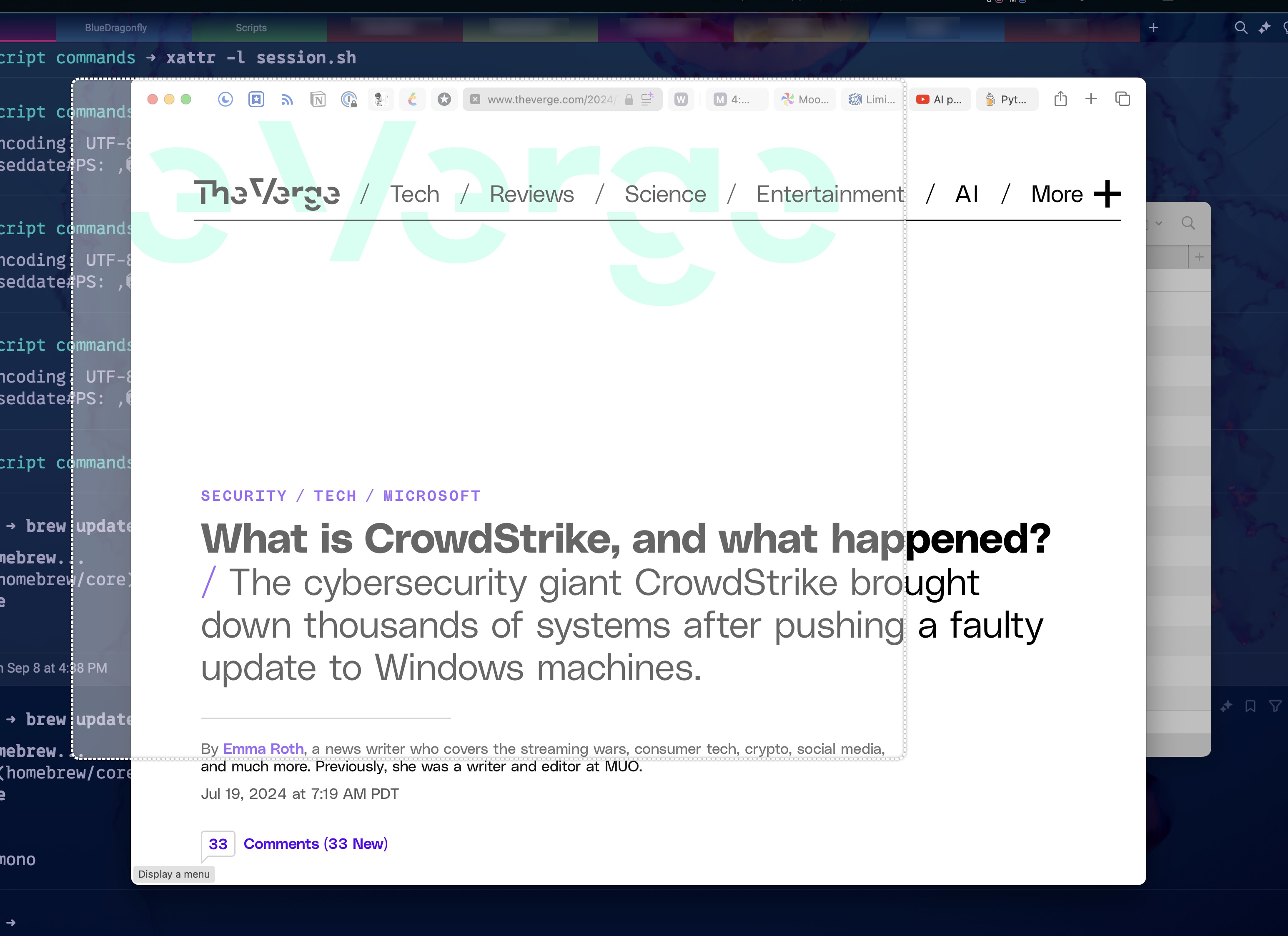
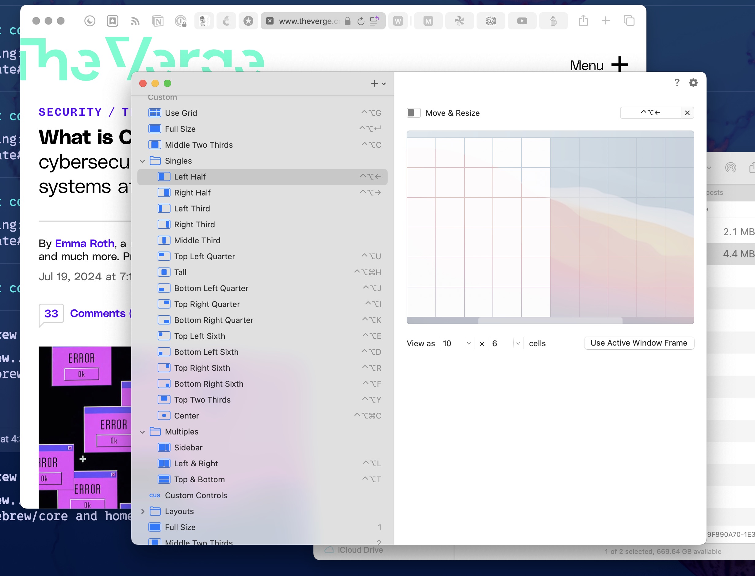
And then there’s the grand champion of all freeform resizing, the Moom grid. It allows you to quickly draw out a window size to fit anywhere on a grid. You can set the number of rows and columns in the grid, which gives you quite a bit of range in window size granularity.
Here’s what it looks like to drag out the shape you want to resize your window to on the grid:
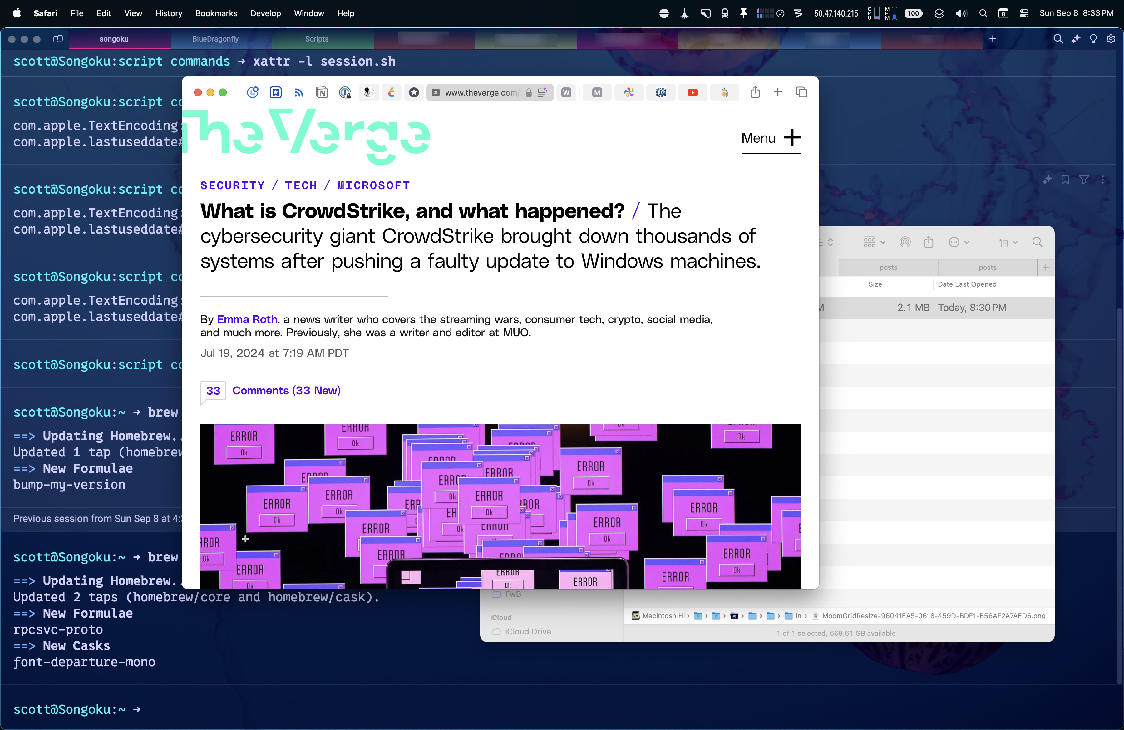
And here’s the resulting resized Safari window.
Despite all these great window management options, sometimes good old fashioned hotkey controlled instant resizing and moving is still the best way to quickly tile windows. Moom allows for that. You can create custom window sizes and locations and assign hotkeys to them. You can also make window layouts with multiple windows that can be applied instantly. Window layouts can be set to apply to specific apps only, or to whatever windows are handy when you apply the layout.
You can see some of my window settings complete with hotkeys in my Moom settings window below.
And in a bit of good news for me, Moom commands can be activated via AppleScript. Thanks to this, I modified my Sessions Raycast script command to accommodate setting window layouts using Moom instead of using Raycast’s window management tools. I’ll show you that in a future post.
I do like the window management commands in Raycast, and there’s always an argument for having one less application running in memory. But Moom is more versatile (and frankly more fun to use), and Raycast lets me disable its window management, and so Moom 4 seems like a no-brainer to me.
This is not a normal topic for me on this site, but since I blather on about technology nonstop and make my living thanks to it, it’s important to highlight the very real downsides it brings. For example, the current push towards electrification of everything is ramping the planet’s need for copper, and copper means exploitation, death, and environmental disaster to people in many parts of the world.
If this doesn’t sound very interesting, the human element of the story is intriguing. Just the part about Robert “Toxic Bob” Friedland illustrates how wild this story really is:
By the early 1980s Friedland had teamed up with some Vancouver-based financiers and moved into the world of mining, hustling for small gold outfits. He made headlines in 1992 when a Colorado gold mine he had previously overseen (as its parent company’s CEO) leaked toxic heavy metals into a nearby watershed, earning him the nickname “Toxic Bob.” In the meantime he had also discovered a major gold deposit in Alaska and an even bigger nickel deposit in Canada, which he later sold for more than $3 billion. Friedland has been a major player in the industry ever since. (He also has a sideline in movies, helping to produce Crazy Rich Asians and other films. Another fun Friedland fact: This summer, he bought a scenic California estate from Ellen DeGeneres for a trifling $96 million.)
Interestingly, at one point this guy ran the commune Steve Jobs lived on in Oregon in the ’70’s. Steve eventually left, disillusioned with what he saw as Toxic Bob’s materialism. Not to put too fine a point on it, but Toxic Bob was far from the only hippy idealist who transformed into an uber capitalist, convincing themselves in the process that it was for the good of humanity and not just their own ballooning bank accounts.
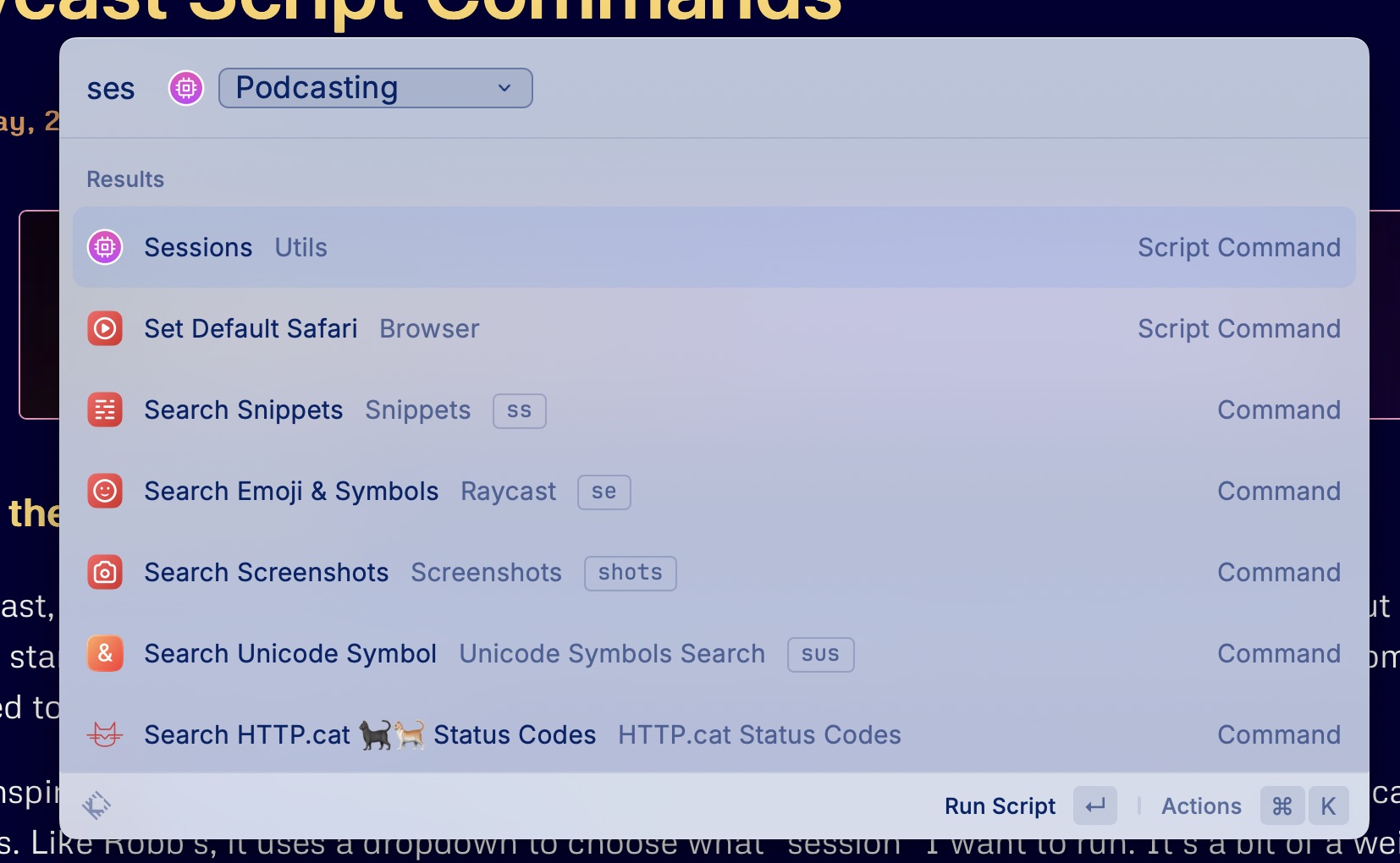
I took inspiration from Robb Knight’s App Mode Raycast script command and created one called Sessions. Like Robb’s, it uses a dropdown to choose what “session” I want to run. It’s a bit of a weird name, I guess, because I have one called “Stop Podcasting”, which doesn’t really seem like a session, but more like a lack of a session.
When I run the Sessions script command, I currently have two choices: Podcasting or Stop Podcasting.
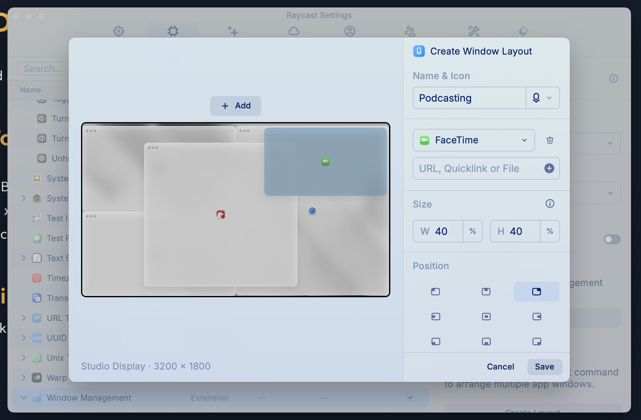
This is what the Raycast Window Layout Command looks like. The apps are Audio Hijack (top left), Farrago (bottom left), Bear (center), FaceTime (top right), and Safari (right half).
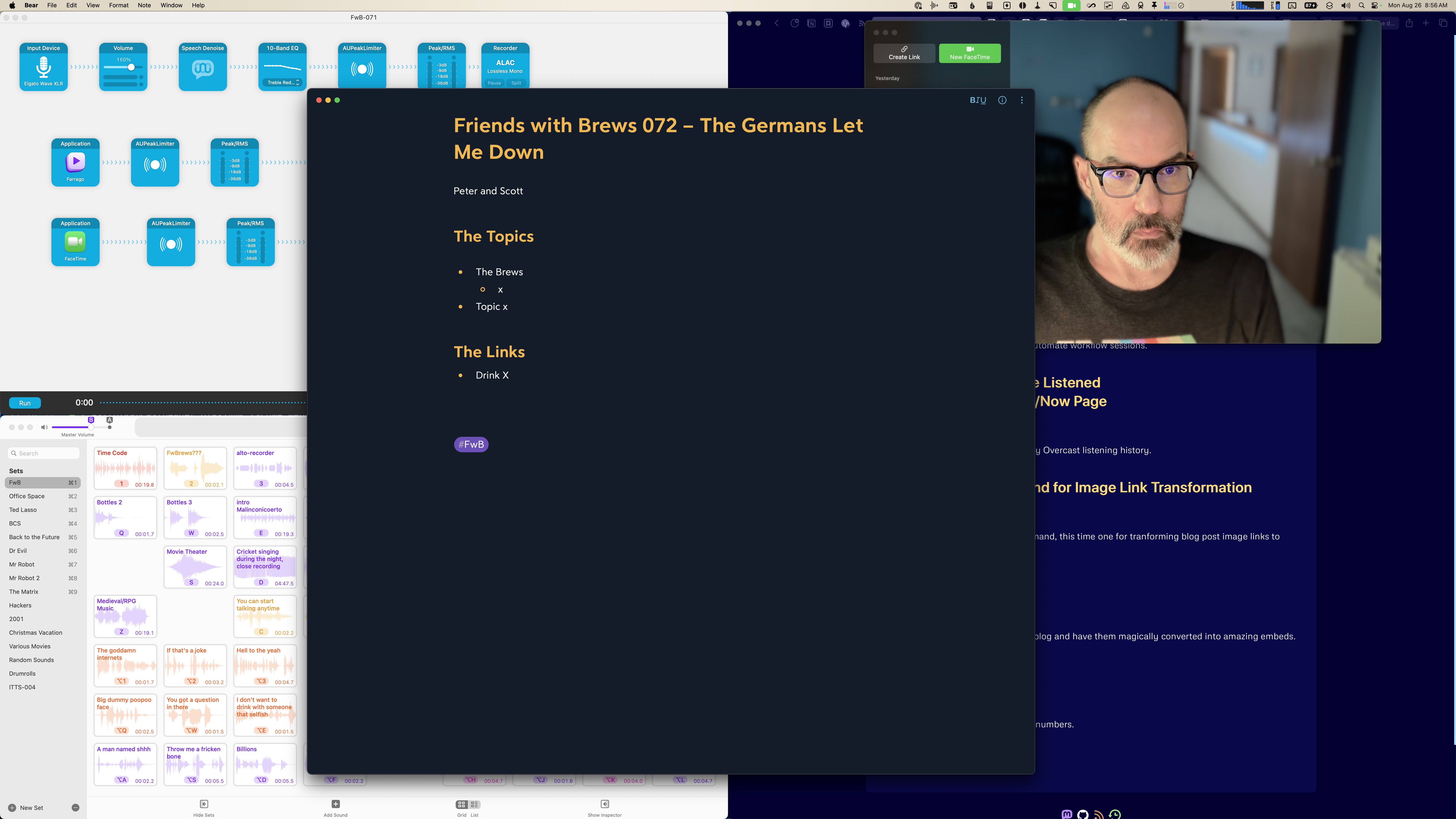
The script command also sets the audio output to my Elgato Wave XLR, which has my podcasting headphones plugged into it, and sets the audio input to a Loopback audio device that combines my podcasting mic and Farrago soundboard into one input device. Finally, it starts an Amphetamine session, which keeps the display from sleeping if I don’t touch the mouse or keyboard for awhile while podcasting, and toggles my desk lamps on using a Shortcuts shortcut.
Here’s what it looks like on my Apple Studio Display after running the Sessions script command:
The Stop Podcasting option sets the audio output and input to my Studio Display’s speakers and mic, closes Audio Hijack, Farrago, Bear, and FaceTime, centers Safari on the screen again, and stops the Amphetamine session. It also toggles the desk lamps.
osascript-e'tell application "Amphetamine" to end session'
39
exit
40
fi
Raycast script commands can be written in bash script, Apple Script, Swift, Python, Ruby, or JavaScript (Node.js). This one is a bash script, and the Podcasting option very simply uses bash commands to run a bunch of other utilities: SwitchAudioSource, to set audio output and input, a Raycast custom window management command to open my podcast session apps and place their windows per a custom layout, a shortcut to toggle my desk lamps, and finally an inline Apple Script (osascript) to start an Amphetamine app session so the display can’t sleep.
The Stop Podcasting option runs similar commands plus several Apple Script calls to close the apps that were opened by the Raycast custom window layout in the Podcasting option.
Script commands are both a great reason to use Raycast and a great tool for automation if you already do use Raycast.
As you know, I have a /now page that I update on occasion to let anyone who cares know what kinds of things I’m watching, reading, and eating at some random point in my life. So far, it’s been a very manual update process because I haven’t had time to start automating any of it until now.
I’ve taken inspiration from Robb Knight’s video Using Eleventy to Gobble Up Everything I Do Online, particularly for the Overcast part of the automation process. I watched enough of the video to see Robb mention the extended version of the Overcast OPML file you can download from your Overcast account that includes episode history and decided to write a script that would automate downloading and parsing it for me.
Enter overcast-history, my python script for checking to see when I last downloaded the OPML file, getting a new copy if needed, and parsing it if a new copy was downloaded (or if I passed it the -f flag to force it to parse the local OPML file anyway).
You might be thinking “hold on here, Robb also wrote a Python script, don’t act like you’re inventing the wheel!”, and that’s a fair point. I actually thought he was manually downloading his OPML file until I finished the video today (after writing my own Python script). Now I realize he’s at a high level of automation on this task.
Another key difference between Robb’s approach and mine so far, besides the fact that our Python scripts are completely different1, is that I believe he creates a JSON file with it and consumes that as part of his site build process to completely automatically update his listen history.
In contrast to Robb, I’m not very automated with my /now page yet. This python script is part of a collection of tools for quickly automating certain aspects of updating my site, which I build locally and ftp to my server. I haven’t decided yet how much I want to automate the build process again.
Therefore, with the understanding that this is ONLY an example of how to grab and parse information off the internet, and with the understanding that my Python coding skills are shaky at best, here’s my approach to getting recently listened to podcast episodes from my Overcast history into a Markdown list.
overcast-history
You’ll see immediately that I’m a terrible Python programmer and that I have no idea what Python best practices are yet. I have 6 files to do this one simple task:
constants.py (purpose of which should be self-evident)
session.py (used to keep the overcast login active across modules)
main.py (entry point script that gets run directly to make it all happen)
oc_login.py (logs in to my Overcast account)
oc_history.py (handles downloading the extended OPML file from my Overcast account)
oc_opml_parse.py (parses the OPML file and gives me the recent list of podcast episodes I want)
Right away I’ve made you cry. Yes, I have my Overcast account password in my constants file. THIS WILL BE REMEDIED SOON! I plan to use keyring to fix this issue. Maybe. Probably.
session.py
1
import requests
2
3
session = requests.Session()
This one creates a requests session object which can then be imported into any other modules that need to use requests to grab stuff. That’s it. There’s probably a way better way to do this that I should know about.
main.py
1
#!/Users/scott/Scripts/python/venv/bin/python
2
import argparse
3
import os
4
from datetime import datetime, timedelta
5
import constants as const
6
from oc_history import load_oc_history
7
from oc_opml_parse import oc_opml_parse
8
9
p = argparse.ArgumentParser()
10
p.add_argument('-f','--force',action='store_true',help='Force local OPML file parsing')
print(f'OPML file is older than {const.OPML_AGE_LIMIT_DAYS} days or doesn\'t exist. Downloading new data...')
32
history_was_loaded =load_oc_history()
33
else:
34
print(f'OPML file is less than {const.OPML_AGE_LIMIT_DAYS} days old. Skipping download.')
35
36
if history_was_loaded or args.force:
37
print('Parsing OPML file...')
38
ifoc_opml_parse():
39
print('Done!')
40
else:
41
print('You have to update your podcast list manually, dude.')
42
else:
43
print('No new Overcast history generated.')
44
45
46
47
if__name__=="__main__":
48
main()
I run main.py as the script entry point and it gets all the work going. It checks to see if the date of my copy of the OPML file is older than the value in the OPML_AGE_LIMIT_DAYS constant and redownloads it if so, using the load_oc_history() function from oc_history.py.
If a new OPML file was downloaded OR I ran main.py with the -f flag, then it parses the OPML file by running the oc_opml_parse() function in oc_opml_parse.py.
oc_login.py
1
import os
2
import constants as const
3
4
from session import session
5
6
defoc_login():
7
ifoc_test_login():
8
returnTrue
9
else:
10
returnFalse
11
12
defoc_enter_login():
13
print('Attempting login')
14
r = session.post(const.LOGIN_URL,data={'email': const.EMAIL,'password': const.PASSWORD})
15
print(f"Response {r.status_code}")
16
if r.status_code== const.SUCCESS:
17
print("Successfully logged in")
18
returnTrue
19
else:
20
print("Failed login attempt")
21
returnFalse
22
23
defoc_test_login():
24
print('Testing login status')
25
r = session.get(const.ACCOUNT_URL)
26
27
if const.ACCOUNT_PATHin r.url:
28
print('Already logged in')
29
returnTrue
30
elif const.LOGIN_PATHin r.url:
31
print('Login required')
32
ifoc_enter_login():
33
returnTrue
34
else:
35
print(f"I have no idea what happened\n{r.url}")
36
37
returnFalse
Right now this doesn’t make sense, but if I actually store auth tokens somewhere later, maybe it will. Right now it always checks to see if I’m logged in or not by checking to see if I stayed on the /account page or got bounced back to the /login page. If I got bounced back, it logs me in.
The reason it doesn’t make sense is I don’t persist any login tokens across script runs, so if I need to download an OPML file, it’s always going to need to log into my Overcast account. I may just keep that workflow and simplify this script to not even check instead, and just admit it’s going login to the account every time.
oc_history.py
1
import os
2
import constants as const
3
from session import session
4
from oc_login import oc_login
5
6
defload_oc_history():
7
ifnotoc_login():
8
print("Couldn't log in to Overcast.fm account!")
9
returnFalse
10
11
print("Loading history...")
12
r = session.get(const.OPML_LINK)
13
print(f"Response {r.status_code}")
14
15
match r.status_code:
16
case const.SUCCESS:
17
print('OPML file downloaded')
18
file_path ='overcast_history.opml'
19
try:
20
withopen(file_path,'w',encoding='utf-8')asfile:
21
file.write(r.text)
22
print(f'OPML file saved to {os.path.abspath(file_path)}')
23
returnTrue
24
exceptIOErroras e:
25
print(f'Error saving OPML file: {e}')
26
case const.TOO_MANY_REQUESTS:
27
print(r.headers)
28
print(f'Too many requests - Retry-After = {r.headers.get('Retry-After')}')
29
case _:
30
print(f'Unexpected status code: {r.status_code}')
31
32
returnFalse
This is pretty simple. I download the OPML file and it either downloads ok or it doesn’t. It’s funny that I have the file name hardcoded here but I use constants for everything else. I’ll have to fix that.
oc_opml_parse.py
1
import pyperclip
2
import xml.etree.ElementTreeasET
3
import constants as const
4
from datetime import datetime, timezone, timedelta
5
6
deffind_podcast_name(root,episode_id):
7
for podcast in root.findall(".//outline[@type='rss']"):
8
for ep in podcast.findall("outline[@type='podcast-episode']"):
This is the longest one and probably the one where my meager Pythoning probably should embarrass me the most. This parses the OPML file as XML and grabs information about any podcast episodes newer than a certain date (hint: the value of OPML_AGE_LIMIT_DAYS plus 1 day) and then sorts them by the userUpdatedDate value from that episode’s data. After that, it’s just creating a Markdown list of the episodes that match the date and listened to criteria, and copying that list to the clipboard using pyperclip.
I have a Raycast Script Command I can run this from, but obviously in the future it would be better to integrate it more into the site build process itself.
I assume you’re a Python genius compared to me, so please let me know if you have any improvement suggestions beyond the ones I’ve already mentioned.
Footnotes
I haven’t looked at his yet, but I assume they are different since I assume he’s a much better Python programmer than I am! ↩
One of my blogging workflow chores is to make sure my image links are correct for where images (both full-sized and optimized versions) are stored in my Astro project. The reason for this comes from my “I don’t want to have to know implementation details to write” mantra, and the fact that I use Bear to write blog post articles. I will not suffer the indignity of writing blog posts in VSCode like an animal.1
Bear is nice for inserting images into articles – just drag and drop. But Bear also then makes the image relative to the article itself in terms of image file path, like this:
This means when I do transfer my post to VSCode to create the compile-ready blog post for Astro, the images are broken. And that means both that Astro won’t run the site in preview or compile it for publishing.
You may think that something similar to my remark plugin that transforms my social media links would be the answer, but that doesn’t work – the broken image links for image asset imports cause Astro errors way before remark can get to it. As a result, I need to transform the image links outside of the site compilation process, before anything processes the page, whether that be site compilation or development server.
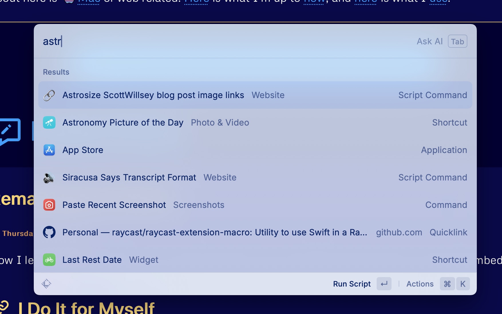
Enter yet another Raycast Script Command. I call this one Astrosize ScottWillsey blog post image links.2
It’s written in JavaScript, which means Raycast will run it with Node, and it looks like this:
astrosize-scottwillsey-blog-post-image-links.js
1
#!/usr/bin/env node
2
3
// Required parameters:
4
// @raycast.schemaVersion 1
5
// @raycast.title Astrosize ScottWillsey blog post image links
6
// @raycast.mode fullOutput
7
8
// Optional parameters:
9
// @raycast.icon
10
// @raycast.packageName Website
11
12
// Documentation:
13
// @raycast.description Convert blog post image and media links for ScottWillsey.com posts from Bear local links to correct Astro asset image links
I had to replace actual node fs and path calls in the code block because my server’s modsecurity really hates them, and I haven’t figured out how to work around that yet. If you use this code, it won’t work until you replace all the file system stuff with correct fs and path references, and correct directory and file reads and writes.
Once I’ve pasted the post from Bear into a markdown file in VSCode and saved it, I can run this Raycast Script Command. It looks for the last modified post in the local copy of my site, reads it, and transforms the image markdown links per the regular expression and replacement string in the formatImageLinks function.
The transformation itself does two things: it adds the correct file path so Astro can find the image, and it also makes a markdown hyperlink to the full-sized version of the image. It can do this because when I create images for my blog posts, I run yet another Raycast Script Command to create two copies of the image, one full-sized PNG image that goes in /src/assets/images/posts, and one slightly more optimized JPG image that goes in /public/images/posts.
The PNG image that goes in assets is imported and optimized by Astro’s Image Service API. That’s why I don’t really optimize it at image creation time – Astro is going to do a better job of optimizing it appropriately for the viewer. It is the image that gets displayed in the blog post. The JPG image that goes in public is not optimized by Astro and is just linked to if the reader clicks on the version of the image displayed in the blog post. Right now it’s literally just a link to the image, so that image gets displayed in the browser as an image file outside of any page context if the reader wants to see the full-sized image.
The result of Astrosize ScottWillsey blog post image links Script Command is that the link goes from this:
[](/images/posts/AstrosizeBlogImage-187290FD-ED76-4674-ABE4-AD411F3778BE.jpg)
As you can see, the end markdown result is a markdown image link to the image in assets which gets displayed in the blog post, surrounded by a markdown URL link which links to the full-sized image in public.3
The nice thing is since my Script Command looks for the last updated blog post to modify, all I have to do is paste and save in VSCode, and then run my Script Command. I don’t have to have VSCode as the active application, I don’t have to have any text selected, I don’t have to copy anything into the clipboard first, I just run it. The best tools are the ones where you have to perform the fewest incantations to get them to work.
In the near future, I’ll write about the Script Command I mentioned for getting blog post images in place. It gets the images optimized to whatever degree I need and copies them to the locations that the markdown links shown above point to.
One of the cool things about Astro is how it supports Markdown using remark. This means it also supports remark plugins, and THAT means you can write your own custom remark plugins to modify the markdown in your posts however you like.
Astro’s documentation has many examples of modifying front matter with remark. Actually modifying things in the markdown content itself is a slightly different matter, but it’s still pretty simple, all things considered. Astro has a recipes and guides section on their Community Educational Content page (basically links to external articles), and in that recipes and guides section is a section on Markdown, with a link to this example:
I don’t care about runts because I’m neither a pig farmer nor a person who notices them on my own blog. But I’m glad John cares, because he basically outlined a strategy for looking for and transforming specific things in my blog posts.
Social Links in Blog Posts
If you read a lot of blogs, you’ll notice that most times you see social media or YouTube videos linked to, they’re basically a fancy little mini-view of the content called an embed – the content is actually embedded into the post rather than just being a link.
Naturally I want that look for any social media or YouTube links I post here, but one constant with me is that I never like to know implementation details to write a post. That includes things like embedding links from YouTube, Mastodon, Threads, or whatever. I want to be able to just paste the link in and have my site handle it for me. There is an astro integration called Astro Embed that will worry about this for you, but it doesn’t support Mastodon or Threads links. So I created my own remark plugin that does, primarily because I found it easier than modifying the Astro Embed extension.
Mastodon links are weird compared to other social network links in that they don’t have a known common domain for every link. There are all sorts of Mastodon URLs out there. My profile link, for example, is https://social.lol/@scottwillsey. Take that, X. YouTube links are easy, and Threads links are easy. It’s trivial to use regular expressions to find these links, assuming they exist on a line all by themselves, unadorned and glaringly obvious, like a hanging chad desperately waiting to be peered at and analyzed within an inch of its life.1
Transforming Social Media Links in Astro Markdown files
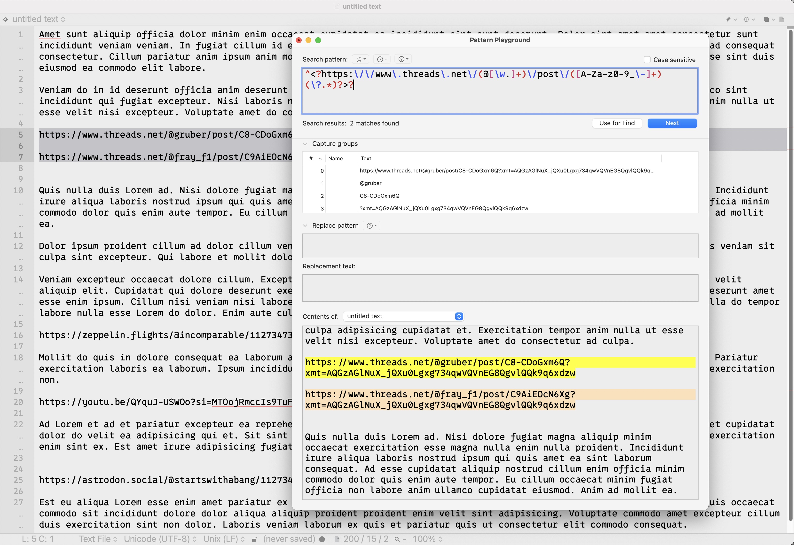
Step 1 in transforming the social links is creating aforementioned regular expressions and testing them.
Regular Expressions for YouTube, Threads, and Mastodon Links
If you have a Mac and you do any scripting or text file management or log analysis, I highly suggest BBEdit from Bare Bones Software. It’s not cheap, it’s complex, and a lot of things are done in counterintuitive ways. But it’s powerful, and it has an outstanding Pattern Playground feature for building and testing regular expressions. It’s simple to make a bunch of sample posts and try matches and replacements on them to craft both your regular expressions and the replacement strings for the embed code.
Here are the regular expressions I’m currently using for Mastodon, Threads, and YouTube, respectively.
These may change as I encounter variations of the different URLs for each service. These are rev 2 of the Threads and YouTube regular expressions, for example.
How Remark Plugins Work in Astro
When you create a remark plugin in Astro, it’s important to understand that the code is going to get applied to all your markdown files. So for whatever you see in your remark function, that will attempt to apply to every single post and any other pages you have where the actual content is inside a markdown file. That concept is important, because it makes it clearer what’s happening when you look at an actual remark plugin.
Creating a Remark Plugin in Astro
Creating a remark plugin in Astro is pretty simple. Somewhere in a folder you like under src, create a .mjs file with a name you like, such as remark-plugins.mjs. Inside that file, export a function:
Again, this code will be applied to every markdown file in your project, one at a time. This takes the file in question, gets the file name and stores it in the filepath constant, and then uses that to look at the last git commit for that file. Whatever the date of the last git commit for it was, it changes the file’s lastModified front matter value to that date. Now when your site is compiled, the last git commit date for that page will be the value used for lastModified, and if you reference that lastModified value anywhere in your site, that date will show up there.
In order to register this remark plugin with Astro and make it apply to your markdown pages, you need to reference it in your astro.config.mjs file like this (note the highlighted lines):
astro.config.mjs
1
import { defineConfig } from "astro/config";
2
import expressiveCode from "astro-expressive-code";
3
import pagefind from "astro-pagefind";
4
import { rehypeAccessibleEmojis } from "rehype-accessible-emojis";
5
import remarkToc from "remark-toc";
6
import { remarkModifiedTime } from "./src/components/utilities/remark-modified-time.mjs";
7
import { remarkSocialLinks } from "./src/components/utilities/remark-social-links.mjs";
Changing the markdown in the body of the markdown file is a little different. It’s possible that it can be done directly, but to the best of my knowledge, it requires walking the DOM tree of the document and looking at each node. This will allow us to look at the solo lines of text containing our social media URLs individually. To do this, we use a package called unist-util-visit.
Here’s the bones of the plugin we’ll create:
remark-social-links.mjs
1
import{visit}from"unist-util-visit";
2
3
exportfunctionremarkSocialLinks(){
4
return(tree)=>{
5
visit(tree,"text",(node)=>{
6
// do things on each node, or line of text in the markdown file
7
});
8
};
9
}
Remarking the Social Media Links
For each line, we’ll check it against our regular expressions and perform the appropriate action (replace the bare URL with whatever embed code is appropriate for the link).
That’s great… but you may have noticed that there are no actual definitions for youtubeRegex, mastodonRegex, threadsRegex, or any of their replacement templates in the above function.
Well, earlier I showed you my regular expressions. I didn’t show you the replacement strings, but here’s the whole thing, including regular expressions (highlighted) and replacement strings (also highlighted):
You can see that replacementTemplates is a javascript object that contains three functions. Each of those functions returns the text create by the string literals inside of them. These string literals are the embed template with appropriate insertion of the specific unique information in the URL, such as username, post or video ID, or domain name (in the case of Mastodon).
That’s my entire remark plugin. I register it in astro.config.mjs and it gets executed upon all my blog posts automatically.
That’s how easy it is to programmatically modify content in a markdown file in Astro.
It’s probable that I can walk the tree without using unist-util-visit, based on the Astro documentation remark plugin example called Add reading time, so I’ll probably make that modification. Maybe I can condense my check/replacement code a little more too.
Footnotes
Remember when hanging chads were the biggest of our political problems? It can definitely be argued, however, that there’s a direct line from those hanging chads to where we are today with people storming the capitol to protest a “stolen election”. ↩
This morning as I was going through my blogroll waiting for my double-height cup of coffee to kick in, I came across Cole’s post about the obvious rewards, or lack thereof, of blogging (or any content creation, really), and it resonated with me. Why DO people like me have websites that we update and maintain and post links to when it genuinely seems like maybe one or two people at most ever notice?
The good thing is that we can do our art because we love it. It really doesn’t matter how great (or small) the response is. As Robert notes, “I’m doing this because I love it. If others like it too, great, but that’s not the main purpose.”
That’s it exactly. It’s not about public notoriety or the dopamine hit of notifications and increasing follower counts. I don’t care at all about those things. I care about doing things I find interesting, and if someone ever finds one of my posts useful, that will be wonderful! That’s what I want! But it’s not what I need in order to keep doing it.
If you’re going to make a business or a large part of your income from your online work, you need eyeballs, and you need “engagement” (I really don’t like that word). But when I see some of my friends obsessing about their follower counts and using the word engagement non-ironically, I just think that I never want to have to live that way. 😄 I’m one of those dumb enthusiasts who doesn’t track anything, has almost no followers, and loves the fact that it’s never going to be about numbers.
But what about you? What are you doing with your website to make it uniquely yours? I like to link to people’s stuff on my links page, whether it be in my Blogroll section or my Cool Site Spotlight. The best of the web is people doing things because they love it, and linking to each other. Let me know on Mastodon what I’m missing!