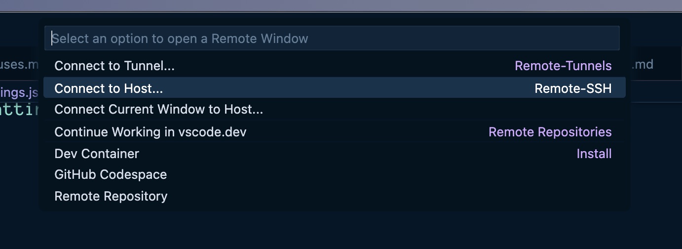
Recently I needed to work on some script files on a server and wanted to edit them in Visual Studio Code. Visual Studio Code supports remote connections, including ssh connections. Unfortunately, some of these files require root privileges, and I can’t and don’t want to be able to ssh into this server as root.
What about sudo su once you’re logged in, you say?
The good news about configuring ssh connections is that you can set up RemoteCommand entries in your ssh config that will be executed upon connection. sudo su is a command. And the good news about Visual Studio Code is that it lets you specify an ssh config file to use for its ssh connections, so you can customize your Visual Studio Code ssh connections to perform a sudo su upon connection, if needed, while keeping your normal ssh config file free of such silliness so that this doesn’t happen in your normal terminal ssh sessions.1
First create a copy of your ~/.ssh/config file and name it something obvious. Mine is named config_vscode.
Terminal window
1
ll
2
total168
3
drwx------@20scottstaff640BJan2108:47.
4
drwxr-xr-x@76scottstaff2.4KJan2109:02..
5
-rw-r--r--@1scottstaff6.0KDec182023.DS_Store
6
drwx------3scottstaff96BJan2108:471Password
7
-rw-------@1scottstaff1.7KJan1014:32config
8
-rw-------@1scottstaff1.7KDec2020:26config_por
9
-rw-------@1scottstaff948BJan1014:58config_vscode
Now edit your newly created created config_vscode (or whatever) file and add the following to the end of connections that need root access to files in Visual Studio Code:
Terminal window
1
RemoteCommandsudosu
This means a given connection that looks like this in ~/.ssh/config:
~/.ssh/config
1
Hostserver1
2
HostNameserver1.domain.com
3
Port22
4
Userserverperson
5
IdentityFile~/.ssh/server1
6
IdentitiesOnlyyes
Should look like this in ~/.ssh/config_vscode:
~/.ssh/config_vscode
1
Hostserver1
2
HostNameserver1.domain.com
3
Port22
4
Userserverperson
5
IdentityFile~/.ssh/server1
6
IdentitiesOnlyyes
7
RemoteCommandsudosu
Then in your Visual Studio Code user settings.json file, make sure to point to your custom ssh config and set enableRemoteCommand to true.
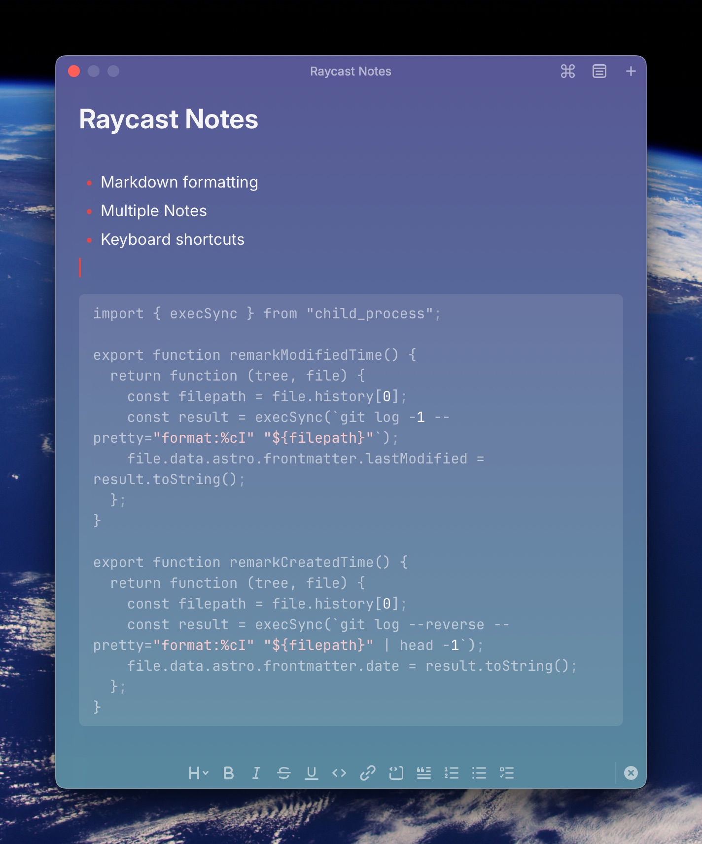
Raycast Floating Notes started off as a very simple text window you could dump stuff into. That’s all it was. One window, one note, and anything you put in there was always going to be there when you opened Raycast Floating Notes again. Then late last year, Raycast introduced Raycast Notes, a Floating Notes update and replacement (Meet the new Raycast Notes - Raycast Blog).
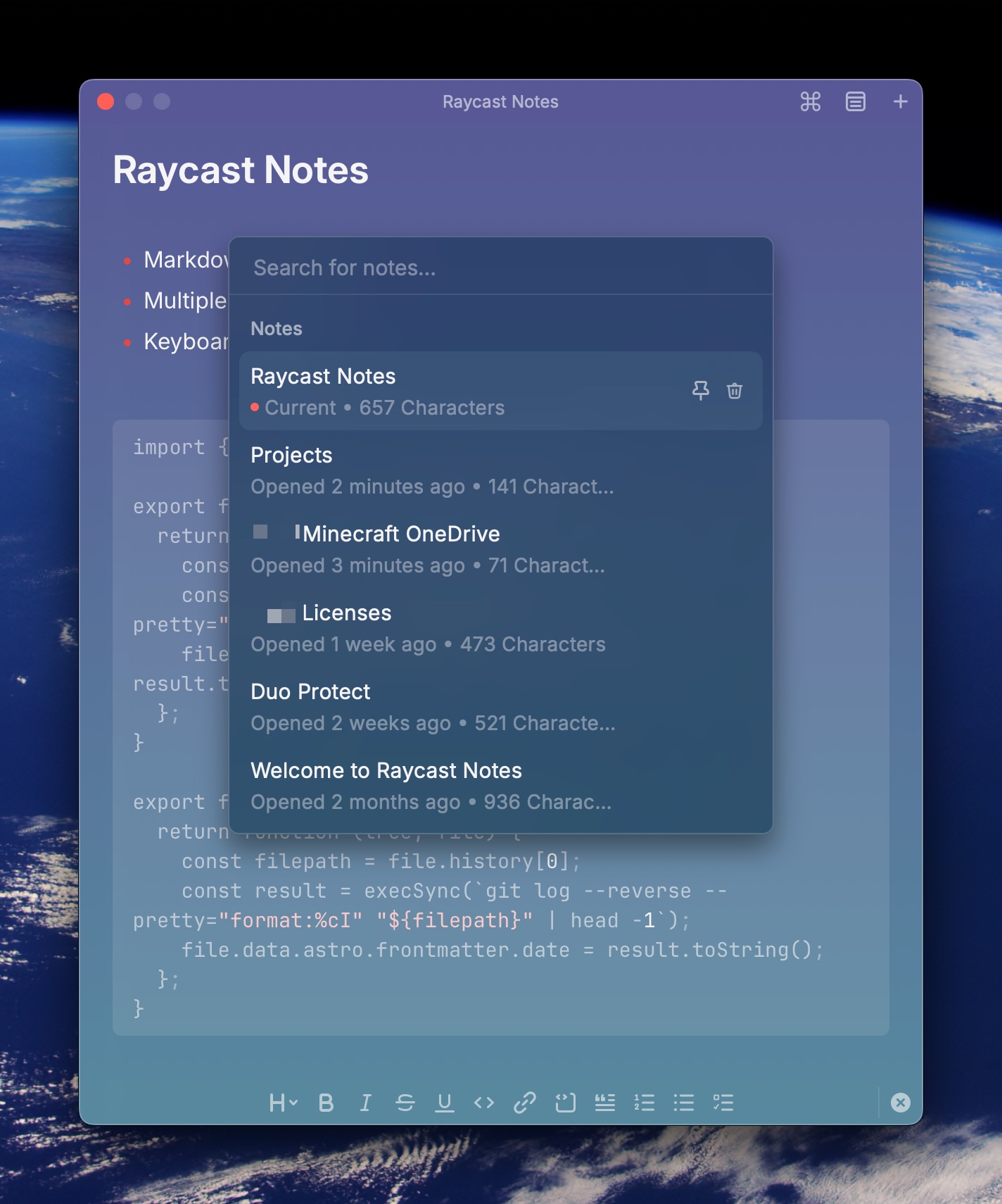
Raycast Notes is a big upgrade over Floating Notes for the simple reason that you can keep multiple notes… something Floating Notes just couldn’t do. Browse your notes and select the note to view using the menu icon at the top of the current note, or use ⌘P to pop up the list.
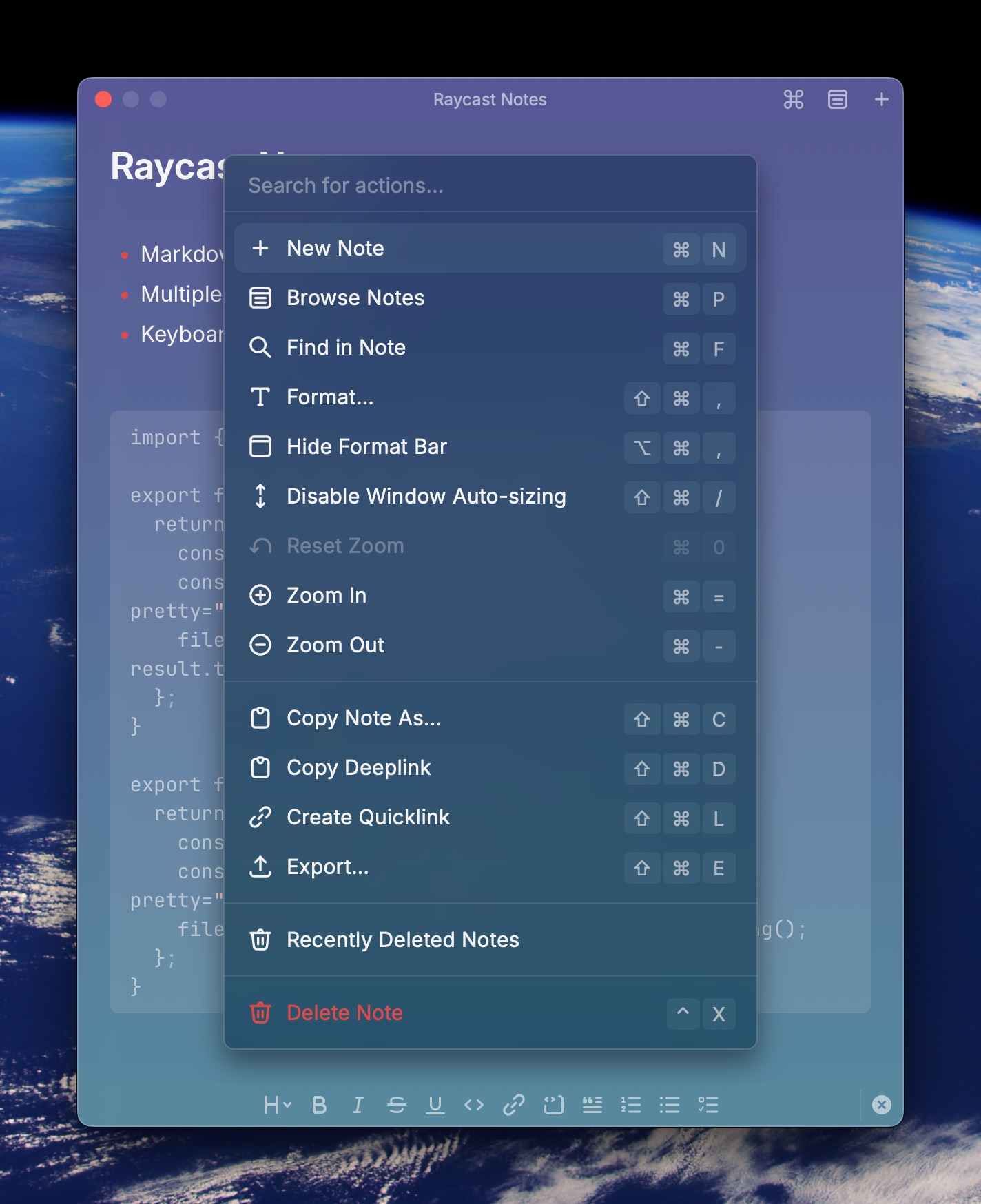
You can also perform a bunch of actions in/on notes, such as window auto-sizing, zoom, copying, formatting, searching, creating a quicklink to the note, all with keyboard shortcuts, by clicking the ⌘ icon or using the ⌘K keyboard shortcut.
Here’s the catch, though, at least for me – people who use Raycast want Raycast Notes to become the be-all, end-all of notes apps for them. There are people who genuinely want to replace Obsidian, Apple Notes, or Notion with Raycast Notes, and this has led to some minor annoyances for me. I don’t like the fact that pasting a URL into a note in Raycast Notes auto-formats it as a markdown link. Most of the time I just want a text link that I can see and copy as plaintext.
I understand why people want Raycast Notes to do all these things and have all these features, but honestly for me, I want a scratchpad, not a word processor. Raycast Notes is never going to replace Notion, Apple Notes, or Bear for me. It just can’t, and it’s going to be way too clunky if Raycast tries to do that.
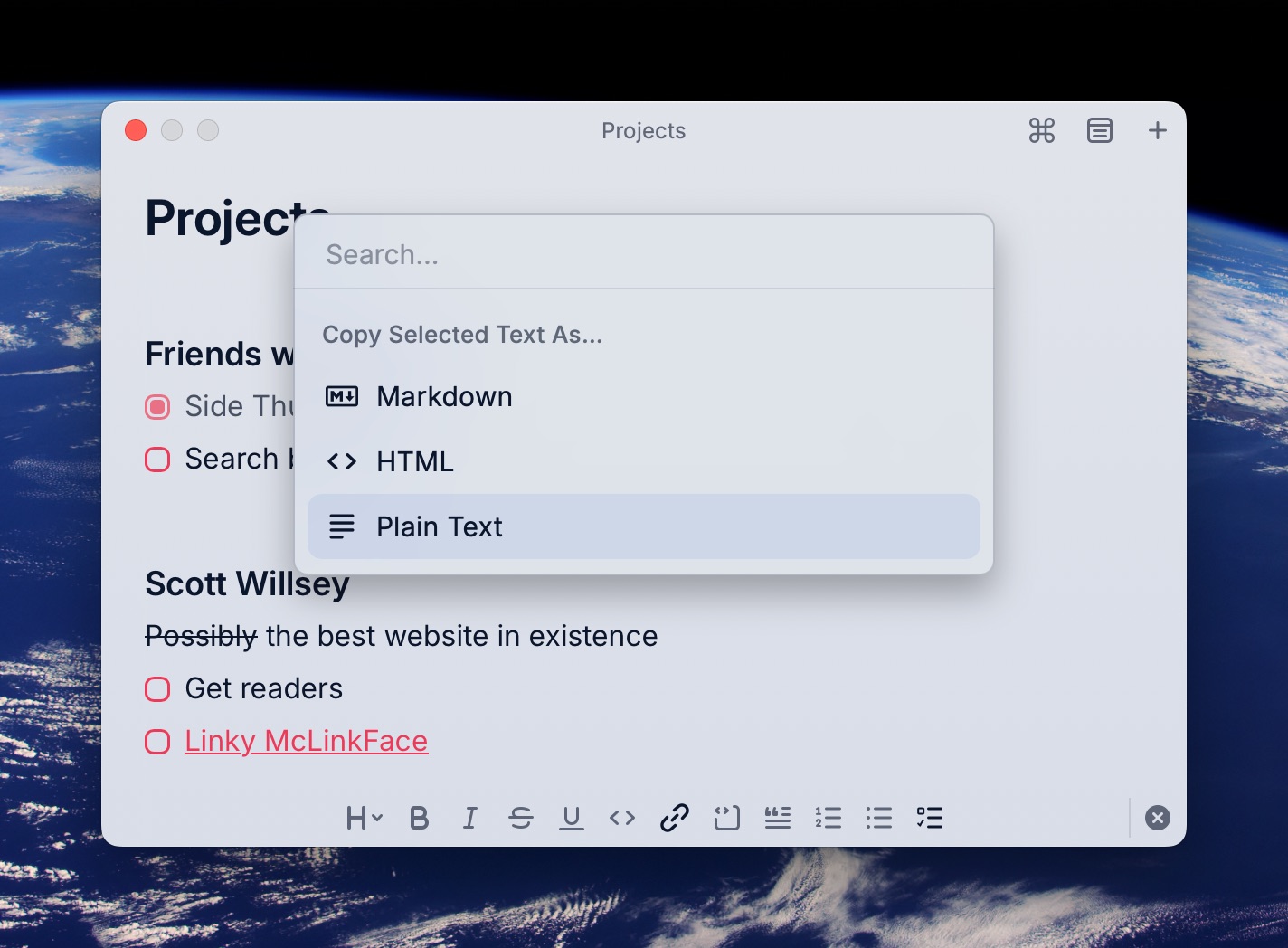
I did learn that there’s a way to at least copy the links that Raycast Notes insists on formatting into markdown back out of the note as plaintext though. Highlight the link, hit ⇧⌘C to pop up the “Copy Selected Text As” menu, and choose “Plain Text”.
Aside from little quibbles like that, I do use Raycast Notes all the time to capture quick info or keep things I need floating on my screen while I work. It’s very much a quick reference, context-based tool for me, and for that use case, I do appreciate it.
Just quit trying to make it into the Microsoft Word of Markdown editors, people. 😄
There is a fascinating LLM CLI tool called aichat that lets you use all kinds of LLM models in the command line, including REPL mode, RAG mode (feeding it your documents and files of choice to use as a knowledgebase), and much more.
I was a little confused about how to configure it to give me a choice of OpenAI and Anthropic LLM models though. I kept breaking the config and generating error messages. Finally I stumbled across a post in the aichat repo’s closed issues that explained for OpenAI and Anthropic, you can configure their API and type information and skip configuring any model information. That way aichat will pull the list of available models from each API for you.
You can see I default to the Claude 3.5 Sonnet (latest) model. The nomenclature for the value of specified model is type:model-name. Then I have a clients section which lists two types of models: OpenAI and Claude (Anthropic).
Here’s the default Claude 3.5 Sonnet (which is notoriously shy about answering questions about model information):
Terminal window
1
scott@Midnight:~➜aichat"what model are you using?"
2
I'm Claude, an AI assistant created by Anthropic. I aim to be direct and honest in my
3
communications, including about what I am.
But I could also specify a model manually, or set it in an environment variable:
Terminal window
1
scott@Midnight:~➜aichat-mopenai:gpt-4o"What LLM model are you using?"
2
IambasedonOpenAI's GPT-4 model.
And in aichat REPL mode, you can get a list of models to choose from with the .model ⇥ command (that’s .model followed by a space and a tab).
Arrow up and down to select the model you want and then hit return. This basically does the same as you typing .model type:model-name:
Terminal window
1
scott@Midnight:~➜aichat
2
Welcometoaichat0.26.0
3
Type".help"foradditionalhelp.
4
> .model openai:gpt-4o
5
6
> what LLM model are you?
7
IambasedonOpenAI's GPT-4.
There’s a lot that aichat can do that I haven’t even poked at yet. Honestly, I don’t have time and probably use cases to dig into it much more in the very near term, but it is definitely a very comprehensive CLI tool for LLM use.
Long-time Mac users will undoubtedly have heard of BBEdit. BBEdit is the favorite Mac text editor of many old Mac users1 for various types of writing, including programming, notes, articles, and basically any type of writing Mac nerds can do.
Personally, I wouldn’t program using BBEdit. Visual Studio Code and offshoots like Cursor are much better for that. I wouldn’t write this blog post in it. That’s what I use Bear for. And, in my humble-ish opinion, they’re much better at those tasks than BBEdit is.
But there is a specific use that BBEdit can’t be topped for on the Mac – log file analysis. It’s like BBEdit was made specifically for it.
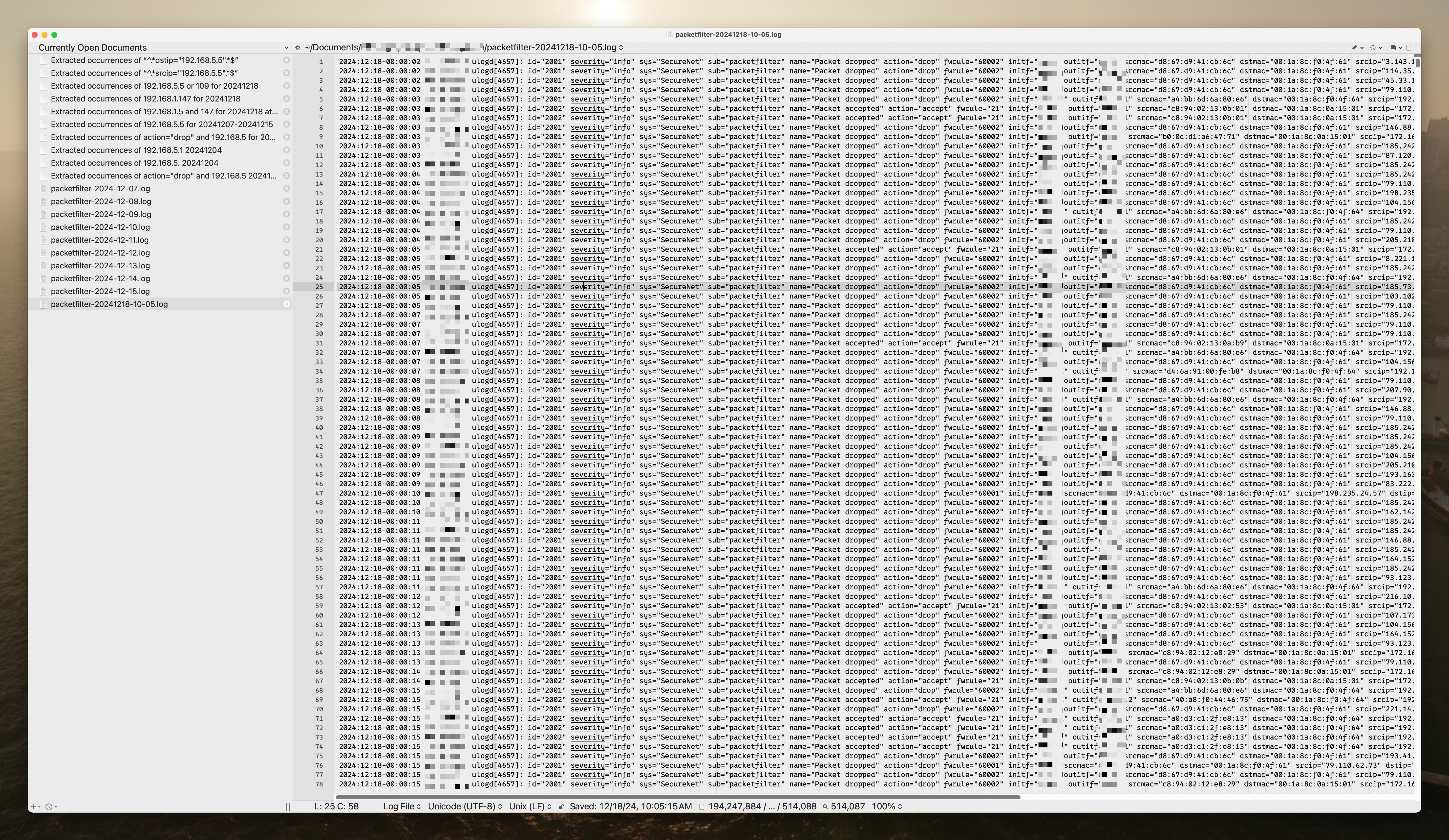
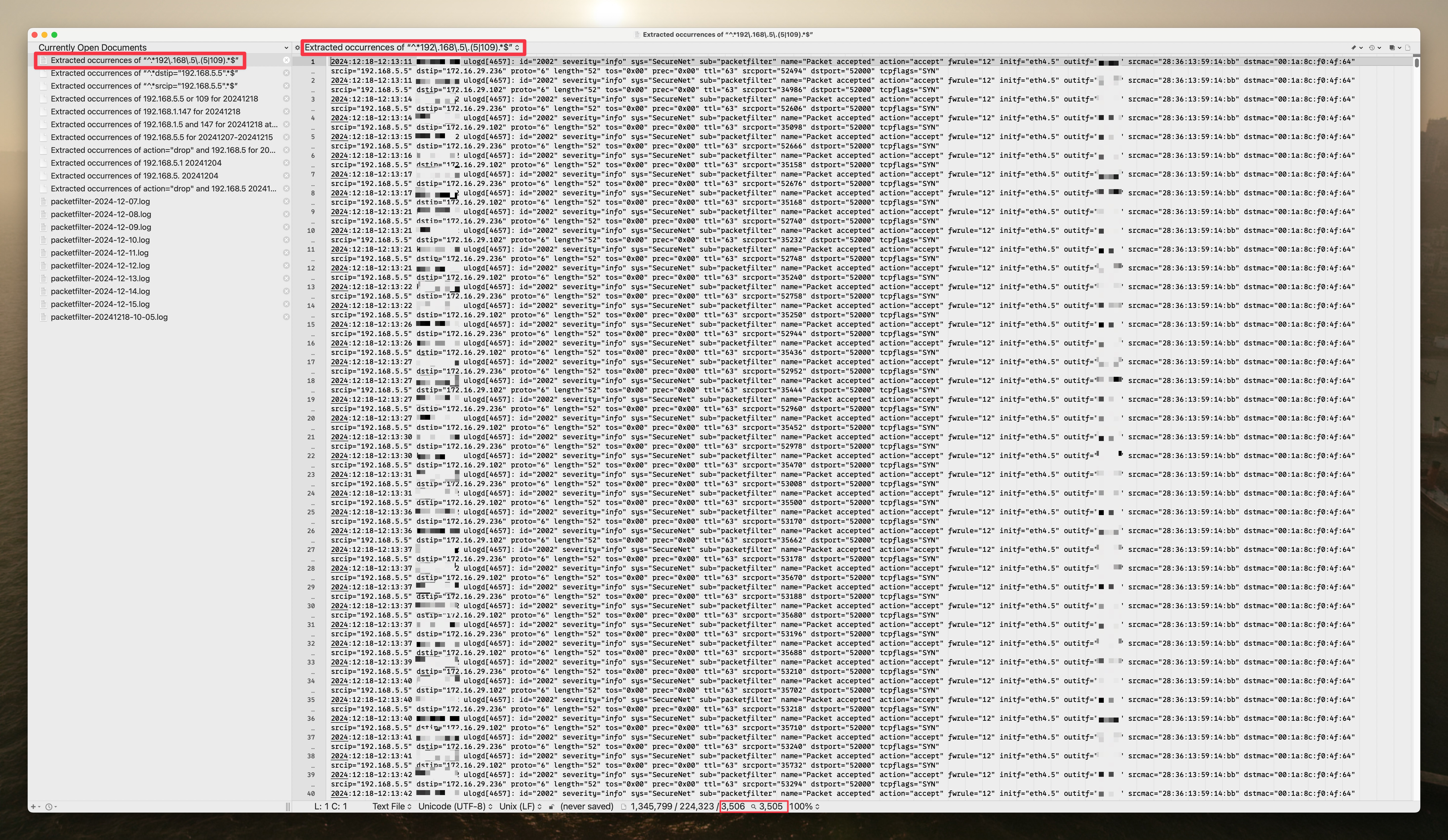
Here’s a UTM firewall packet filter log containing all entries for a given day, downloaded right from the UTM’s log file interface.
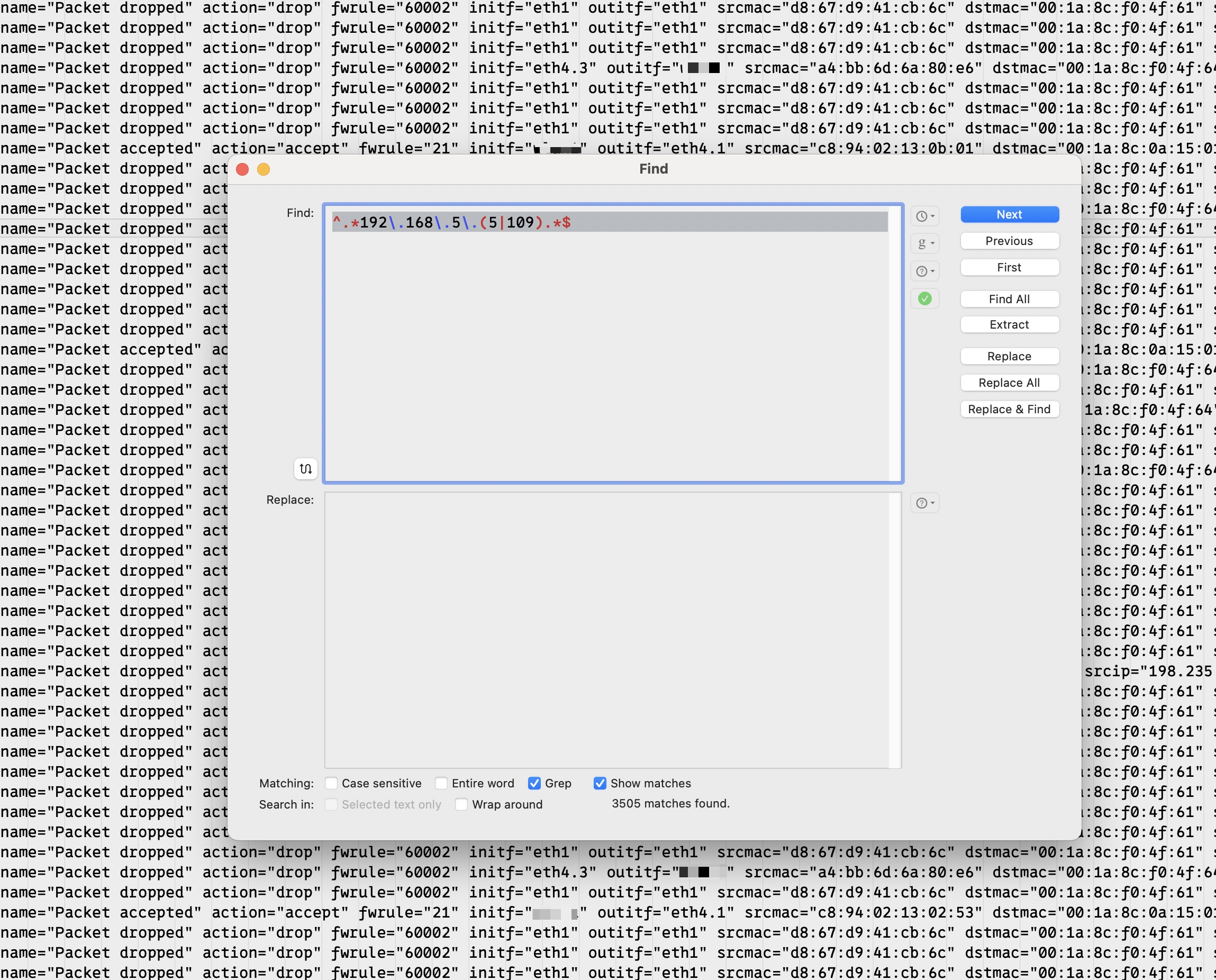
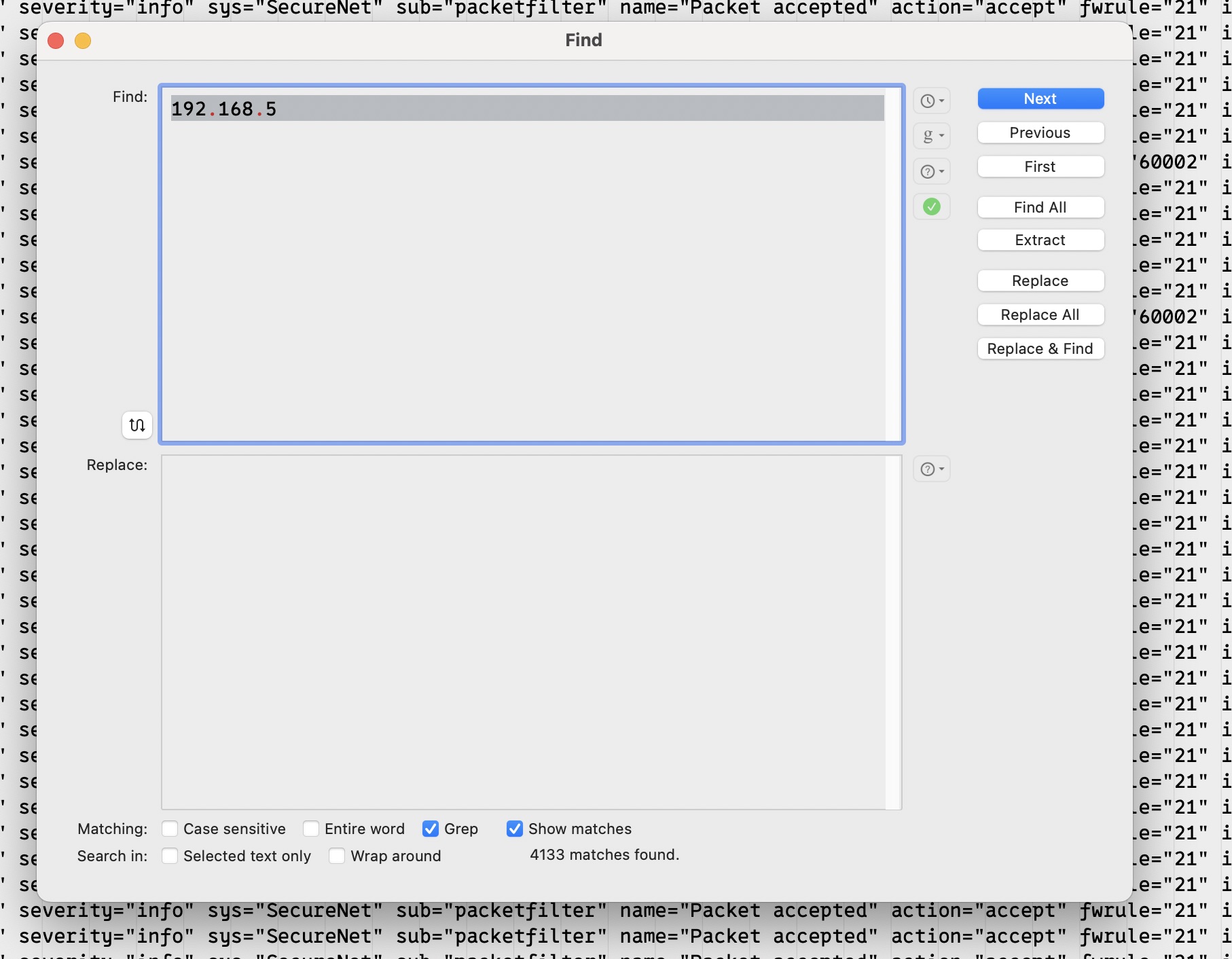
If I want to look at only entries for 192.168.5.5 and 192.168.5.109, I can open the Search dialog box with ⌘F and put in a regular expression to search for that.
Right in the Search dialog box, before even hitting “Find All”, it shows me at the bottom how many matches there are – 3505 of them.
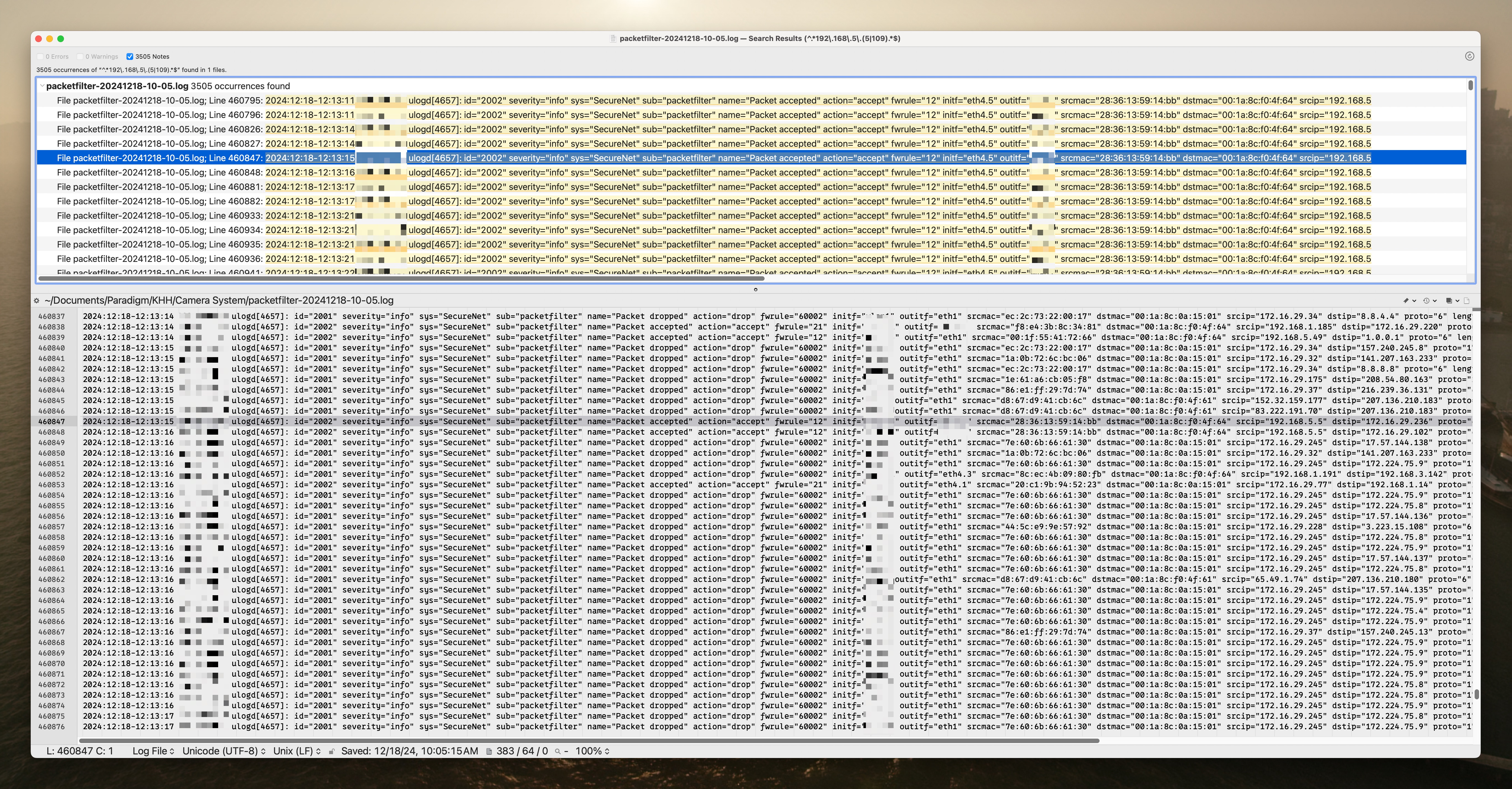
If I do hit “Find All”, it opens a new window containing those lines at the top of the window, and, if I click on one of them, the log file they are in with the highlighted line in view at the bottom of the window. It’s great for contextualizing matches.
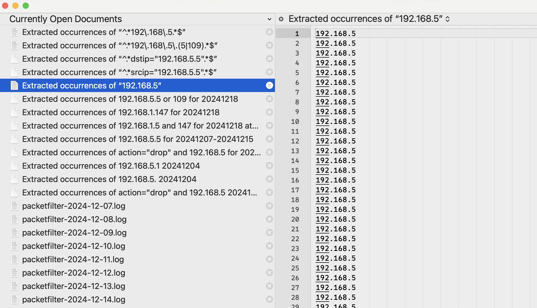
But what if I want a document that contains those matching lines and nothing else? That’s what the “Extract” button on the Search dialog box is for. By clicking that instead of “Find All”, a new document is created in BBEdit that contains just the matching lines named “Extracted occurrences of (insert regular expression search string here)”.
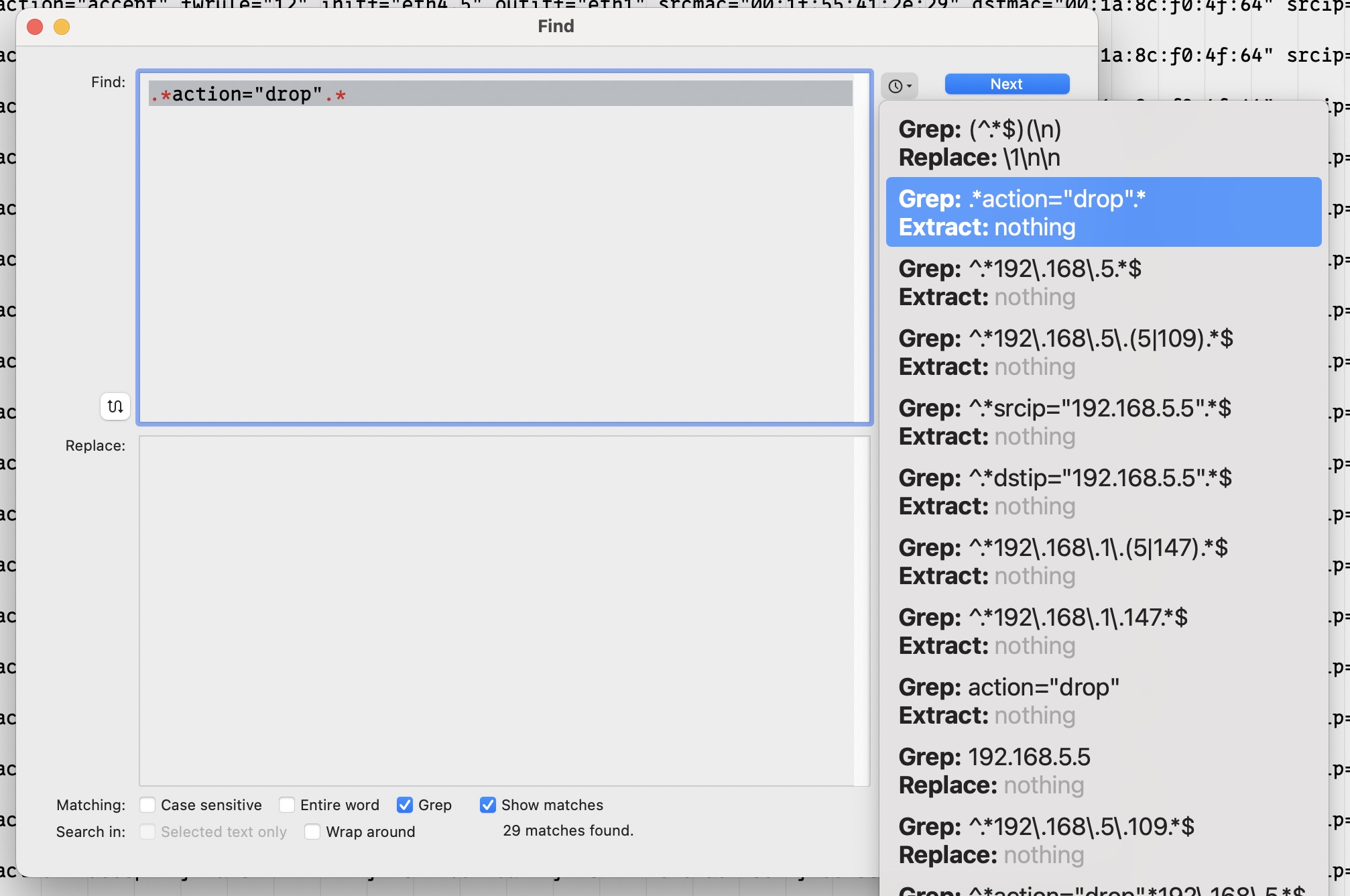
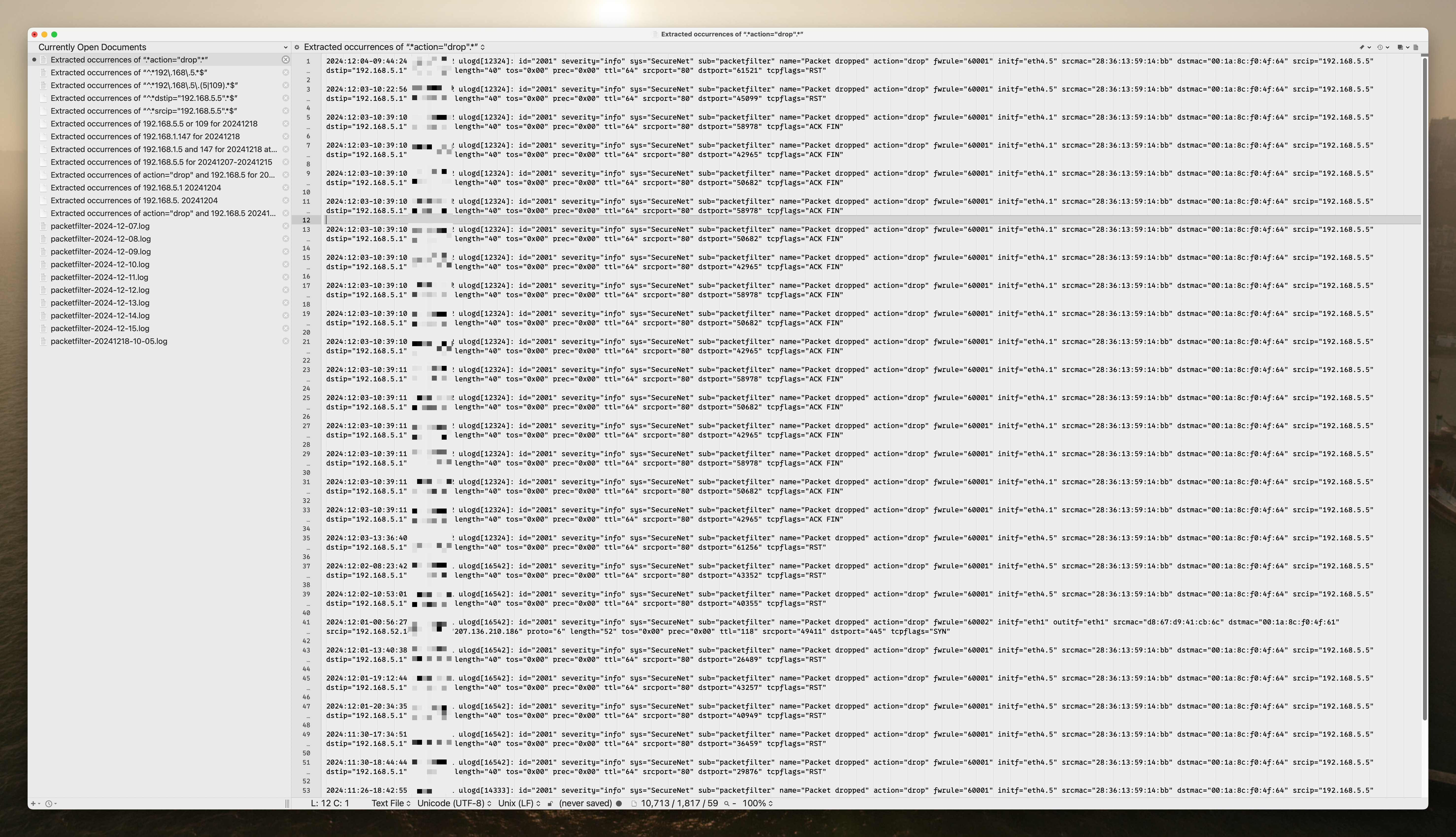
I use this all the time to drill down further and further without having to edit any files or keep search results windows open. Let’s say I have a subset of IP addresses extracted, like anything in the 192.168.5.x range, and I want to see only lines that have a firewall action of “drop” in them. In other words, I want to ignore all cases where the firewall passed the traffic along and only see when it blocked it for those IP addresses.
Very simple. While viewing the document of extracted 192.168.5 matches, ⌘F again and enter a new regular expression looking for lines where action=“drop”. The search dialog shows 29 matches.
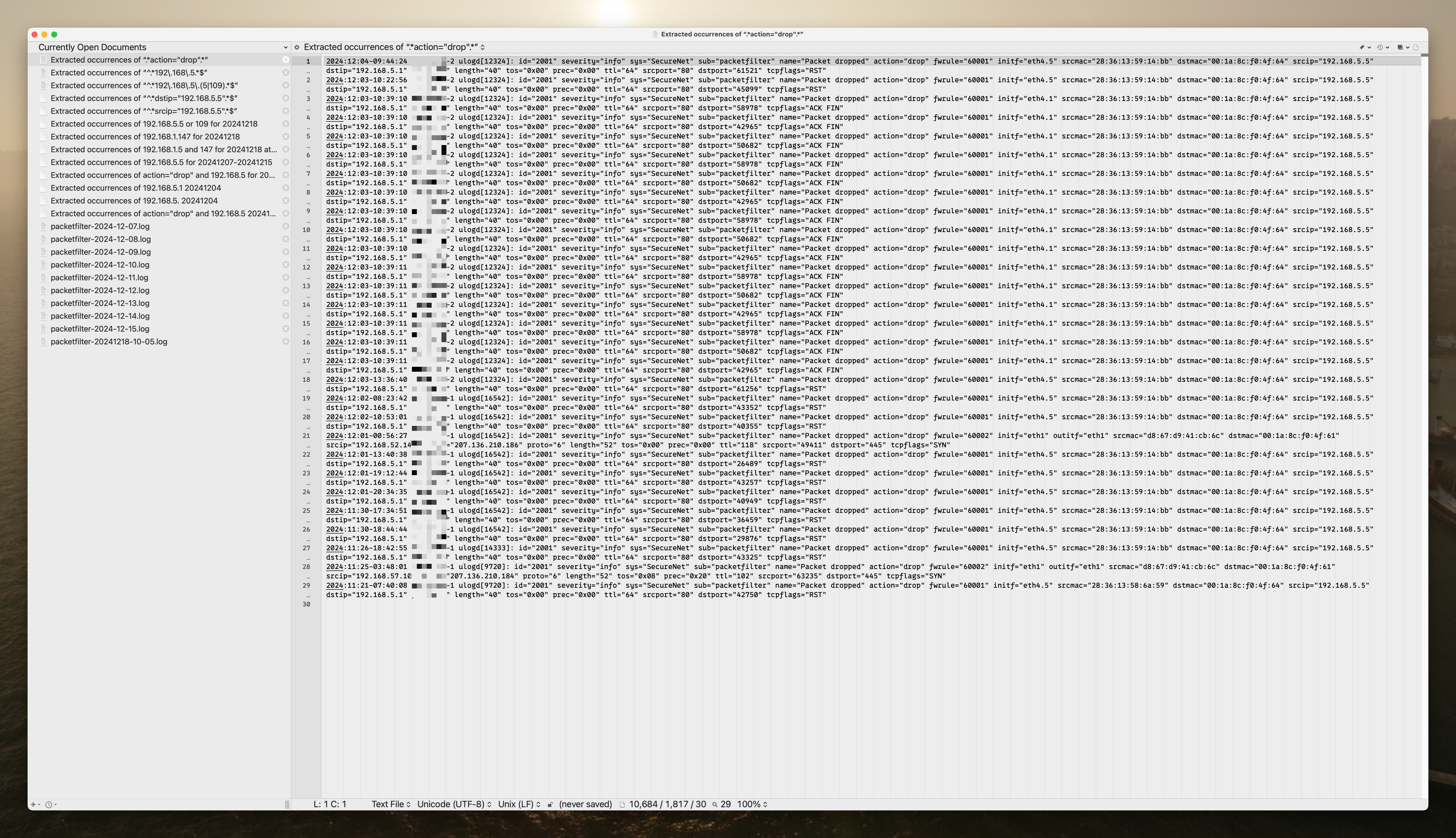
Hit the “Extract” button and extract the 29 matches to a new document.
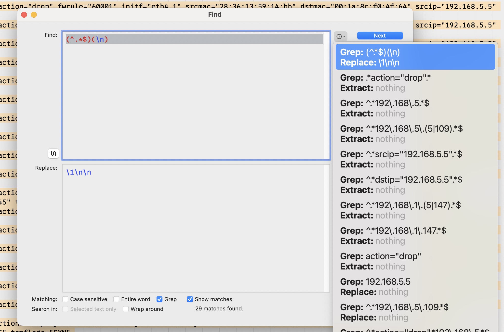
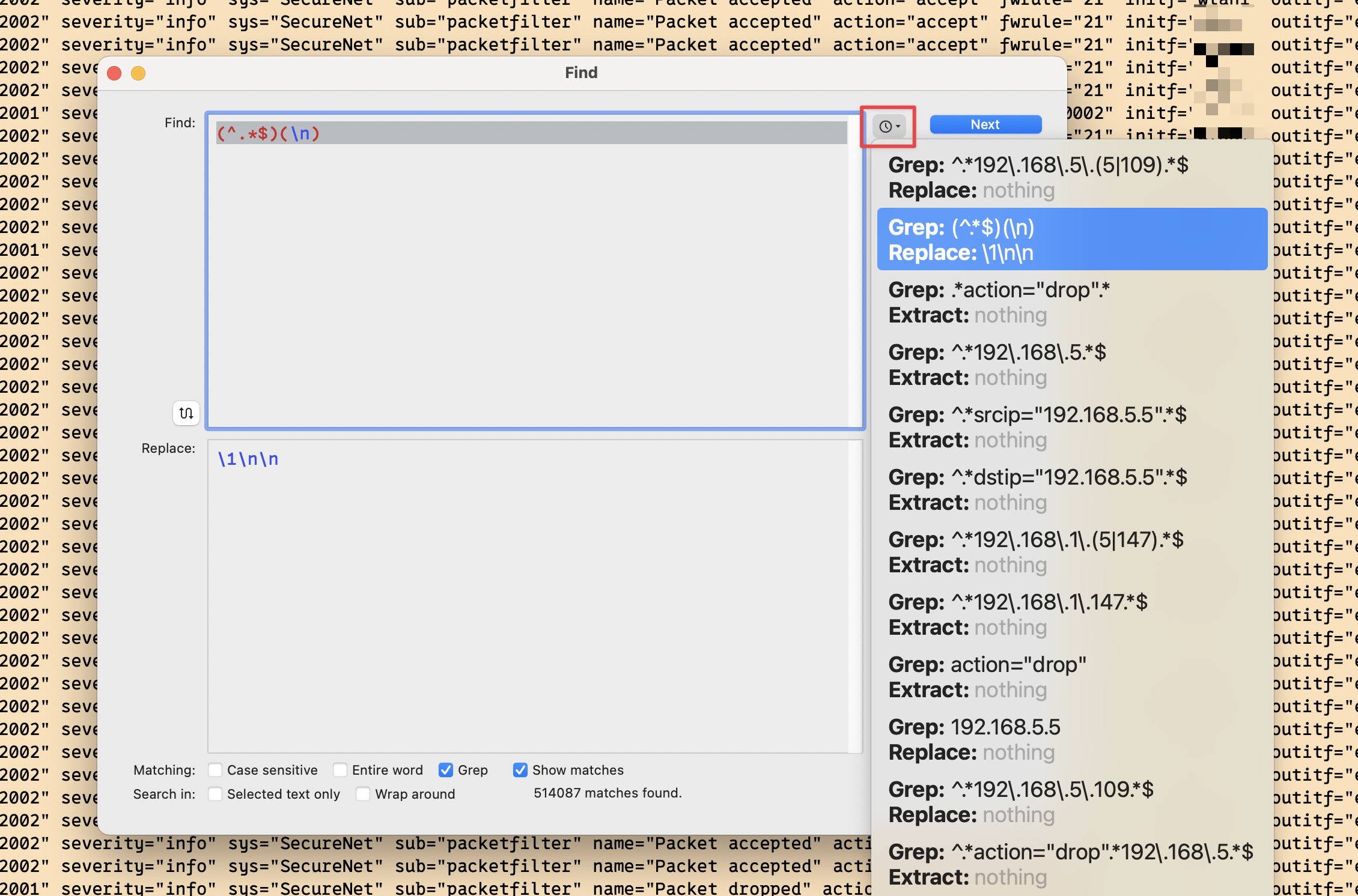
Sometimes when viewing results like this I want blank lines between them so I use a regular expression find and replace when doing this, and click the “Replace All” button in the search dialog, which acts on the active document and replaces all matches with what I want – in my case, the same result lines but followed by 2 newlines after each of them.
Much better for my tired old eyes.
And now for some additional niceties of BBEdit search:
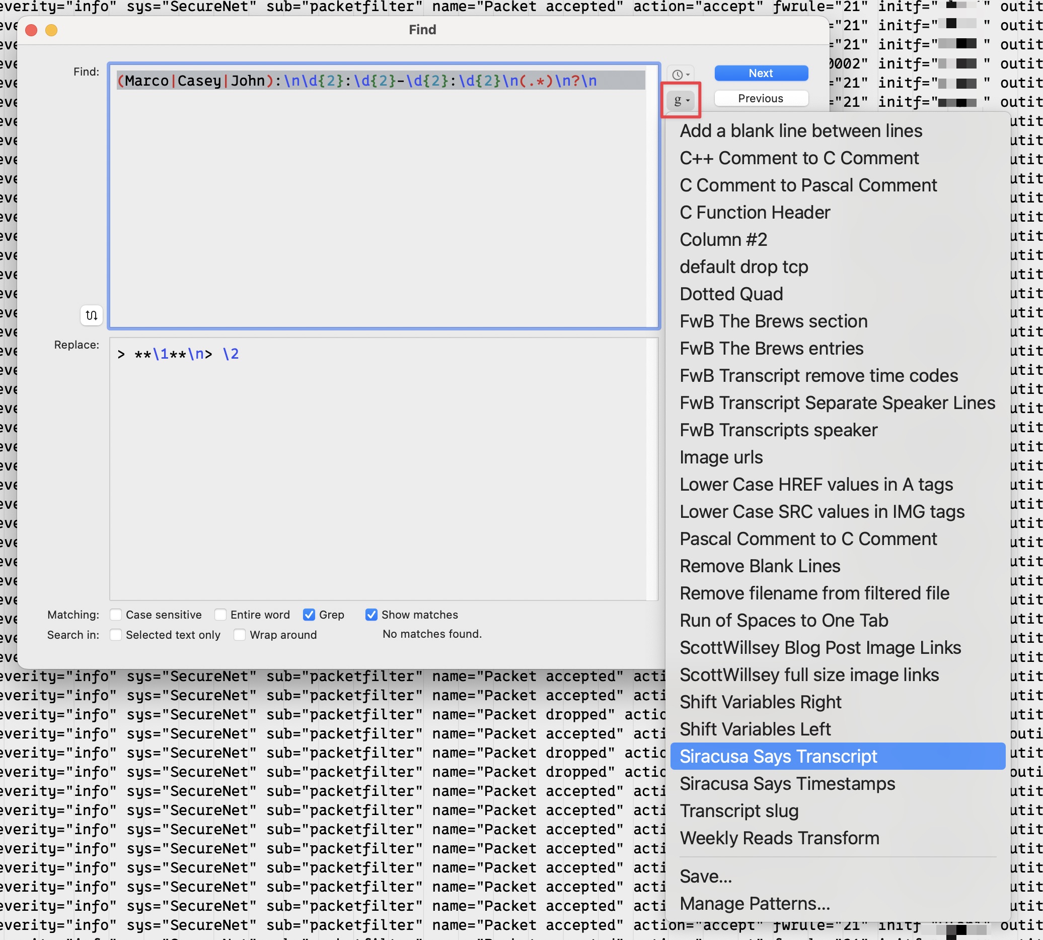
You can save your searches and access them using the “g” button on the Search dialog to get a dropdown list to choose from.
You can also, as my examples in this post illustrate, pull up previously used searches from the search history feature by clicking the clock icon button on the search dialog, and choosing from the dropdown list.
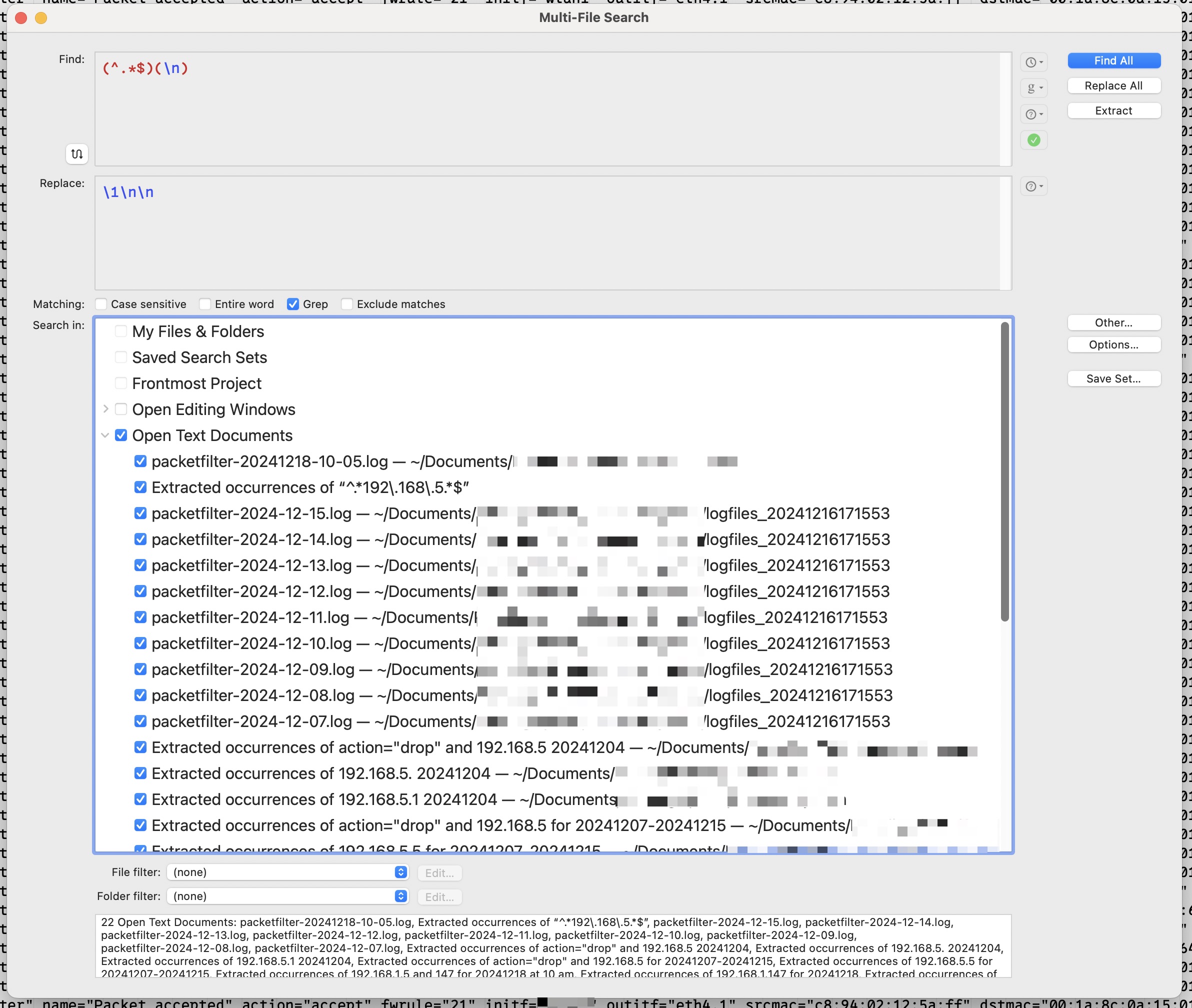
There’s also a multi-file search you can open separately from regular search, with the same features mentioned above, using ⇧⌘F. It lets you choose the files to search in with great granularity, and it has the same “Find All”, “Replace All”, and “Extract” functions as the regular active file search function. This means you can extract all instances of a specific thing contained in multiple files to one new document.
One important thing about composing a search in BBEdit if you do want to extract to a new document is that you need to compose your regular expression to include a full line and not just the exact search terms specified. For example, if you just search for “192.168.5” like this, and then Extract:
You get this:
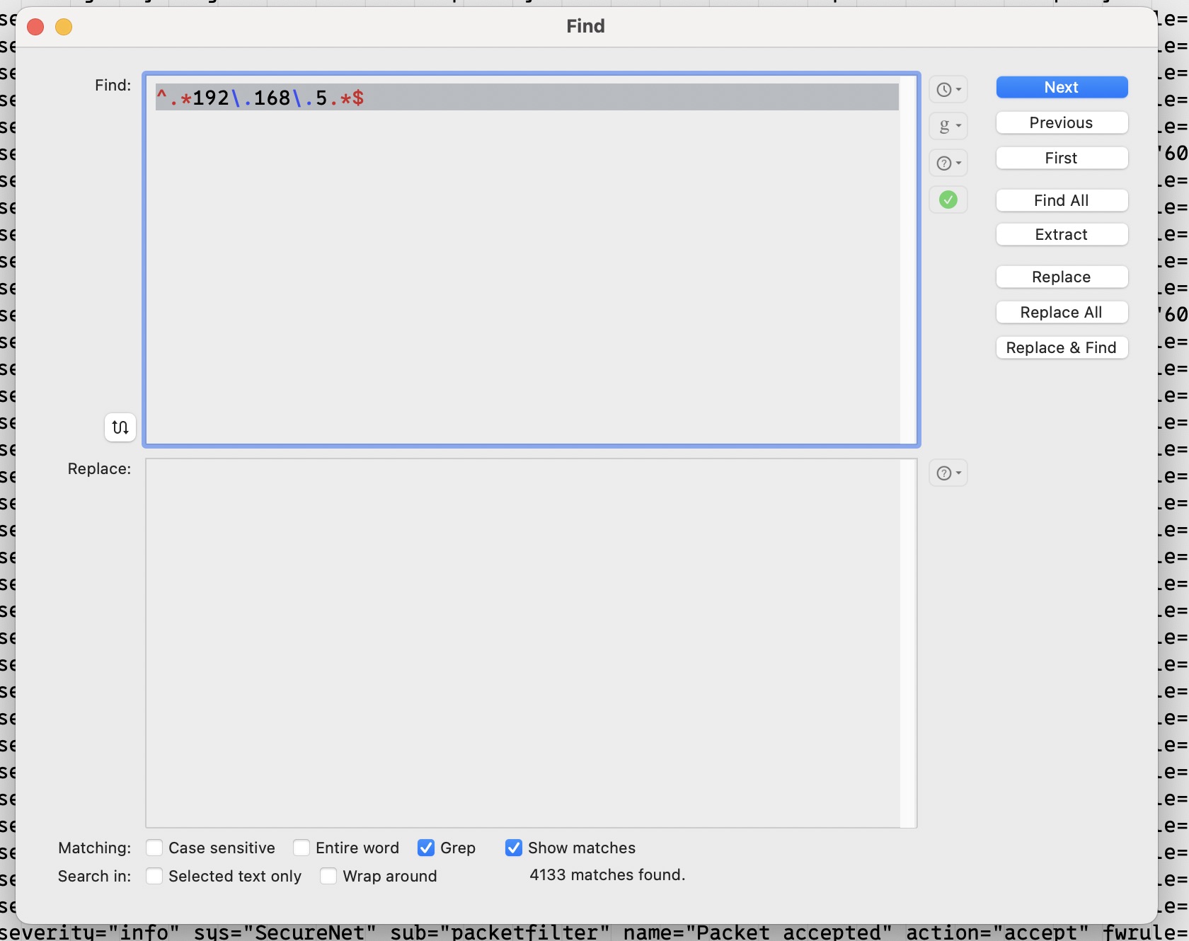
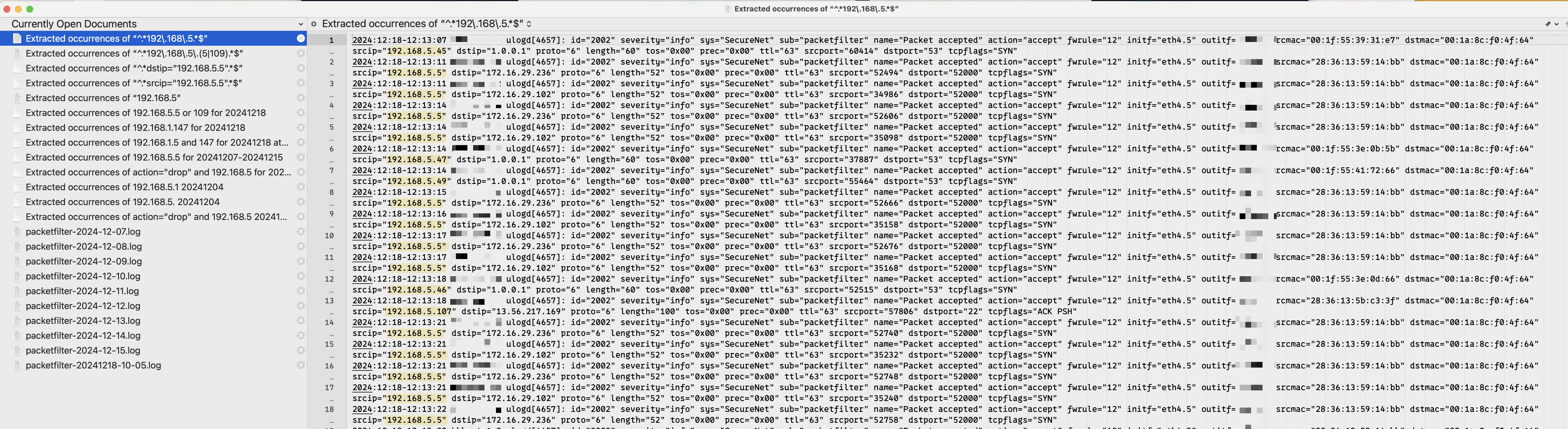
Not very useful if you’re into context or understanding of any kind. But if you use a regular expression that looks like this (since in my case, the log is separate lines of logged events):
Now you get the full line for each matching line:
That’s because the search was created with a regular expression of ^.*192\.168\.5.*$, which looks for start of line, any characters any number of times followed by 192.168.5, followed by any number of any characters, followed by end of line. When using regular expressions as search terms, make sure that the Grep option next to “Matching:” in the search dialog box is checked so that the search term acts as a regular expression instead of a literal string.
I’m sure there’s much more that I haven’t even discovered about BBEdit and searching and extracting yet, but these are some things that I use all the time and find indispensable. If your job or hobby requires you to parse log files very often, I recommend a copy of BBEdit even if you never use it for anything else. It’s still very worth the price for that.
Footnotes
I’m old too, so this is fair game. And it’s true. I don’t think many new and or young Mac users use or even know about BBEdit. ↩
Astro 5 is out, and it has a number of changes from Astro 4. The good news is, I was able to upgrade this site to it without making any changes at all. That doesn’t mean I don’t have any to make – I need to convert my Content Collections to the new Content Layer API at the very least, for example.
But the fact that it worked as is enabled me to update all my packages to the latest versions and then worry about updating specific implementation details later.
Sometimes I want to be able to pull a personal GitHub repository onto a server in order to keep some files up to date. Things like scripts that I won’t edit on the server and so won’t need to push to GitHub are good candidates for this. In order to accomplish this in a reasonably secure way, I use GitHub Deploy Keys. With a read-only deploy key, if someone ever gets access to my server I’ll suddenly have a billion new problems, but worrying about my repositories being overwritten with malicious garbage won’t be one of them.
Deploy keys are repository specific, however, which means if you have multiple repositories you want to pull from GitHub onto the server, you need a way to specify which deploy key each repo should use.
Let’s use an example where I have two repos, both of which I want to pull onto my server. One is called server-management-scripts and the other is called website-management-scripts.
Create the Deploy Keys
You can use good old ssh-keygen in your account’s .ssh directory on the server to create your keys. In my case, ecdsa keys, named sms-deploy (for server-management-scripts repo) and wms-deploy (for website-management-scripts repo).
~/.ssh/
1
ssh-keygen-tecdsa-fsms-deploy
And
~/.ssh/
1
ssh-keygen-tecdsa-fwms-deploy
Because these are going to be read-only keys for their repos, I do not use a passphrase on them.
~/.ssh/
1
scott@dragonfly~/.ssh $ ll
2
total40
3
drwx------2scottscott4096Nov1918:23./
4
drwxr-xr-x8scottscott4096Nov1918:21../
5
-rw-------1scottscott194May82024authorized_keys
6
-rw-r--r--1scottscott133Mar122021config
7
-rw-------1scottscott505Nov1918:22sms-deploy
8
-rw-r--r--1scottscott177Nov1918:22sms-deploy.pub
9
-rw-------1scottscott505Nov1918:23wms-deploy
10
-rw-r--r--1scottscott177Nov1918:23wms-deploy.pub
Add the Public Keys to the GitHub Repositories
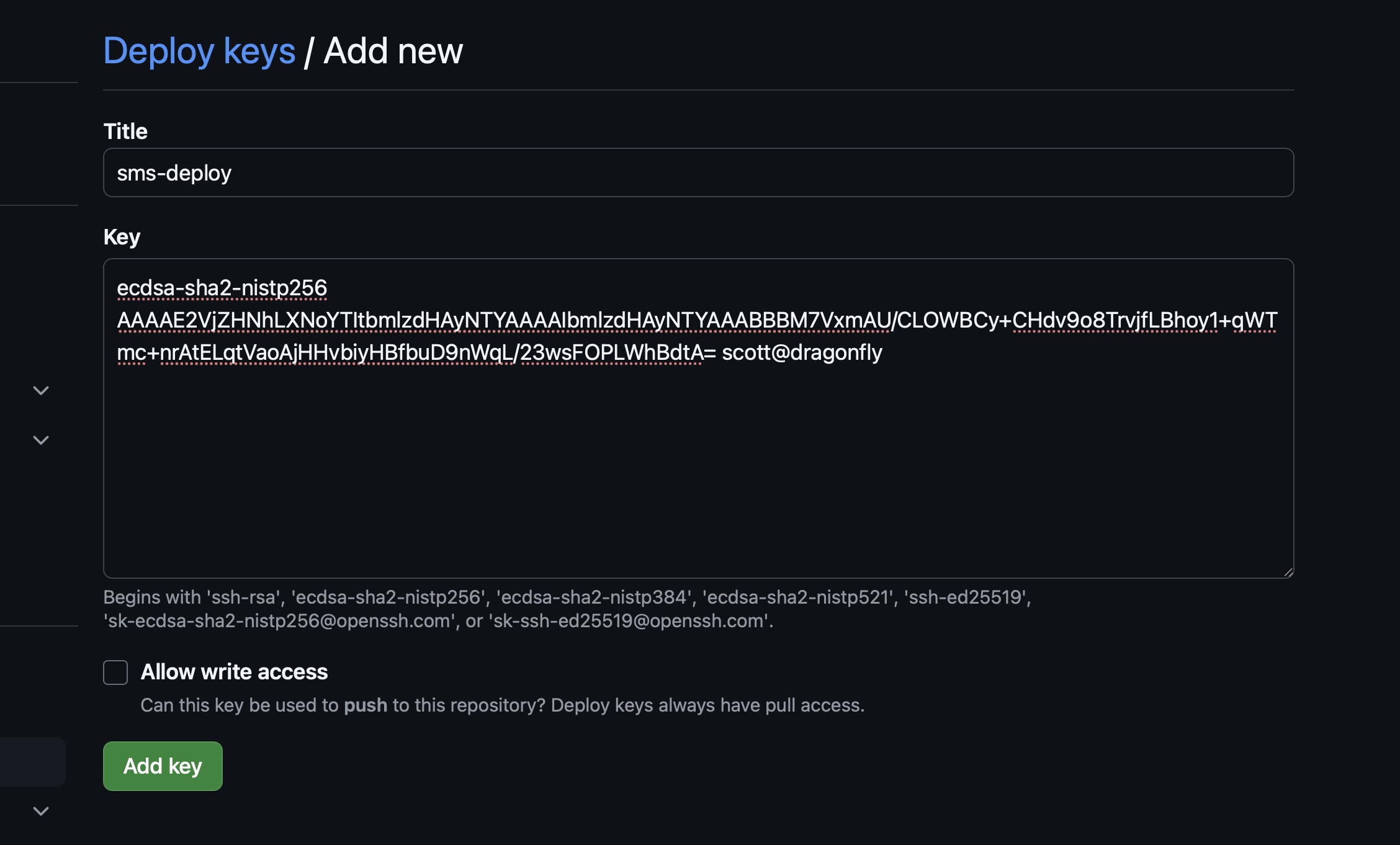
Go to your repository on GitHub, go into the repository settings, Click the Deploy Keys link, and click the Add Deploy Key button.
Give the key a name in the Title textbox, copy the contents of your public key (the .pub file for the key) that you created on your server into the Key textbox, and leave “Allow write access” unchecked. Click the “Add key” button.
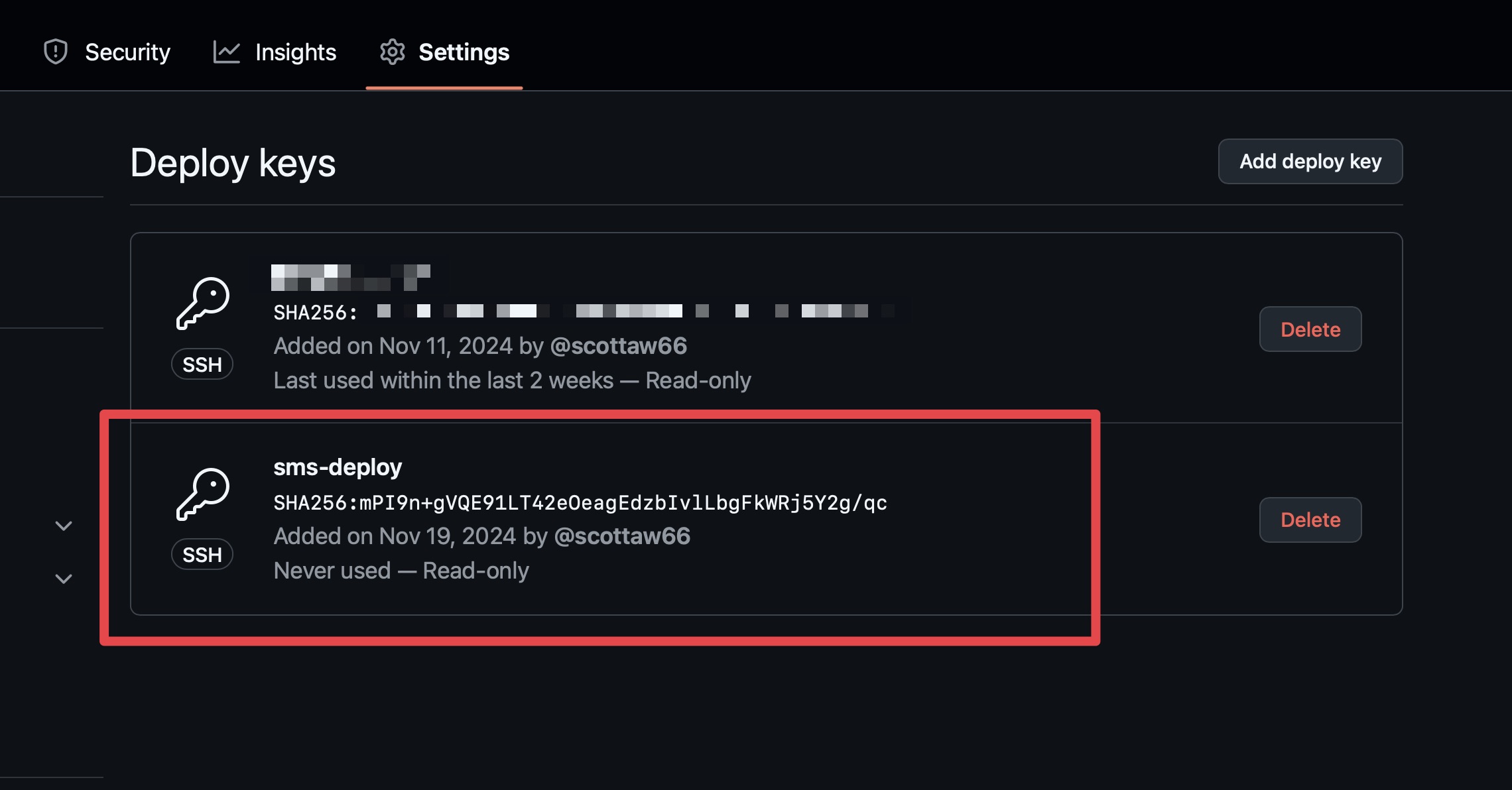
Now your new deploy key shows in the repo’s Settings > Deploy keys, and this key can be used to pull the repo.
Once you’ve added the public keys to the repos, you can delete them from your server, leaving only the private keys behind.
~/.ssh/
1
scott@dragonfly~/.ssh $ ll
2
total32
3
drwx------2scottscott4096Nov1918:23./
4
drwxr-xr-x8scottscott4096Nov1918:21../
5
-rw-------1scottscott194May82024authorized_keys
6
-rw-r--r--1scottscott133Mar122021config
7
-rw-------1scottscott505Nov1918:22sms-deploy
8
-rw-------1scottscott505Nov1918:23wms-deploy
Assign the Correct Keys to the Correct Repositories
In order to make sure that a git pull command works correctly in each repo, I can edit my user account ssh config file on the server to contain these entries:
~/.ssh/config
1
Hostserverscripts
2
HostNamegithub.com
3
Usergit
4
AddKeysToAgentyes
5
IdentityFile~/.ssh/sms-deploy
6
IdentitiesOnlyyes
7
ForwardAgentyes
8
9
Hostwebsitescripts
10
HostNamegithub.com
11
Usergit
12
AddKeysToAgentyes
13
IdentityFile~/.ssh/wms-deploy
14
IdentitiesOnlyyes
15
ForwardAgentyes
Now, in each repo’s .git directory on the server, I can edit the config file to reference the correct entry in ~/.ssh/config :
Notice the highlighted part, which is the URL for the repo to use. It uses serverscripts as the server portion of the URL (the part after the @ symbol and before the :), because that matches the first Host entry in my account’s ~/.ssh/config file on the server.
The second git repo’s config file on the server would look like this, since I gave it a Host name of websitescripts in the ~/.ssh/config file:
Now both repos are linked back to a specific entry in ~/.ssh/config, and therefore to their respective deploy keys, specified on the IdentityFile line. The ssh key file for the server management scripts repo is ~/.ssh/sms-deploy, and the ssh key for the website management scripts repo is ~/.ssh/wms-deploy.
When you do a git pull in either of those repos on the server, it will now use the correct deploy key to authenticate.