Thanks entirely to Tiffany White, I finally implemented something that’s been on my site to-do list for some time, but that I’ve never gotten around to actually doing until now: link posts.
You’ve seen link posts before, certainly so if you read a lot of Mac related blogs like Daring Fireball, SixColors, or MacStories. The idea is the title of the post links to an article on another site, and then you add some commentary and maybe quote part of the article in your post.
Tiffany created an issue on my site repo asking if I’d setup link post support in Astro yet. I had it on my to-do list, namely in my Obsidian kanban board for this site, but I hadn’t done it yet because I haven’t really wanted to link to too many external articles here. But Tiffany creating an issue for me gave me the motivation to figure out how I would do it.
Adding the Url Link
In order to add the URL that the post title should link to, I decided to add a front matter item called link:
1
---
2
title:"How to use Raycast and how it compares to Spotlight and Alfred"
3
description:Raycast compared to Spotlight and Alfred.
Because I’m using Astro Content Collections, I also needed to add this to my collection schema. Not all posts will have a link front matter item, so it needs to be optional.
src/content/config.ts
1
import{z,defineCollection}from"astro:content";
2
3
exportconstcollections={
4
posts:defineCollection({
5
schema:z.object({
6
title:z.string(),
7
description:z.string(),
8
link:z.string().optional(),
9
date:z.string().transform((str)=>newDate(str)),
10
keywords:z.string().array(),
11
}),
12
}),
13
};
Zod allows for optional entries, so links is defined as a z.string().optional().
The Astro Code for Link Post Titles
The rest of the work is done in a new component for creating the blog post title called PostTitle.astro.
I check for the existence of the link front matter value in two places: one for creating the href for the post title, and the other to decide whether or not to show the link icon next to the post title indicating that this is a link post.
If post.data.link exists, I use that as the href for the title link, otherwise I use the url of my blog post as the href so that my blog post links to itself as usual.
Now in my Post.astro component which creates the blog post layout, I call my PostTitle component instead of just creating the title in Post.astro itself.
Before implementing PostTitle to create link post titles when appropriate, I just created the title directly in Post.astro with the following:
1
<!-- old way of creating post title -->
2
<a
3
href={newURL(
4
path.join(config.get("posts.path"),post.slug),
5
config.get("url"),
6
)}
7
>
8
{titleCase(post.data.title)}
9
</a>
As you can see, it’s just a subset of what’s now in PostTitle.astro, namely just the portion that assumes the post title should just link back to the post itself. But you can see how easy it was to go from that to the new PostTitle component that can handle both link posts and regular posts.
Improvements
That’s it! There are still some improvements to be made. Besides just showing the link icon next to the title of a link post, I probably want to change the color of the title slightly and maybe change the post background color very subtly to indicate that it’s not just the usual site post.
I also plan to make quote sections a little more stylish by adding some nice quote marks around them to offset them just a little bit more than they already are.
I’m linking to a year-old article on The Verge because I just started using Raycast today. Prior to this, I was using Alfred. I was leery of Raycast because of the subscription model for pro features as well as concern over privacy issues, but it incorporates so much of what I was using other menubar apps for in addition to Alfred that it won me over in less than an hour of testing.
Typing Window into Raycast gives you a whole host of commands that let you manage the shape and size of the app you’re currently using. You can maximize it, set it to cover the left half of the screen, make it smaller, and more. There’s also a built-in notes app for jotting down quick thoughts into a floating window. There’s even a command built into Raycast that makes a shower of confetti appear on your screen.
This was a big one for me. I have tried several different window managers and JUST switched from Lasso to Moom yesterday before discovering today that I could customize Raycast’s window functions to do all this for me in a much nicer way.
My friend Donnie Adams asked me on Mastodon if I’ve ever written anything about my podcasting setup and recording and editing workflow. The answer is… I don’t think so. Even if I did, whatever I wrote is out of date and not online anymore anyway. So in 2023, here’s my basic podcasting setup hardware.
Mic
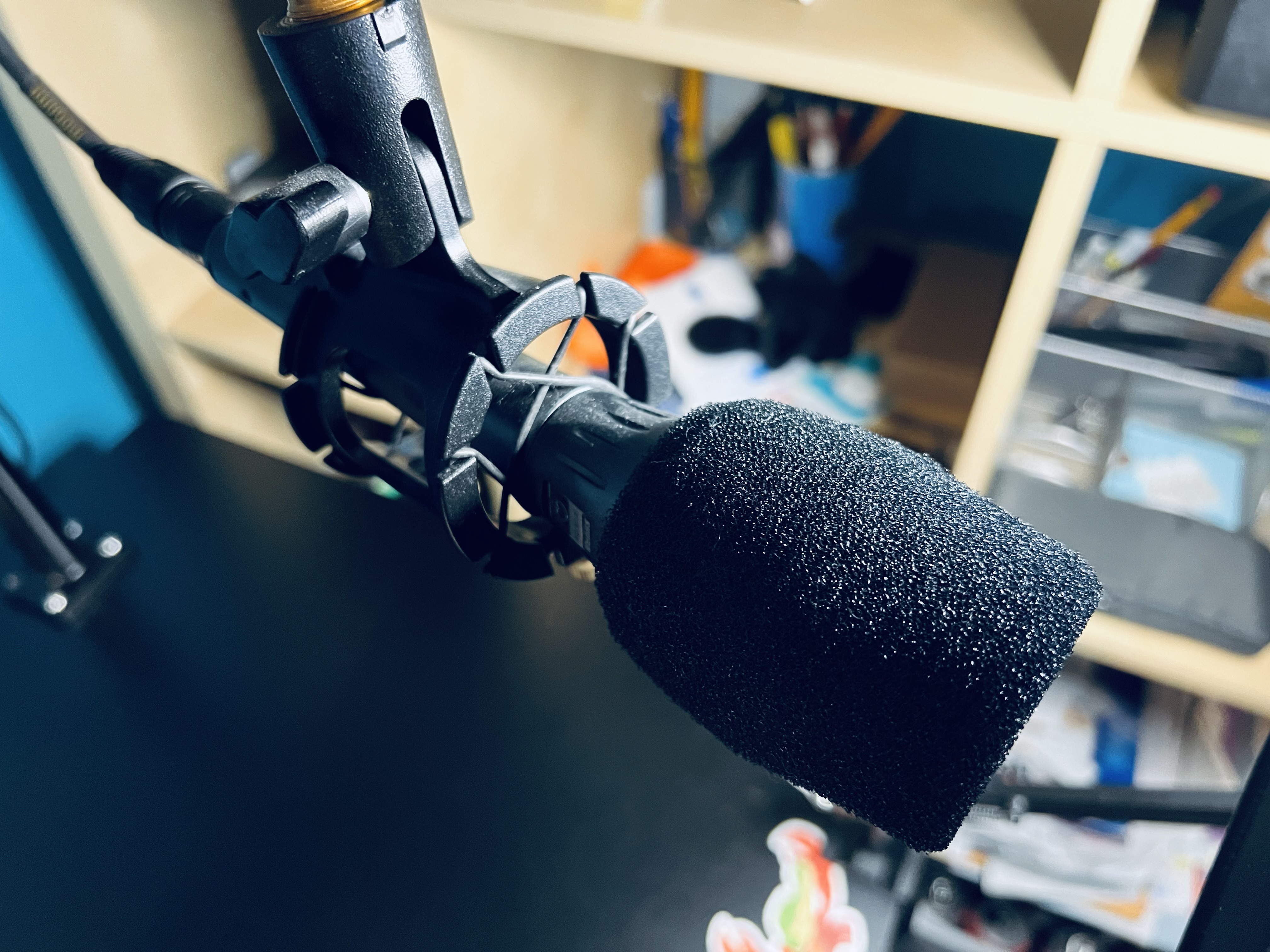
Mics are very subjective, and a mic that works well for one voice might not work well for others. In addition, the type of mic you get should also suit your recording environment. Many a relatively inexpensive condenser mic has been the go-to mic de jour for beginning podcasters, and condensers are not good for noisy environments. You need a quiet, non-echo-ey room for a condenser mic.
My mic is the Shure Beta 87A. I like the fact that it has the benefits of a condenser mic while also having good drop-off so that it doesn’t pick up every spec of dust hitting something somewhere in outer space.1
Personally I don’t recommend USB mics and I don’t recommend most of the mics marketed towards podcasters. Don’t get a Yeti. Don’t get a Snowball. Don’t get a Rode Podcaster or Procaster.2
Regardless of what mic you use, learn how it works in terms of proximity effect and positioning, use a pop filter and preferably a boom arm, and don’t bump it or move it while recording. Also find a way to mute the mic for when you need to clear your throat or make other noises. Depending on who’s doing your editing, you may find all that in the episode if you’re not careful.3
Mic Stand
The best stand for a mic is a boom arm, which keeps the mic off the desk, isolates it from bumps and vibrations, and makes it easy to position where you need it to get the best sound for your recording.
I think I’m currently using an Innogear mic stand. I’m not sure because I ordered a couple around the same time, one for me and one for my daughter. This is the nicer looking of the two in my order history, so that’s the one I’ll point out.
In the past I’ve had some bigger, heavier duty ones, but anything that can hold a 3 lbs or so will be fine.
Audio Interface
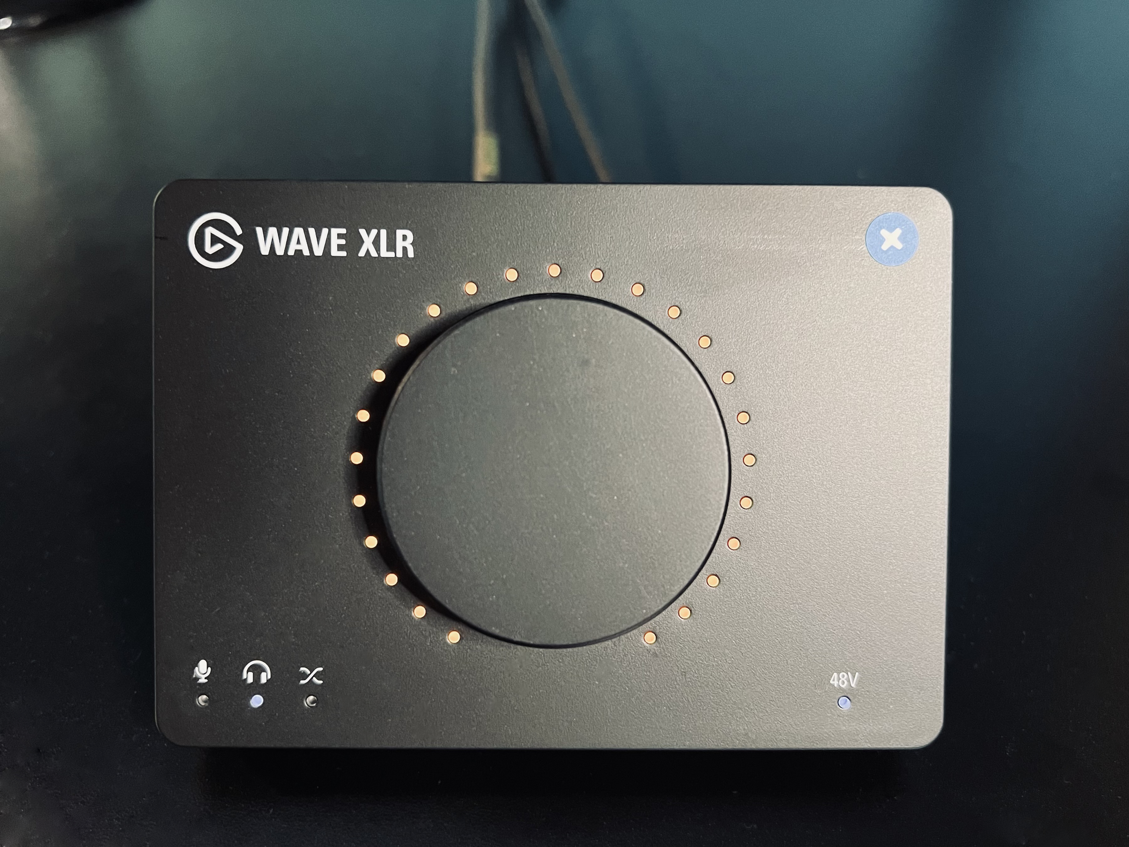
If you’re using an XLR mic and not a USB one, which is my recommendation, you’ll need an audio interface. Believe it or not, for podcasting or streaming, I’m not going to recommend some traditional interface with lots of knobs and features. I’m recommending the relatively inexpensive Elgato Wave XLR.
With a capacitive touch-to-mute function, plenty of gain, software settings including clipping prevention and other effects, this is a great value for the price. Previously I used a Tascam US-2x2, and I can’t be happier that I ditched it for the Elgato. It’s just nicer to use for podcasting and has plenty of clean gain.
If you do in-person recording with a co-host, you may need an interface with multiple mic inputs. If not, the Elgato Wave XLR is perfect for podcasting.
Computer
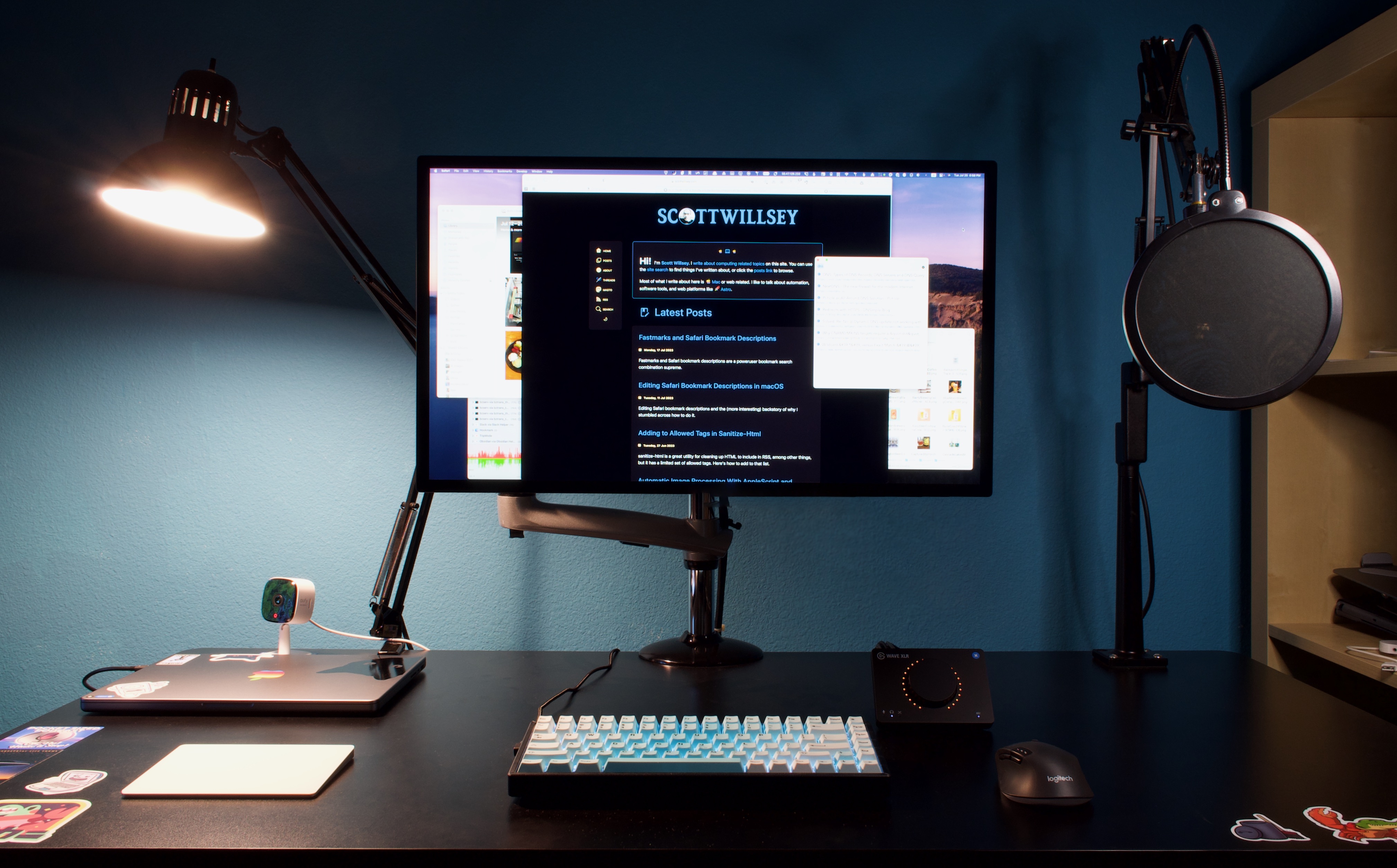
My computer is a 14” 2021 MacBook Pro M1 Pro with 16 GB of RAM, a 1TB SSD, 10 core CPU, and 16 core GPU. Those memory, SSD, and CPU/GPU specs are the absolute minimum I would ever go with, but for the money this is by far the most amazing computer I’ve ever owned. It eats giant number-crunching chores for breakfast and never gets hot. The only time I can warm it up even remotely is when generating transcripts of podcast episodes with MacWhisper.
When I have 5 or 6 tracks of audio in Logic Pro, all split up with silences stripped, it can get really slow to respond to selections and movements, especially for longer episodes. I attribute this to the 16GB of RAM. Previously I had 32GB in my iMac, but that was because I could add and remove RAM with ease. That’s obviously not the case with the MacBook Pro, so go for as much as you can afford.
I absolutely love the 14” form factor, by the way. I was tempted to go larger but this Mac is the nicest combination of size and utility I’ve ever had in a laptop. You get very good edge to edge use of the screen, it’s high resolution, and it has the most beautiful monitor Apple makes, in my opinion. It’s simply lovely to use for hours on end.
Before the current MacBook Pro, I had a 5k 27” iMac and this display is very much like that one except it has more usable area and it doesn’t have the huge chin and the giant foot hanging off it. I had it mounted on the same VESA arm the Studio Display is on, but the Studio Display is lighter and doesn’t jiggle when I type like the iMac wanted to do sometimes.
Look, I don’t know why PCs continue to have such horrendous monitors (especially the built-in laptop screens) and trick people into thinking 4k is amazing, but the 5k Apple Studio Display quality is the minimum I’ll accept for an external monitor.
Keyboard
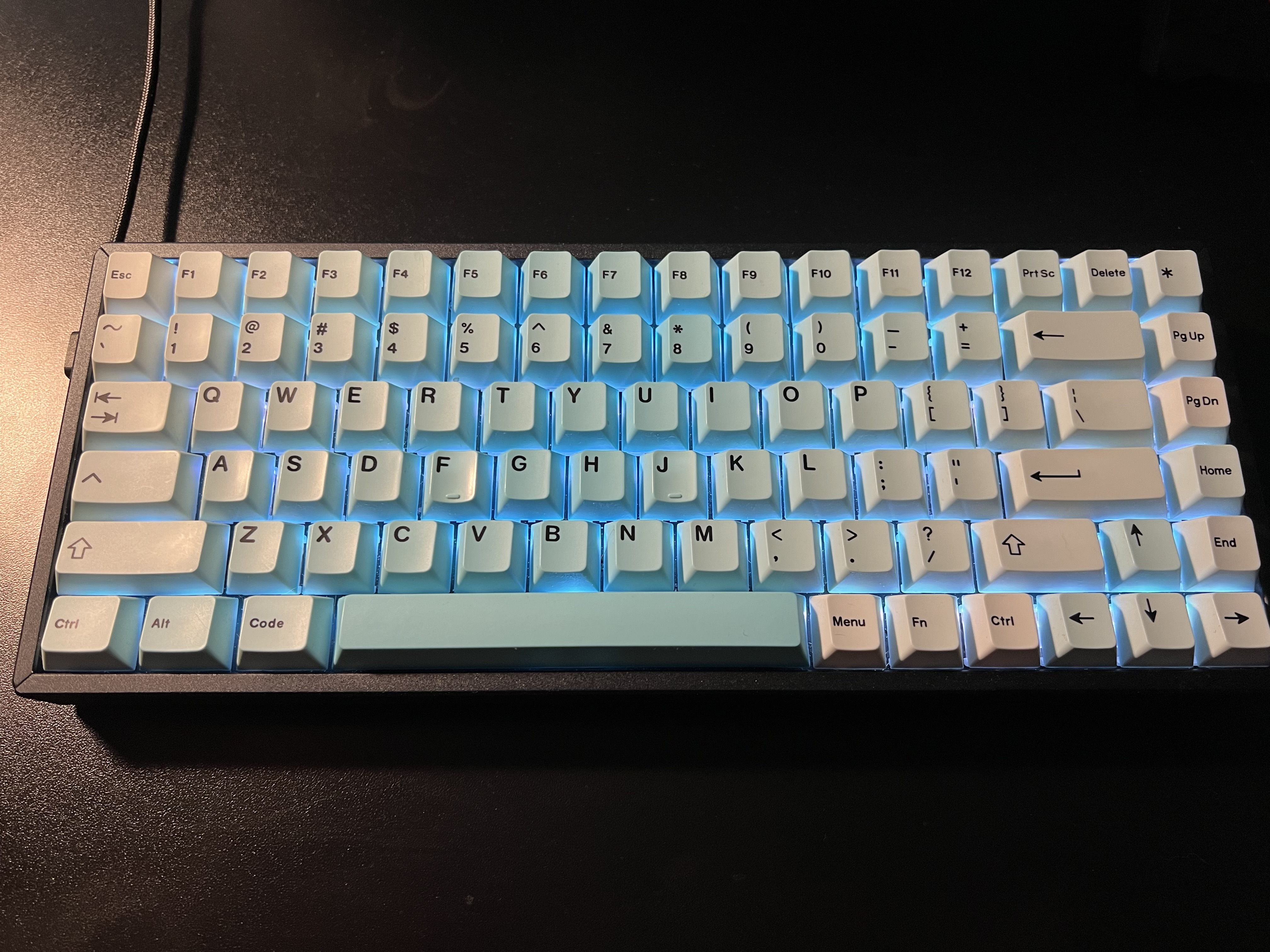
I love my clacky keyboard. It’s a Keychron K2 wireless (but I run it wired) with an Artifact Bloom Series Ocean Wave Keycap Set from Drop.com. I have some other custom keycaps but I love the blue of these, especially with the keyboard set to a light blue backlight.
Mouse and Trackpad
It’s really important to stress this – you don’t have to use the horrible Apple mouse. Yes, yes, I know, and I tried to like it too. But it’s ergonomically disastrous and it’s functionally stupid.
In order to keep the ability to use macOS gestures, I also have an Apple Magic Trackpad in white, and I love that too.
The mouse sits to the right of the keyboard and the trackpad to the left.
USB/Thunderbolt Hub
Docking the Mac and having it connect to all my accessories is simple. I have the CalDigit Thunderbolt 4 Element Hub. It’s got all the bandwidth needed for the Apple Studio Display with 4 Thunderbolt 4/USB4 ports and 4 USB-A ports. The same single connector that connects all my devices to my MacBook Pro also powers the computer so I don’t even have to bust out the MagSafe.
For the price, I think it’s one of the best out there. You could get a TS4 if you really want to go nuts, but I couldn’t quite justify it.
Standing Desk
My standing desk is a FLEXISPOT 55 x 28 Inches Standing Desk with electrical height adjustment motor. It’s black, it has lots of space, and it’s clean underneath which allows easy mounting of hub mounts and cable management items. I do use it in standing configuration quite often, and almost always while podcasting.
That’s All, Folks
That’s pretty much it for my hardware. Next time I’ll get into software, and then later we can talk about workflows, editing processes, and other things that will help make your podcast excellent.
Footnotes
That would be quite a feat since sound doesn’t travel in space. ↩
The Rode Podcaster and Procaster look tempting, but they have really muddy midrange. For voices like mine, they’re the absolute worst mic for way more money than is reasonable. ↩
If YOU are the editor, there’s no excuse for not editing that out. Anything that bothers you will definitely bother others, and a lot of things that don’t bother you will bother others. ↩
In my last post, I talked about the bizarre world of Safari bookmark descriptions and how to edit them, and I justified this weird tangent on my part by the fact that I want to use Fastmarks for searching for and opening bookmarks.
Fastmarks is a blazing fast, keyboard shortcut driven utility for searching bookmarks. And it’s stupendously quicker than accessing bookmarks any other way I’ve tried, including online services, even with integrated plugins and apps.
The problem I had though was that, as I mentioned last time, I intended to pseudo-tag my bookmarks by putting keywords in the bookmark descriptions. Safari supports bookmark descriptions, although it does its best to hide them. Sadly, I discovered that Fastmarks doesn’t use description data for searching bookmarks.
At least, it didn’t. Until I emailed the Fastmarks developer, Tyler Hall of Retina Studio, who promptly sent me a test build with descriptions indexed in Fastmarks along with the previously searched bookmark title and URL.
It’s glorious.
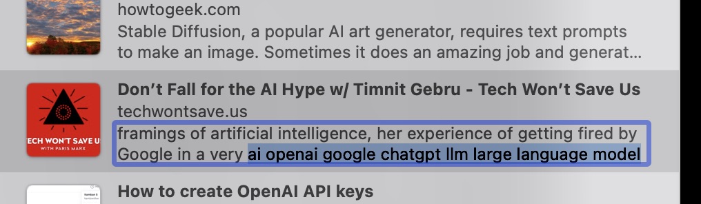
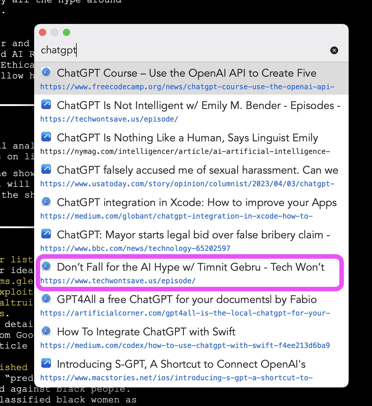
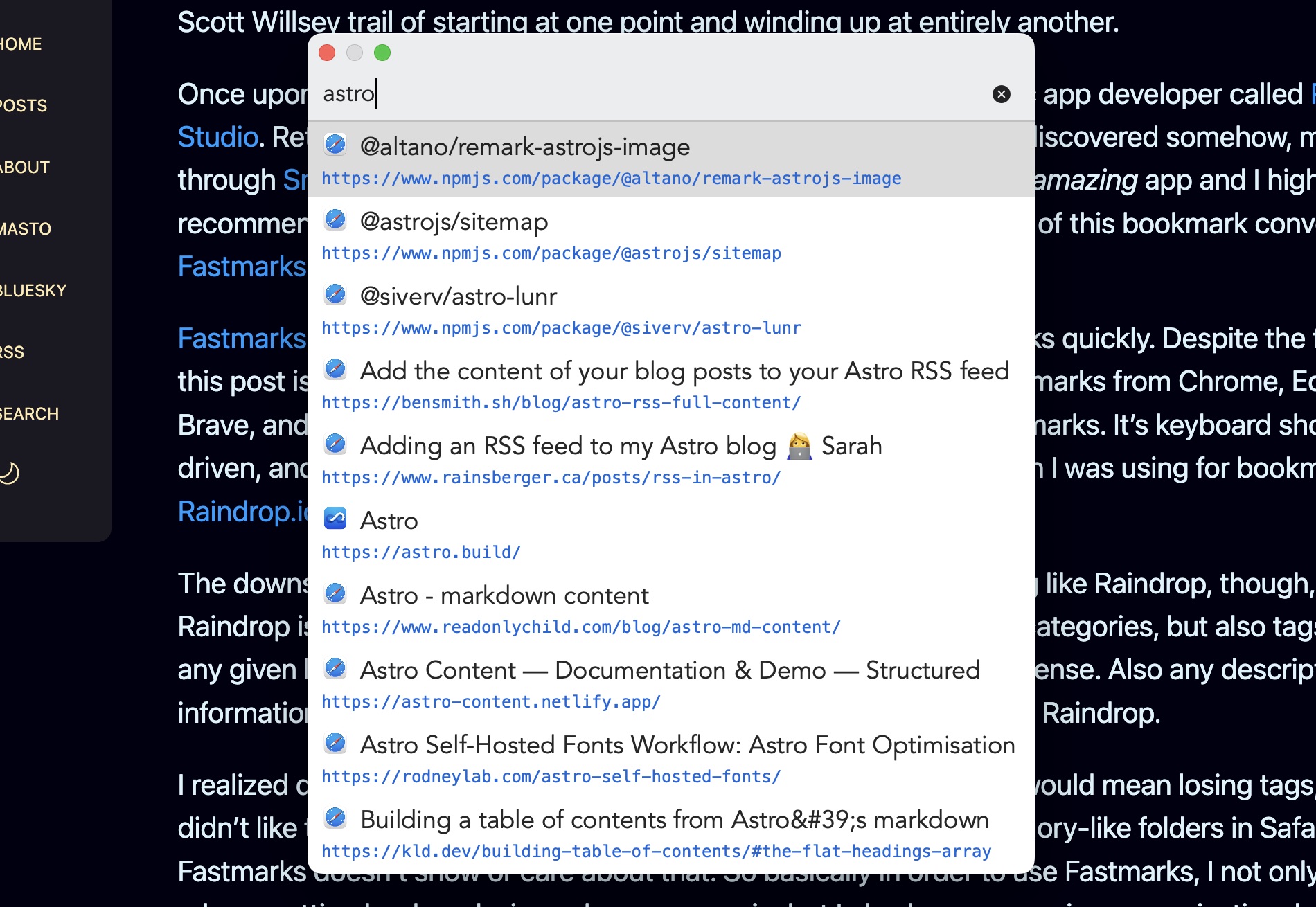
Now I can edit bookmark descriptions and throw some keywords in at the end, like this:
And searching for any of those keywords will bring up the bookmark in my Fastmarks search results.
By the way, not only is Tyler clearly a superior human based upon the utilities he codes, he also was super open and responsive to the idea of adding descriptions to the Fastmarks search index. Once again, an indie Mac developer shows what makes the Mac great - people who care about the platform and about user experience.
Yesterday I learned about a really cool way to edit Safari bookmark descriptions in macOS. I understand this immediately opens up questions like “why would you want to?” and “why are you even using Safari bookmarks at all?”. I will answer those questions, but first let me show you how to edit Safari bookmark descriptions. 🙂
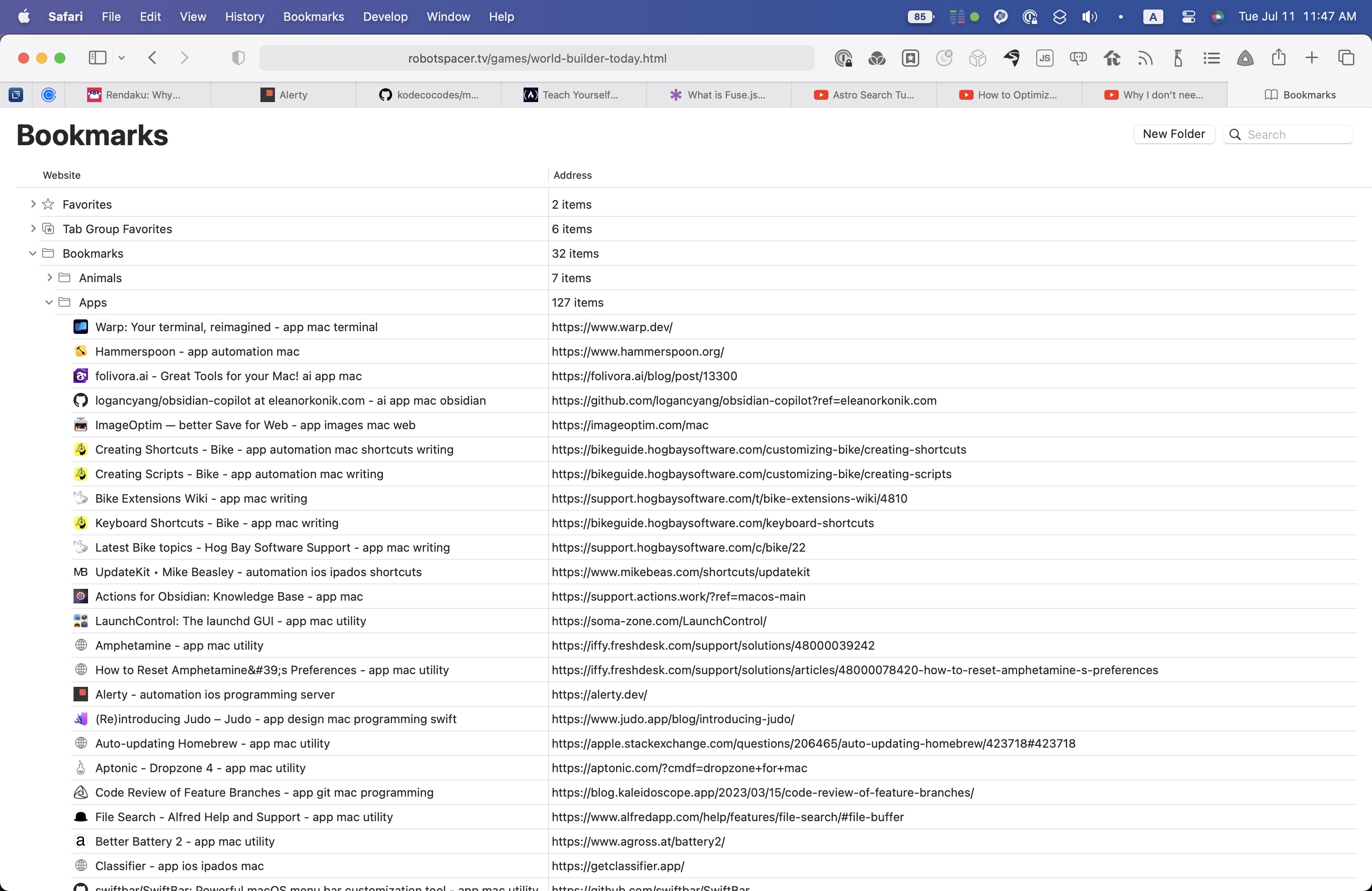
When you think of editing Safari bookmarks, you may immediately think of going to the Bookmarks menu and choosing “Edit Bookmarks” (or typing the Opt-Cmd-B keyboard shortcut to do the same thing). I did too, but this won’t let you edit bookmark descriptions. It will only let you edit bookmark names and URLs, as you can see in the image below.
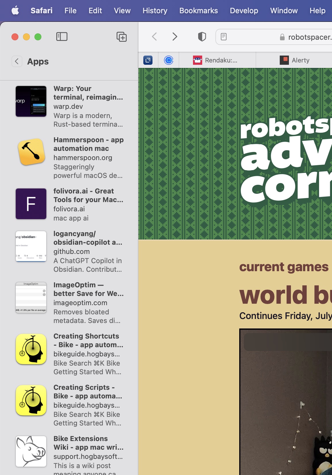
Instead, use the View menu and choose “Show Bookmarks in Sidebar” or type Ctrl-Cmd-1 to show your Safari bookmarks in normal bookmarks view. Double-click on a bookmarks folder, and you’ll see all of the bookmarks in the folder presented in mini-preview style with an image representation, name and description.
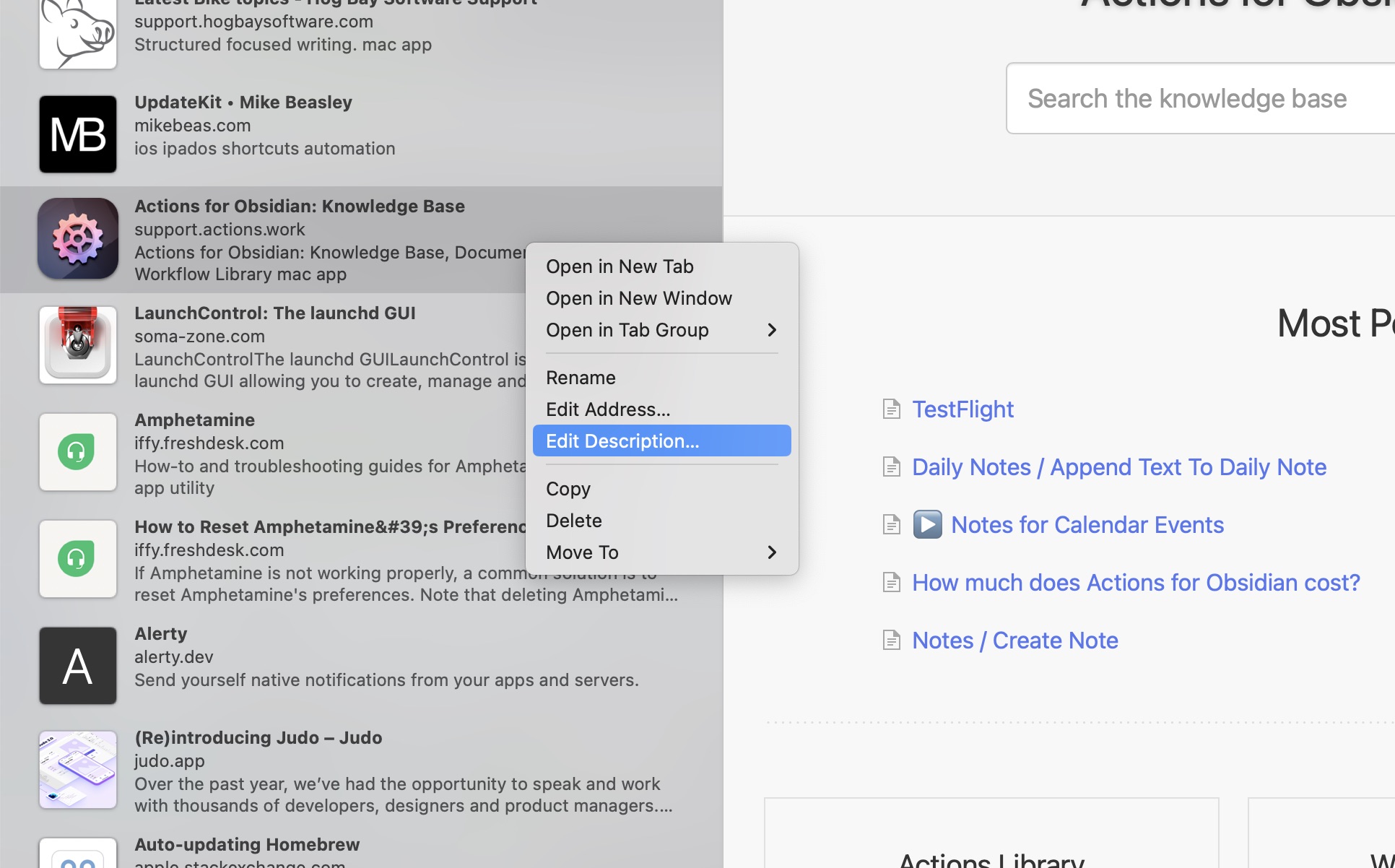
Here, you can right-click on any bookmark and choose to edit the name, the address, or the description.
Great! You can edit bookmark descriptions. So what? My answer to that is yet another convoluted Scott Willsey trail of starting at one point and winding up at entirely another.
Once upon a time, namely now, there existed a little private indie Mac app developer called Retina Studio. Retina Studio are the makers of a wonderful little app that I discovered somehow, maybe through Snazzy Labs, maybe not, called TextBuddy. TextBuddy is an amazing app and I highly recommend it, but it’s another app of Retina Studio’s that is the point of this bookmark conversation: Fastmarks, which I tried after purchasing TextBuddy.
Fastmarks is all about searching and opening your browser bookmarks quickly. Despite the fact that this post is about Safari bookmarks, Fastmarks can also search bookmarks from Chrome, Edge, Brave, and Firefox, as well as iCloud tab groups and Hookmark bookmarks. It’s keyboard shortcut driven, and it’s way faster than either Safari bookmarks or the solution I was using for bookmarks, Raindrop.io.
The downside to using browser bookmarks as opposed to something like Raindrop, though, is that Raindrop is all about categorization and organization. Yes, there are categories, but also tags, so that any given bookmark can fit across several topic domains, as makes sense. Also any description information you add is readily available while searching bookmarks in Raindrop.
I realized quickly that switching to Fastmarks and Safari bookmarks would mean losing tags, and I didn’t like that. In addition, although I could put bookmarks into category-like folders in Safari, Fastmarks doesn’t show or care about that. So basically in order to use Fastmarks, I not only have to rely on putting bookmarks in my browsers again, but I also lose my precious organizational metadata.
My solution, I thought, would be to just add keywords equivalent to tags to the bookmark descriptions. This is where the procedure above for editing Safari bookmark descriptions was to come in handy. And it did. It’s just that apparently Fastmarks doesn’t use the description metadata for search results.
Wah, wah, wah…
So now my current plan is to just add the keywords to the ends of my bookmark titles, in alphabetical order. In fact, if you look at the first image in this post closely, you’ll see I’ve already started that process. This will make it so I still get the incredible speed of Fastmarks, but also the increased likelihood of finding what I’m looking for that comes with tags and other extra metadata.
Fastmarks isn’t perfect – I really wish it would let me specify for it to match whole words from my search in any order instead of only matching in the order they appear in the bookmark name,1 and I wish I could use regular expressions to search bookmarks with – but it’s fast and I’m going to give it a proper try as my bookmark search solution.
Footnotes
Fastmarks does have fuzzy searching, but it matches every character in a search and quickly becomes a problem of building a bigger haystack than with non-fuzzy searching. ↩
Because I include full body text in my RSS feed, I use an html sanitizer called sanitize-html to sanitize, escape, and encode everything in the item body. One thing I didn’t realize until today is that by default, it strips out img tags. I knew that images were missing from my posts when viewed in RSS readers, but I thought this was due to me using relative URLs for them and not including the full URL including domain name. This may actually still matter, but it turns out my images never got that far, because sanitize-html was removing them whenever my RSS feed was rebuilt.
The good news is, there’s an easy way around this because sanitize-html provides an easy way to add tags to those allowed, and their documentation even includes the img tag example:
In my case I run all this through yet another custom function called globalImageUrls, which just takes relative URLs from the post body and converts them to absolute urls including the domain:
Every episode of Friends with Brews, I need to generate images for the drinks to include in the podcast chapter artwork and (more importantly) to feature on the website. What I create is a square image in PNG format (for reasons I won’t get into here, but more on the image format later) that has a naming scheme that reflects the manufacturer, the drink name, and a UUID to make sure I never accidentally have file naming collisions (although that should never happen anyway in this use case). I used to do this manually, but no longer.
At some recent point in my life, I purchased a copy of Flying Meat’s Retrobatch. I don’t remember why, other than I was manually tweaking images for Friends with Brews already, and I am a very happy customer of Flying Meat’s other product, Acorn. Acorn is the image editor that I was using to get beverage images ready for the site – it’s simple but powerful, and it’s human-friendly, as their tagline “the image editor for humans” attests. Anyway, Retrobatch is all about batch image processing, and I’m pretty sure my thought process was along the lines of getting out of the manual image tweaking business for Friends with Brews.
Flying Meat has dumped a ton of features, scriptability, and customizability into Retrobatch. You can get a taste of some of its capabilities on the product description page. One thing I couldn’t figure out how to do in Retrobatch though was to easily append a UUID to the image filenames. Retrobatch allows for all kinds of dynamic naming schemes for files, but I couldn’t see a way to get the filename without the extension, append the output of an AppleScript or JavaScript block on it, and save it to that concatenated string plus the extension. Generating the UUID in Retrobatch isn’t the issue - I could just run an AppleScript or JavaScript in a Retrobatch script block that does it - but modifying the filename the way I want is (apparently) not easily done.
AppleScript, however, can talk to both the shell and Retrobatch, so I can use it to fire up Retrobatch processing, generate a UUID with a shell command, and finally, rename all the files in the OUT folder to include the UUID before the file extension.
1
-- Use Retrobatch to square images and save them as PNG
2
tellapplication"Retrobatch"
3
setdto open ((POSIX file"/Users/scott/Documents/Podcasts/FwB/BrewsImages/FwB Images.retrobatch")asalias)
But, wait – there’s more! It turns out macOS natively supports folder events such that you can run a script when something happens in a folder. This means I can have it run my AppleScript, with a slight modification, whenever I drop the images into my IN folder, and it’ll put the formatted images into my OUT folder and rename them with the UUID added.
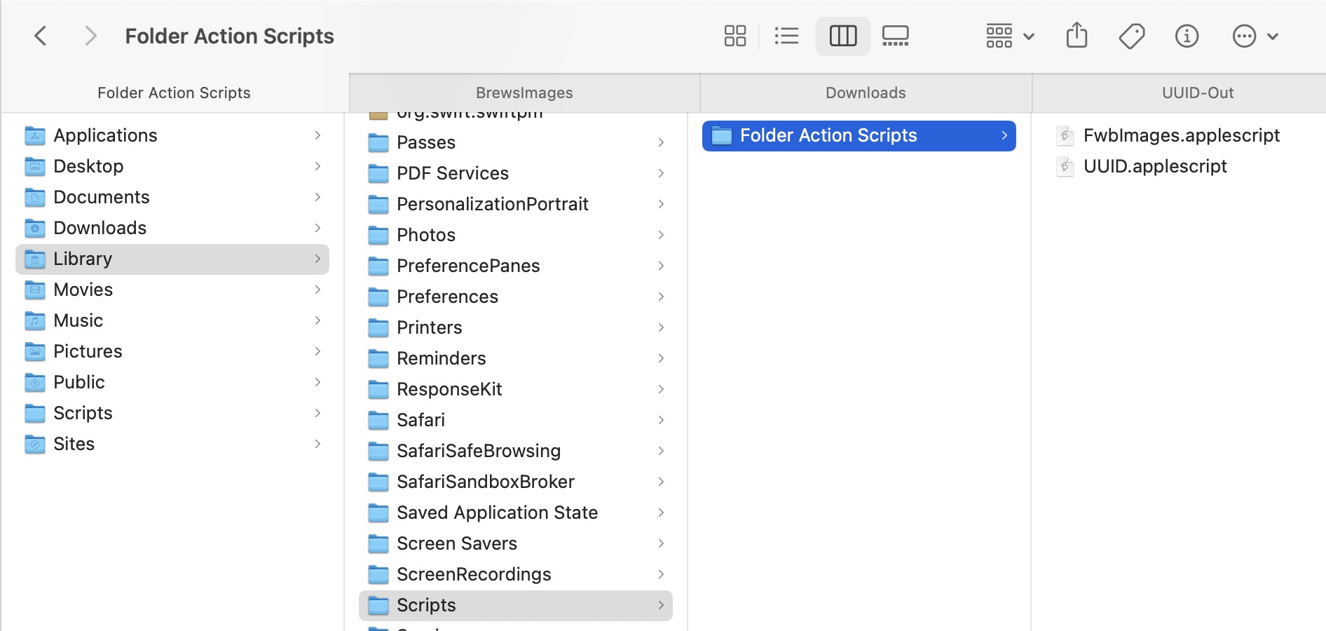
The trick to this is in adding my AppleScript (slightly modified) to my ~/Library/Scripts/Folder Action Scripts folder. Note the ~ indicating this is in the user folder’s Library folder, not the top level /Library folder.
First the AppleScript modification: A line at the top and a line at the bottom which tell it to only execute the AppleScript when new items are added to the folder:
1
onadding folder items to theAttachedFolder after receiving theNewItems
2
3
... (original AppleScript here) ...
4
5
6
endadding folder items to
The full script now looks like this:
1
onadding folder items to theAttachedFolder after receiving theNewItems
2
3
-- Use Retrobatch to square images and save them as PNG
4
tellapplication"Retrobatch"
5
setdto open "/Users/scott/Documents/Podcasts/FwB/BrewsImages/FwB Images.retrobatch"
For the AppleScript to execute automatically on a folder, first it needs to be located in ~/Library/Scripts/Folder Action Scripts.
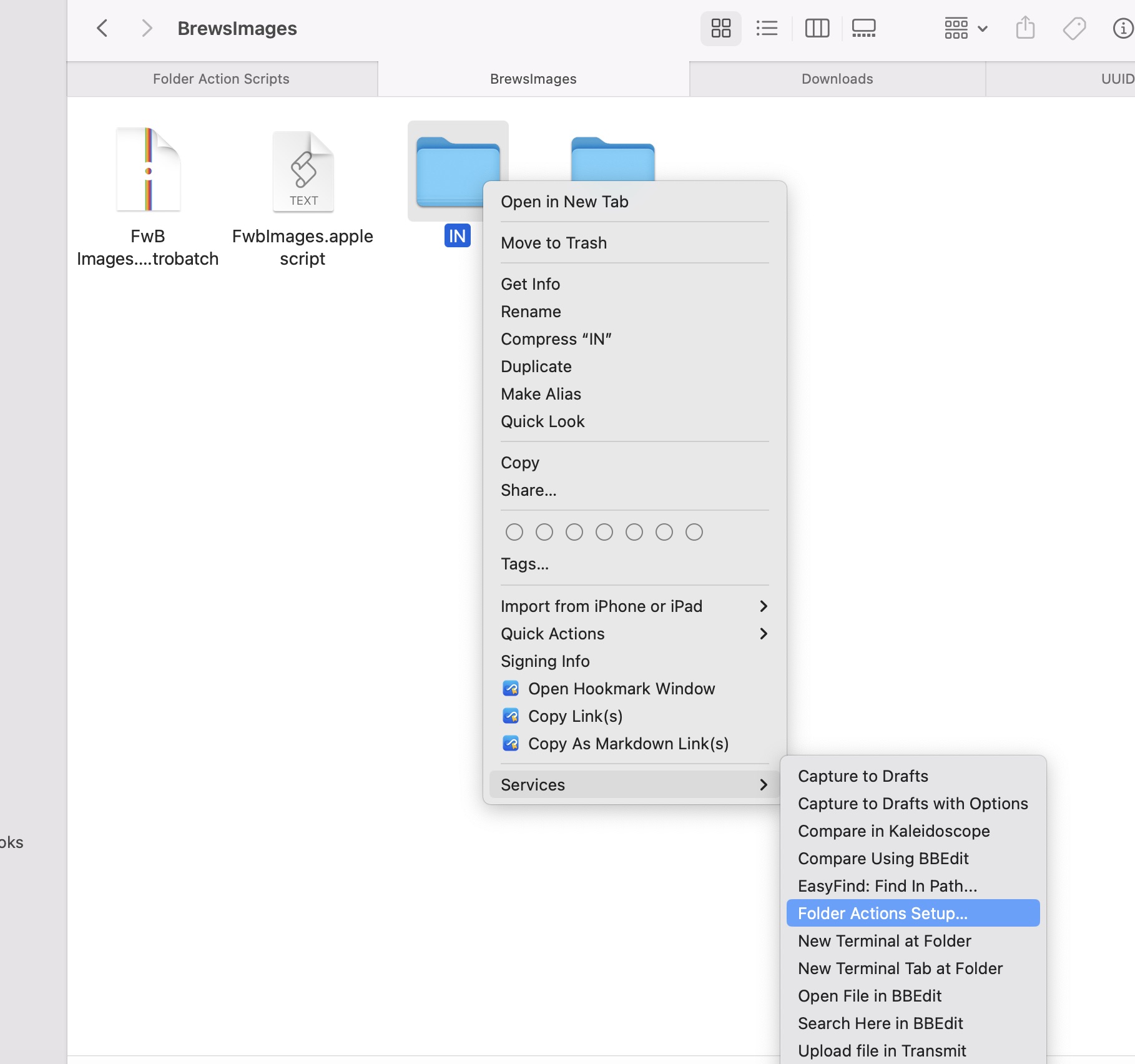
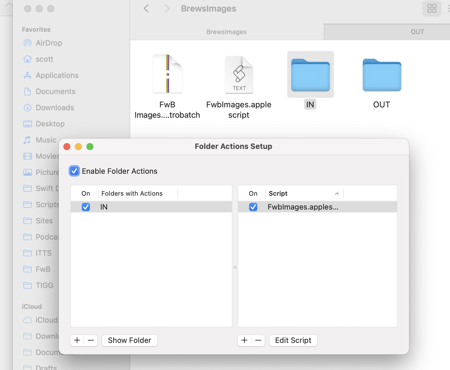
Once I had the AppleScript there, I right-clicked my input folder, selected Services and then Folder Action Setup.
On the “Folder Action Setup” dialog box, I clicked on the action name on the right to reveal a dropdown with my AppleScript in the list. I chose the AppleScript, made sure “Enable Folder Actions” was checked, and closed the dialog box.
Now I have a folder that I can drop images into, and they automatically get formatted and renamed and placed in my output folder.
There IS one thing to remember about renaming files in a folder that watches for new items: renaming a file will trigger the script again because it appears to Finder to be a new item. That means if you rename an item in the input folder and the script doing the renaming is set to execute whenever new items appear, it’ll run repeatedly on the same file and the name won’t be what you want. This is why I move the files to the output folder before changing the name by adding the UUID to it.
This workflow doesn’t completely remove all manual labor because I still have to download the files, determine whether or not I need to pre-crop so the Retrobatch square crop action won’t remove something I want, and finally maybe add a background using Acorn if the original image background is transparent. I think I can probably get Retrobatch to handle that last part for me… I hope. I haven’t tried yet.
At the start of this post, I said I’d mention image formats again. I just wanted to point out that regardless of what format I save them to my site src folder in, they get optimized and output in a more responsive-friendly size and format. I use PNG because by being consistent I can overcome an interesting Vite feature regarding dynamic image imports and still get the job done.
As always, I’m really bad at explaining things clearly, so hit me on Mastodon or Bluesky if none of this makes sense.


